Release 43.0 Notes 08 December 2024#
New Chart Designer#
The new Chart Designer makes chart building faster, easier, and more flexible. You can use the new version without any prior technical knowledge or advanced training. Previewing charts is now automated, all possible chart settings are automatically displayed and no longer hidden, and the chart designer now uses a drag-and-drop system that makes selecting settings and viewing results much easier.
Switching to the New Chart Designer#
The old Chart Designer is still available to use so that complex widgets can have time to be transitioned to the new Chart Designer. It is also possible to create a chart in the new version and edit it in the old version. However, not all charts built in the original Chart Designer will be compatible with the new version.
Note
 If an existing complex widget is saved in the new Chart Designer, some settings may be lost. To avoid this, create copies of widgets when transitioning widgets to the new version.
What might be lost when editing an existing chart in the New Chart Designer#
Functions, custom formatting of series (like colors, names, and labels), and some other custom formatting of grid columns and tooltips are not yet available in the new version of Chart Designer. This affects charts that have highly customized colors, fonts, etc., but will not affect most charts.
Custom settings from the old Chart Designer will be lost if you:
Click ‘Restore Defaults’. This will apply the new Chart Designer defaults.
Remove the Series field.
Switch the chart type
Swap the fields between X-axis and Series or vice versa (only the swapped fields will be affected).
Custom settings from the old Chart Designer will NOT be lost if you:
Reorder the fields in the Series list
Add new Series fields from the Fields list
Navigating Chart Designer#
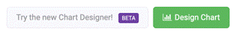
To get to the new Chart Designer, you can select it after you’ve completed building a widget or by opening the Widget Builder screen, selecting a widget and then clicking the ‘Try the new Chart Designer’ button next to the old ‘Design Chart’ button.
The new Chart Designer page consists of three main panels and the top navigation bar. The navigation bar has 4 action buttons.

The Back to Widgets chevron navigates back to Widget Builder. This will also cancel your current edits.
The Activate/Deactivate button activates your widget if it is inactive and deactivates your widget if it is currently active.
The Reset button resets your widget to its last saved state.
The Save button saves your current progress.
The main page of the new Chart Designer is divided into 3 main panels: Fields, Chart Settings, and Preview.
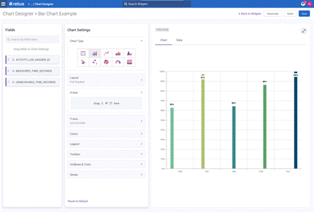
Fields#
The Fields section contains the data fields from your widget that you use to create your chart. For example, this is where you would select your x and y axis values when setting up a bar chart.
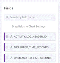
You can search by field name in the search bar at the top of the fields section. Each field has a data type icon and can be dragged and dropped into the Chart Settings panel, depending on the chart type’s accepted data types.
Icon |
Data Types |
|---|---|
|
String |
|
Number |
|
Date |
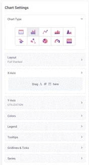
Chart Settings#
The Chart Setting panel is where you choose your chart type and set up the details of your chart, such as the color pallet, legend, series, axes, etc. There are 10 different chart types to choose from, each with their own set of customizable features.
Preview#
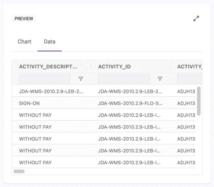
The Preview panel consists of two tabs that you can flip between: the Chart tab and the Data tab.
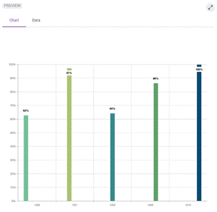
The Chart tab displays your chart preview in real-time. When you make changes in the Chart Settings panel, your chart preview will automatically update.
The Data tab displays the widget’s underlying data in a grid format. The columns are resizable, sortable, and pin-able. This allows you to easily see and organize the data you want to use in your chart.
Procedures#
Setting up a Chart#
This procedure explains how to create charts in the new version of Chart Designer, which lets you configure a chart that shows the data you prepared through the widget builder stages. Open it after you’ve completed building a widget or by opening the Widget Builder screen, selecting a widget, and then clicking ‘Try the New Chart Designer’.
In the Chart Settings panel, select the image representing your preferred chart type. For more information on how to choose a chart type, see Selecting the Right Chart Type to Present the Data.
Icon |
Chart Types |
|---|---|
|
Grid (default) |
|
Bar |
|
Line |
|
Area |
|
Spline |
|
Range |
|
Bubble |
|
Pie |
|
Gauge |
|
Card |
Select the fields you wish to use. For example, the fields for the y and y axes of a bar chart. Drag and drop the fields from the Fields panel into the Chart settings panel.
Set up the remaining details of your chosen chart. These options vary depending on your chosen chart type. For more information relating to specific chart type settings, see Advanced Chart Settings below. Your chart preview will update automatically in the Preview panel. To undo all of your changes, click the Reset to Default button. To reset your widget to its last saved state, click the Reset button on the top right navigation bar.
Save your chart.
Finally, activate your widget using the Activate button on the top right navigation bar.
Advanced Chart Settings#
Each chart type has their own setup options in the Chart Settings panel.
Setting |
What You Do… |
|---|---|
Columns |
Drag and drop your desired columns from the Fields panel. Drag and drop your columns in the Chart Settings panel to reorder them. |
General |
Click the checkbox to turn off the following functionalities: Column filtering, Sorting, Resizing, Range Selection. These options are selected by default. |
Sidebar |
Click the checkbox to hide the sidebar. Select whether you want the sidebar on the right or left side of the grid. |
Pagination |
Select the checkbox to show pagination. Select the checkbox to fit rows to grid height. |
Setting |
What You Do… |
|---|---|
Layout |
Select Stacked, Full Stacked, or Rotated. Type a number between 0 and 1 to determine bar padding. |
X and Y Axis/Series |
Drag and drop your desired fields from the Fields panel into each dropdown. You can add up to 5 series. |
Axes Titles |
Type your Axes titles. |
Labels |
Deselect the checkbox to turn off labels for the X-Axis, Y-Axis and Series. These are selected by default. In the Rotation Angle field, type out the degree at which you want your labels to appear. In the Background Color field, select the background color of your labels. |
Lines and Ticks |
Select the Crosshair checkbox to turn on crosshairs. Select the Grid Lines check boxes for the X and Y axes to turn on gridlines. |
Colors |
Select your desired color pallet from the available options. |
Tooltips |
Deselect the checkbox to hide the tooltip. |
Legends |
Deselect the checkbox to hide the legend. |
Setting |
What You Do… |
|---|---|
Layout Argument |
Drag and drop your desired fields from the Fields panel into the dropdown. |
First Range Field |
Drag and drop a number type field. |
Second Range Field |
Drag and drop a number type field. |
Axes Titles |
Type out your Axes titles. |
Labels |
Deselect the checkbox to turn off labels for the X-Axis, Y-Axis and Series. These are selected by default. In the Rotation Angle field, type out the degree at which you want your labels to appear. In the Background Color field, select the background color of your labels. |
Lines and Ticks |
Select the Crosshair checkbox to turn on crosshairs. Select the Grid Lines check boxes for the X and Y axes to turn on gridlines. |
Colors |
Select your desired color pallet from the available options. |
Tooltips |
Deselect the checkbox to hide the tooltip. |
Legends |
Deselect the checkbox to hide the legend. Adjust the horizontal and vertical alignments. |
Setting |
What You Do… |
|---|---|
Layout Argument |
Drag and drop your desired field from the Fields panel into the dropdown. |
Series |
Drag and drop your desired fields from the Fields panel into each dropdown. You can add up to 5 series. |
Bubble Size Field |
Drag and drop a number type field. |
Axes Titles |
Type out your Axes titles. |
Labels |
Deselect the checkbox to turn off labels for the X-Axis, Y-Axis and Series. These are selected by default. In the Rotation Angle field, type out the degree at which you want your labels to appear. In the Background Color field, select the background color of your labels. |
Lines and Ticks |
Select the Crosshair checkbox to turn on crosshairs. Select the Grid Lines check boxes for the X and Y axes to turn on gridlines. |
Colors |
Select your desired color pallet from the available options. |
Tooltips |
Deselect the checkbox to hide the tooltip. |
Legends |
Deselect the checkbox to hide the legend. Adjust the horizontal and vertical alignments. |
Setting |
What You Do… |
|---|---|
Layout Argument |
Drag and drop your desired field from the Fields panel into the dropdown. |
Series |
Drag and drop your desired fields from the Fields panel into each dropdown. You can add up to 5 series. |
Labels |
Deselect the checkbox to turn off labels for the X-Axis, Y-Axis and Series. These are selected by default. In the Rotation Angle field, type out the degree at which you want your labels to appear. In the Background Color field, select the background color of your labels. |
Lines and Ticks |
Select the Crosshair checkbox to turn on crosshairs. Select the Grid Lines check boxes for the X and Y axes to turn on gridlines. |
Colors |
Select your desired color pallet from the available options. |
Tooltips |
Deselect the checkbox to hide the tooltip. |
Legends |
Deselect the checkbox to hide the legend. Adjust the horizontal and vertical alignments. |
Setting |
What You Do… |
|---|---|
Layout |
Select either Circular or Linear. Select your desired Value Indicator from the dropdown. |
Value |
Drag and drop your desired field from the Fields panel into the dropdown. |
Labels |
Deselect the checkbox to turn off labels for the X-Axis, Y-Axis and Series. These are selected by default. In the Rotation Angle field, type out the degree at which you want your labels to appear. In the Background Color field, select the background color of your labels. |
Lines and Ticks |
Select the Crosshair checkbox to turn on crosshairs. Select the Grid Lines check boxes for the X and Y axes to turn on gridlines. |
Colors |
Select your desired color pallet from the available options. |
Tooltips |
Deselect the checkbox to hide the tooltip. |
Legends |
Deselect the checkbox to hide the legend. Adjust the horizontal and vertical alignments. |
Setting |
What You Do… |
|---|---|
Layout Value |
Drag and drop your desired field from the Fields panel into the dropdown. |
Value Settings Label |
Write the Text of your Label. Select the Font, Weight, Color, Font Size and Position. |
Colors |
Select your desired color pallet from the available options. You can also add a background color by using a hex code. |
Number Format |
Select the format of the widget from the dropdown (fixed, date, decimal, dollar, million, percentage, thousand) Select the number to indicate the precision of the decimal that will be displayed (ex. 2). |