Planning Custom Widgets - General Points#
This topic covers high-level, general concepts pertaining to building a widget in the widget builder.
Planning your Widget - Questions to Ask Yourself#
Things to consider when you’re planning a widget:
What business decision is going to be made using the data shown in the widget?
What metrics are needed when making that decision?
What key performance indicators need to be shown?
How should the data be presented to best support making the decision?
Effective Design - General Points#
Keep labels simple and short
Use color sparingly and to draw attention to what’s important.
Try to avoid creating a spaghetti graph (too many lines). A graph is more legible if its lines are separated by white space.
Selecting the Right Chart Type to Present the Data#
I Want the Widget to Help Me… |
Recommended Chart Types… |
|---|---|
Compare Different Values. |
|
See Change over Time. |
|
See How Parts relate to a Whole. |
pie chart full stacked bar, full stacked line, full stacked area, stacked line |
Find Patterns and Trends. |
|
See the Variations between the upper and lower limits in the data. |
|
See the Real-Time Value of one Important Metric. |
Chart Types#
The following section describes the types of charts that you can use to present the data.
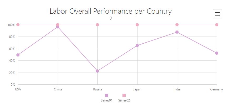
Line, Stacked Line, Full Stacked Line#
Line chart chart types help visualize data trends over specified intervals. Stacked line charts let you see multiple series and compare them. Full-stacked line series help compare the percentage value of multiple line series.
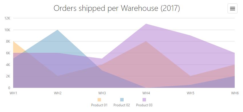
Area, Stacked Area, Full Stacked Area#
Area charts emphasize change in values. Stacked area charts help you to see multiple series and compare them. Full-stacked area series let you compare the percentage value of multiple area series.
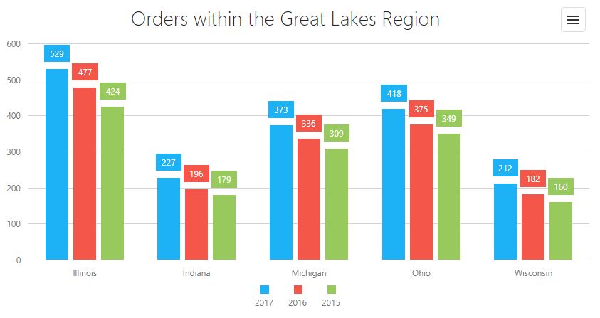
Bar, Stacked Bar, Full Stacked Bar#
Bar charts let you easily compare values. Stacked bar charts help you see multiple series and compare them. Full-stacked bar charts let you compare the percentage value of multiple area series for each argument.
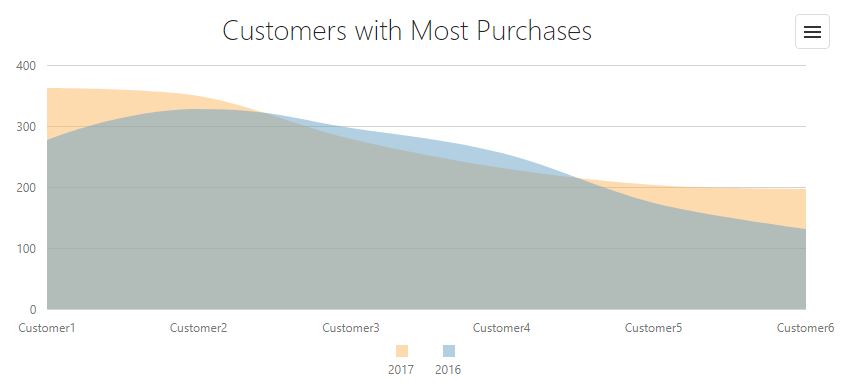
Spline, Spline Area#
Spline area series, like area series, emphasize change in values. However, spline area charts help «smooth» individual lines that connect data points. Stacked spline area charts help you see multiple series and compare them. Full-stacked spline area charts help compare the percentage value of multiple spline area series.
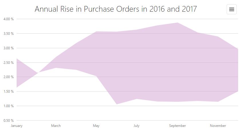
Range Area#
Range area charts show value ranges. Data is displayed as a color filled space between the line that joins the beginning and the line that joins the end series points.
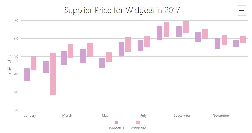
Range Bar#
Range bars show value ranges corresponding to specified arguments. Data is displayed as sets of rectangular bars beginning at a specified start value and ending at a specified end value.
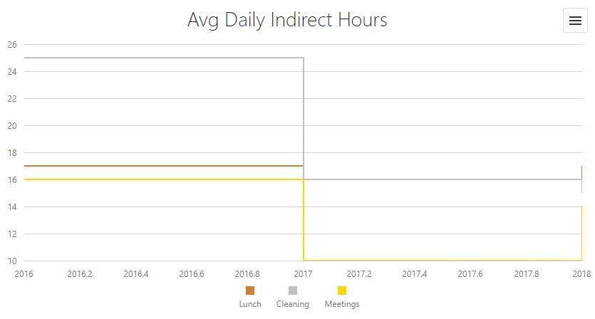
Step Line#
Step line charts are like traditional line charts. The primary difference is that in step line charts, data points are connected by vertical and horizontal lines — resulting in a «stair step» effect.
Step Area#
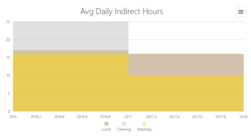
Step area charts are much like traditional area charts. The primary difference is that in step area charts, data points are connected by vertical and horizontal lines — resulting in a «stair step» effect.
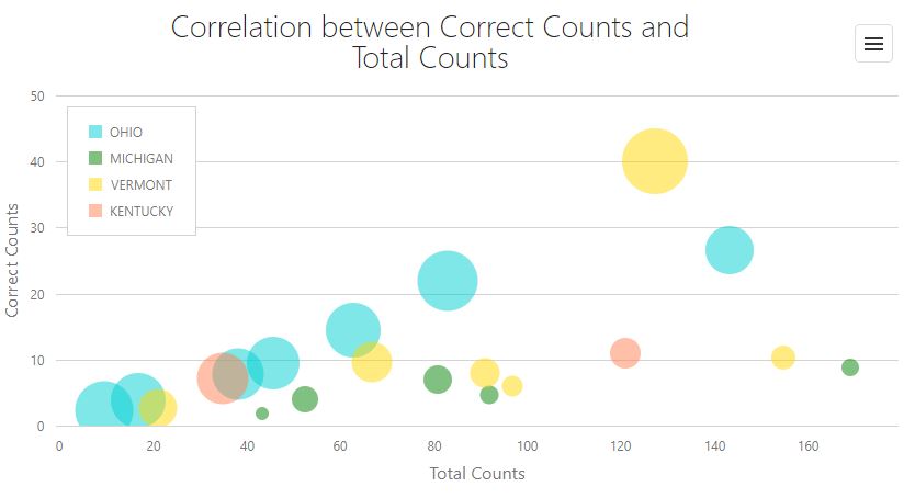
Bubble#
This chart lets you model a data set with three dimensions: the first two dimensions are indicated by coordinates on the axes, the third by the size of the bubble.
