Warehouse Maps - Overview#
A Warehouse Maps widget is a colored representation of data about a warehouse’s locations, where data values are represented as different colors. It lets you bring your data into a map and discover spatial relationships. Examples of data are order picking frequency, restock frequency, quantity of products, the age of products, the travel distance from the shipping area, etc.
A Warehouse Maps widget can show you where there are opportunities to improve the efficiency of your warehouse operations, and help answer questions like:
Where are the problem areas in the warehouse?
What issues are contributing to a reduced efficiency in a certain labor activity?
Is the warehouse’s layout optimal to permit high labor productivity?
How can I improve overall labor productivity?
Where are potential hazard zones?
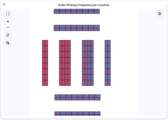
On your dashboard, you can see from a high-level view where you need to investigate for detailed information on the map. The example below is a Warehouse Maps widget showing the concentration of order picking frequency (in percentage) per location, where higher and lower concentrations tend towards respectively the colors red and blue.
Use Cases#
This section describes some use cases for which Warehouse Maps widgets can be useful. Use this information to choose the right Warehouse Maps for your needs and learn what you can do with the information found in the widget.
Identifying Bottlenecks in Travel Time#
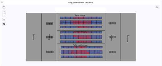
For example, this Warehouse Maps widget shows the picking frequency per location with high frequencies in red and low frequencies in blue. Locations with a high picking frequency are located farther from the Shipping area, while locations with a lower frequency are closer to the Shipping area.
Actions you can do:
Place high-frequency products closer to the Staging area next to the Shipping area to reduce the time and effort required for replenishment.
Free up space for higher-frequency products by relocating low-frequency products to less accessible locations within the warehouse.
Identifying Bottlenecks in the Order Fulfillment Process#
Use Warehouse Maps widgets to identify bottlenecks in the order fulfillment process and optimize workflows to increase order fulfillment efficiency. Let’s look at some examples of the types of information you can visualize in your Warehouse Maps widgets to help you solve this problem and make improvements.
Product Idle Time in Staging Area#
This Warehouse Maps widget example shows the duration in minutes that products have been sitting in the Staging area. Longer durations are shown in red, while shorter durations in blue.
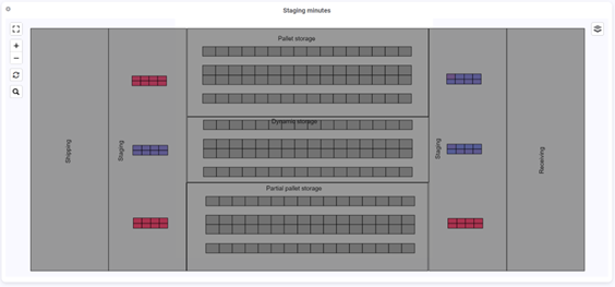
Actions you can do: You could investigate issues in your operations and promptly determine why a particular product has been sitting idle for an extended period by asking questions like: Is the trailer not at the dock door? Does the warehouse staff have other higher priorities preventing them from taking care of the batch ready for shipment.
Daily Replenishment Frequency per Location#
This Warehouse Maps widget example lets you see locations with a high replenishment frequency with high frequencies in red and low frequencies in blue.
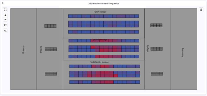
Actions you can do: To reduce resource usage, allocate more locations for products with a high replenishment frequency, or relocate these products to locations in a double-deep racking system.
Plan Where to Place Forecasted Product Inventory#
To prepare for forecasted outbound orders, you can use a Warehouse Maps widget like this one. It displays in red locations with high quantities that are expected to be shipped within a week and are farther from the Staging area next to the Shipping area.
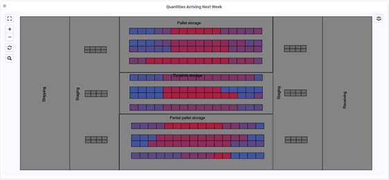
Actions you can do: To prepare for the moment when your staff will need to process the products for an outbound order, move them closer to the Staging area during idle time.