Creating Widgets#
Building Widgets through the Widget Builder screen#
Creating a widget involves two phases:
Preparing the data to populate the widget, and
Configuring the chart that displays the data.
For points on how to plan your custom widget, see Planning Custom Widgets - General Points.
The stages of the Widget Builder screen make it easy for you to prepare data for widgets. A stage lets you select or manipulate data in a particular way. To prepare data for your widget, set up a sequence of stages. Each stage performs some operation on the data and then passes the resultant data set onto the next stage for further processing. The first two stages, Basic Info and Filter, are required because they’re where you set up the widget’s data source and selection criteria. When you click ‘New’ on the Widget Builder screen to start preparing data for widgets, you are prompted to choose between two modes:
You’re New at Setting Up Widgets… |
You Know What You’re Doing… |
|---|---|
Select Guided Mode (a.k.a., the Widget Builder Wizard). You will be led through a sequence of default stages. |
Select Non-Guided Mode. You will be prompted to enter the basic details and how to get the data and then you can add any stages you want in any order. |
Widget Builder Wizard or Guided Mode#
The wizard takes you stage-by-stage, from selecting data to grouping it to setting up pivot tables. After you’ve done these stages you’re invited to use the chart designer to apply a chart type (e.g., grid, pie chart, pie chart) to the prepared data and create a widget that you can publish to users.
When going through the widget builder wizard, keep the following in mind:
If you click ‘Cancel’ at any stage, all the setup that you’ve done up to that point will be lost.
If you click ‘Previous’ and go back to a previous stage, any setup that you’ve done on the stage you just left will be lost.
If a stage is optional, you can skip the stage by clicking the ‘Skip’ button in the lower right.
If you want to refresh the data grid and see how your latest changes affect the composition of the data set, click ‘Preview’.
Widget name and data source can’t be changed after initial setup.
Do It Yourself through Non-Guided Mode#
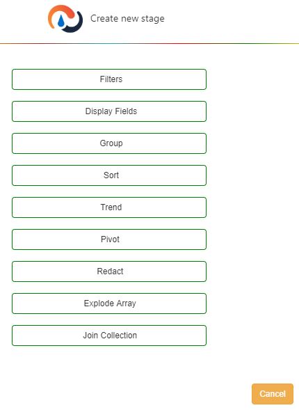
With non-guided mode, you first fill out the Basic Info stage, then decide how the data will be selected (Filter stage) and then you can choose which stages you want to fill out to prepare the widget’s data. After you’ve completed a stage, you are shown a menu of other stages that you can fill out next. You can set up :ref:` multiple instances of the same stage<a_wb_multi_stages>` to build a widget, which lets you have Rebus process the data in more complex ways.
Use the Code Editor to Write Your Own Functions#
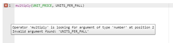
Some stages have a code editor that lets you write your own functions that define precisely how the stage processes data. The code editor has color coding and syntax assistance tooltips. Field names, function names and data types have their own colors, which make the functions easier to read. Your function syntax is automatically validated and if it doesn’t pass validation, a tooltip will tell you what’s wrong. The code editor also helps you avoid making mistakes when entering arguments in functions. When typing arguments for a function, the auto-complete feature shows as options only the following:
Fields of the same datatype required by the function.
Other functions that return a value of the same datatype required by the function.
Type of Element |
Color |
|---|---|
String |
Black |
Number |
Yellow |
Function Name |
Magenta |
Field Name |
Green |
Boolean value |
Blue |
Combining Multiple Widgets into a Single Widget#
You can create a superwidget that shows in a single chart the combined data of multiple active widgets. The Combine Widgets widget builder stage,lets you create a superwidget and select its component widgets whose combined data will be shown. This functionality lets you easily build a widget that has data from multiple data sets. It’s best used as a last resort when you can’t get a single widget to display the information you want.
Note
 A superwidget should not be regarded as a substitute for a Join Collection stage. A superwidget does not let you select its data set based on filter criteria or join a data source to another based on a common field.
How Data is Merged in Superwidgets#
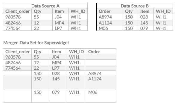
A superwidget’s data set is a union of the data of its component widgets. I.e., the data sets of the multiple data sources are simply merged together into a larger data set. There is no check for duplicate records. If two or more component widgets have a column with the same name, there will be a single column with that name in the superwidget data set and the values from that column from all the component widgets will be listed under it.
Note
The filter stages of each component widget don’t combine to become the superwidget’s filter criteria. Therefore if one component widget has a filter to select for all orders in WH1 and another has a filter to select for all orders of customer ‘XYZ’, the combined data set will not show all orders at WH1 that are for XYZ.
Example: Data from Two Component Widgets Here, data from two component widgets (Data Source A and Data Source B) is being combined. Three column names, Qty, Item and WH_ID, are shared between the two component widgets.
Features of Superwidgets#
You can do the same things with superwidgets that you do with typical widgets: e.g., adding them to dashboards, sharing them with other users, and including them in drilldowns. As with typical widgets, a user needs to be set up to access it through his or her My Account screen.
Note
Any change made to a widget in the Widget Builder carries through to any superwidget of which it is a component. If a component widget is deactivated, then any superwidget of which it is a component will also be deactivated.
Adding/Editing Stages to Superwidgets#
You can add widget builder stages to superwidgets, which lets you process and format superwidget data in the same way you can an ordinary widget’s.
When adding a widget builder stage to a superwidget, be aware of the following:
The Combine Widgets stage must be the first stage after the Filling in the Basics stage.
For superwidgets, a Filtering Data stage isn’t required.
In the Filtering Data stage, you can’t add a parameter whose name matches that of a parameter that’s already used in one of the superwidget’s component widgets. If you try to do so, you’ll get a warning message.
You can’t add a Join Collection stage.
Other points about editing superwidgets:
If you change the list of component widgets, all stages after Combine Widget will be automatically removed and will have to be manually re-added.
If you change how a component widget processes data, that change will be reflected in any superwidget of which it is a part.
For more information on editing widgets, see Editing/Copying/Deleting Widgets.
Editing Superwidgets on a Dashboard#
In a superwidget’s Properties form, you can change the parameters of each component widget. If two or more component widgets of the superwidget share a parameter; however, that parameter will appear only once.
Widget Builder Stages#
Guided Mode Sequence |
Stage |
|---|---|
1 |
|
2 |
|
3 |
|
4 |
|
5 |
|
Not in Guided Mode |
|
Not in Guided Mode |
|
Not in Guided Mode |
Filling in the Basics#
This is a required widget builder stage where you set up the widget’s name, group, and data source.
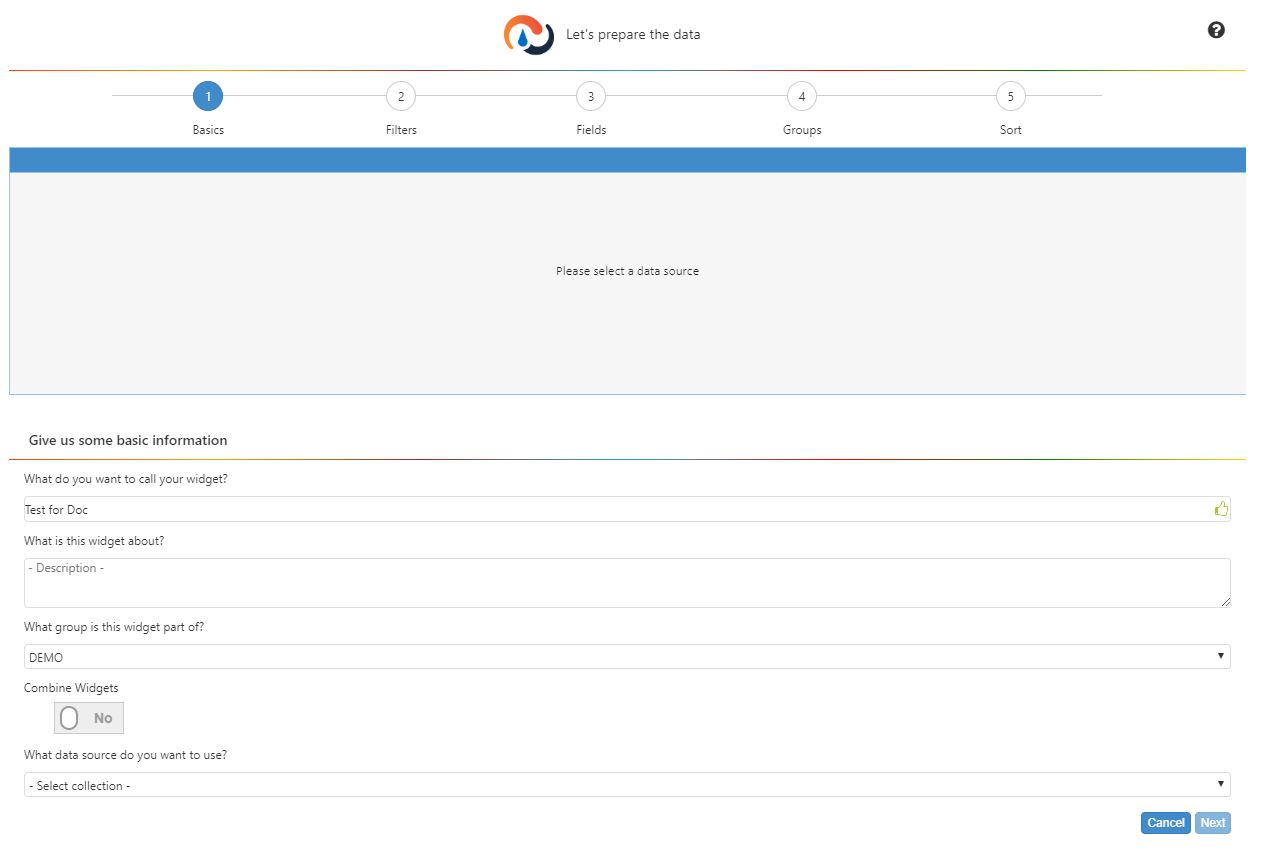
Go to Administration -> Widget Administration -> Widget Builder and click ‘New’. The Basics stage opens. A roadmap of numbered circles on top lets you see which stage you’re at. The grid underneath the roadmap lets you preview the data that will populate the widget.
Fill in the new widget’s name, description, widget group, and data source, which must be a source in the database. If you are creating a superwidget, toggle the Combine flag to ‘Yes’. The data source dropdown will vanish.
Click ‘Next’. If the Combine flag is set to ‘No’, you will be taken to Filtering Data. The grid shows a sample from the selected table. The sample is taken from the bottom of the data set. If the Combine flag is set to ‘Yes’, you will be taken to Combine Widgets.
Filtering Data#
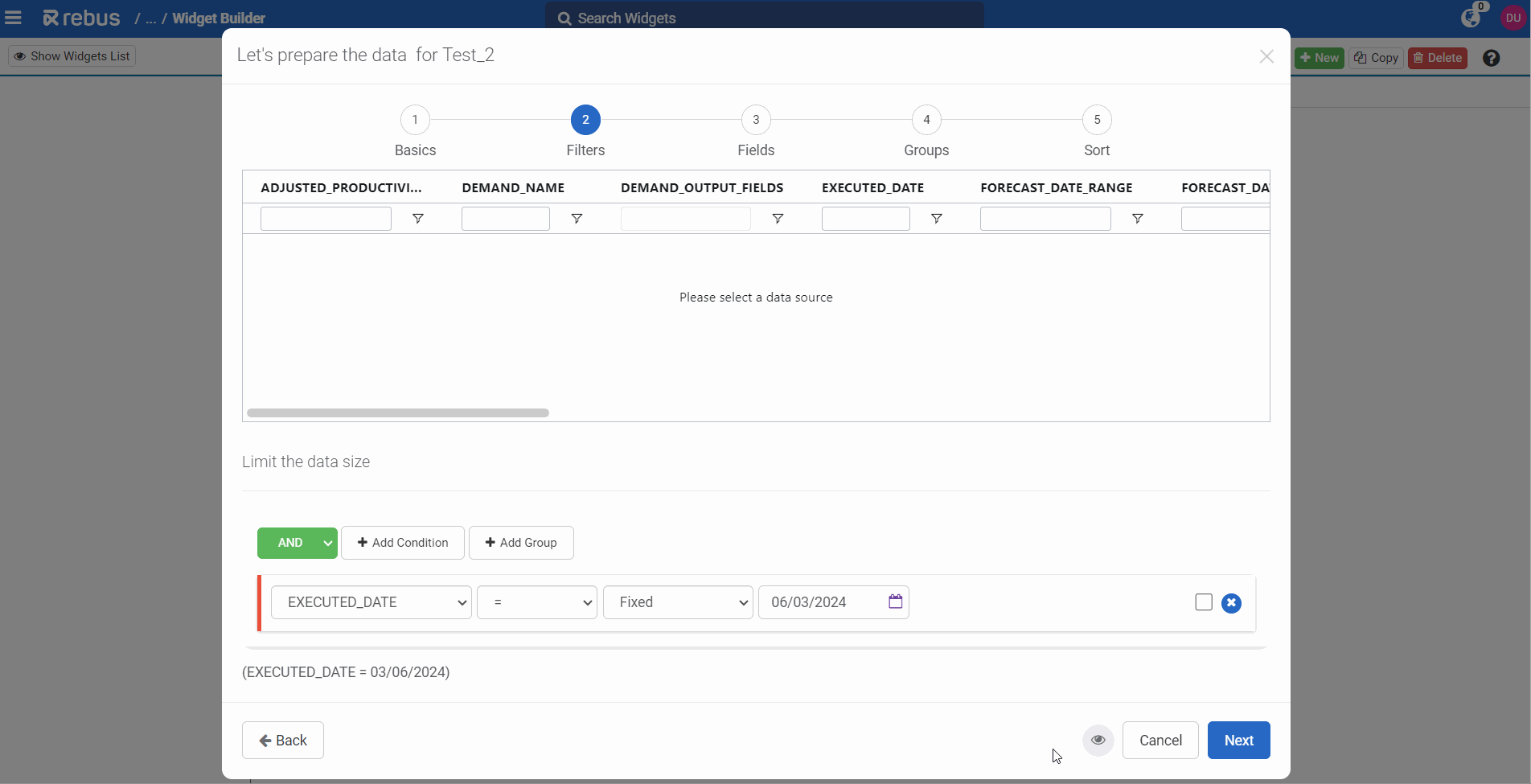
This is a required widget builder stage where you set put together criteria to filter the table’s data so that only the data that’s needed to populate the widget is selected to be in the data set. You can also configure shifts for your facilities and use them as a filter to only see data pertaining to a specific period of time.
For background information about putting together criteria to filter data in the widget builder, see Conditions and Building Widgets.
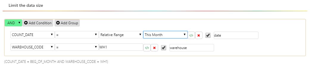
In the screenshot above, the filter criteria are set to select all records that have a count date within this month and where the warehouse code is ‘WH1’. The last condition is set up as a constant, which means that users won’t be able to change it in the widget on the dashboard.
Task |
What You Do… |
|---|---|
Adding a Condition |
If you’re appending this condition to a previously created condition or group, select either the ‘AND’ or the ‘OR’ logical operator from the dropdown in the upper left. Then click ‘Add Condition’ and then fill in the dropdown menus to create the condition. |
Removing a Condition |
Click the ‘x’ |
Making a Condition a Constant |
Make sure its checkbox is unchecked. |
Making a Condition a Parameter |
Make sure its checkbox is checked. |
Creating a Parameter with no default value |
Leave the value field blank and give a name to the parameter. Users will be able to select a value for the parameter through the Widget properties form. |
Setting up the widget to be filtered with fiscal date ranges by default |
Click the ‘Fiscal’ button. The relative range options list changes to the list of relative fiscal date ranges, from which you can select any of the Fiscal Relative Range Options. |
Adding a Custom Expression |
Click the |
Adding a Group of Conditions |
If you’re appending this group to a previously created condition or group, select either the ‘AND’ or the ‘OR’ logical operator from the dropdown in the group’s upper left. Then click ‘Add Group’. Another line of ‘Add’ and ‘Remove’ buttons appears. You can now add conditions or groups to the new group. |
Removing a Group of Conditions |
Click the ‘Remove Group’ button of the group that you want to remove. |


After you’re done building the criteria to select the data needed for the widget, click ‘Next’. The sample in the grid refreshes to show how the data set has changed as a result of the query.
Note
The preview in the widget builder is set to look at the most recent 10,000 records in your system. If you set up a date range that refers to more than a week ago, Rebus might not be able to preview the data in the widget builder. To make sure the desired information is returned, base your widget on more recent data and edit the date parameter once the widget is activated.
If you are in guided mode, you are at Selecting the Display Fields. Otherwise, you are shown a menu of stages that you can add next to your custom sequence.
Conditions and Building Widgets#
Through the Filter stage’s dropdown menus, you create ‘conditions’ by selecting fields, operators, and data types and then put them together using ‘OR’ and ‘AND’ logical operators. A condition is an expression that’s evaluated to see if it’s true. Each row in the table is evaluated against all the conditions in the filter criteria. Those rows that evaluate as ‘true’ are selected to populate the widget.
Grouping of Conditions: Setting the Order of Evaluations#
‘Groups’ let you set the order in which conditions are evaluated. Conditions in groups are enclosed in brackets, which means they are evaluated before conditions outside the brackets.
Constants vs Parameters#
Conditions set up as parameters can be changed by users after the widget is applied to the dashboard. Users will be able to change its value and refresh the widget to see data based on the revised query. If you don’t want users to be able to change a condition, make it a constant. A condition will be a parameter if its checkbox is checked. Otherwise, it’s a constant. A condition’s checkbox is checked by default.
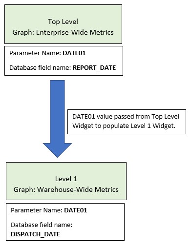
Parameter Names#
You need to enter a parameter name for each added parameter. This is the name that’s displayed for the parameter on the Widget Properties form, which lets you change parameter values of dashboard widgets. A widget can’t have two parameters with the same parameter name and a parameter name can’t have any spaces. Parameter names also make it easier to set up a drill down path or cascading widget group widgets that can pass parameter values to each other. A widget can pass a parameter’s value to another widget that has a parameter with the same parameter name even if the database names of the fields differ.
Example:
In a widget that has a REPORT_DATE parameter with a parameter name of ‘DATE01’, its value can be passed to another widget that has a parameter with a parameter name of ‘DATE01’ even though that field’s database name is DISPATCH_DATE.
Multiple Parameters#
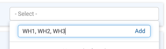
You can paste comma-separated lists of values into Widget Builder’s Filters stage and Widget Properties parameter filters.
Paste a comma-separated list of values (like WH1, WH2, WH3) or values surrounded with single quotes (like ‘Brady, Chelsea’ or ‘Cleveland, Ohio’) into the Search or Add Option box:
After you click Add, each value gets converted into a separate checkbox:
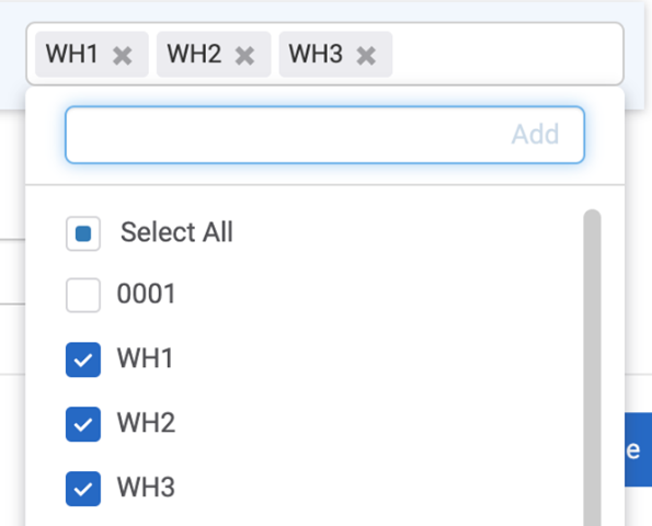
You can then select or search each value individually.
Date Parameter#
A widget’s first filter stage must have a date condition so that there’s a limit on the number of rows selected.
Note
If the first filter stage’s date condition is ever removed, the widget won’t work even if there’s another filter stage that has a date parameter.
Note
If you plan to set up a widget that shows a metric’s trending from some point in the past up to the present day, set up a condition with a Relative or Relative Range date range.
You can also use the system date of the WMS as part of the query that populates the widget.
Operators that can be used in Conditions#
Operator |
Description |
|---|---|
= |
Equal to. |
!= |
Not Equal to. |
< |
Less than. |
<= |
Less than or equal to. |
> |
Greater than. |
>= |
Greater than or equal to. |
Exists |
Field exists in the data set. |
In |
Equal to any of the comma separated values. A comma should not be followed by a space. Each value should be enclosed in double quotes. |
Not In |
Not equal to any of the comma separated values. A comma should not be followed by a space. Each value should be enclosed in double quotes. |
Type |
Has a value of the specified data type. |
Setting up Parameters that can take Multiple Values#
To create a parameter that can take multiple values, set up its condition so that it has the ‘In’ or ‘Not In’ operator. A parameter whose operator is ‘=’ or ‘!=’ can take only one value.
Adding Conditional Formatting in the Widget Building stage#
You can use conditional formatting when building your widget by using the Condition function at the field stage. Conditional formatting lets you display different values or formatting in your widgets based on certain criteria. For example, you can color code charts or add columns to grids to make data easier to understand.
Note
The function works by evaluating a Boolean expression. A Boolean expression is a logical statement that returns either TRUE or FALSE. For example, you can check if a value is greater than or less than a certain number, or if two values are equal.
Imagine you have a column showing a value that represents shipment status, and you want to categorize the status as either “complete” or “incomplete” based on the value.
If the shipment status is equal to C, display “complete”.
If the shipment status is not equal to C, display “incomplete”.
Steps#
Go through the Widget Builder set up steps until you arrive at the field stage.
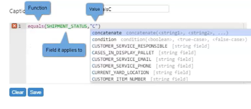
Create the ‘equals’ function. This will later be nested in the ‘condition’ function. Write out the function, field it applies to, and the value you want evaluated as true or false. Click save.
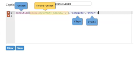
Create the ‘condition’ function. After the ‘equals’ function argument, specify the ‘condition’ function’s argument. The first argument is what will be applied if the value returned by the equals function is true. The second argument is what will be applied if the equals value returns false. Click save. You now have a new field that displays Complete or Other depending on the shipment status.
You can create as many nested ‘condition’ functions as you want that will display different results for different values. When you’re done nesting functions, add a value to display should the equals function evaluate to false.
Finish completing your widget and create a chart to apply the widget to your dashboard.
Previewing the Dataset#
Click ‘Preview’ to see the dataset filtered according to the conditions you created. For parameters with the IN and NOT IN operators, you can leave their value field blank.
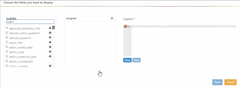
Selecting the Display Fields#
In this widget builder stage, click the checkboxes of the available fields whose values you want to be displayed on the widget.
When selecting fields, keep in mind the following:
If you want to create a widget that shows how a measurement has been trending, select the field that holds that measurement and at least one date field.
Select any field for whose values you want to see aggregates.
The order in which you select the fields will be the order in which they appear from left to right in the data grid. You can click and drag Assigned fields into the order that you want.
Adding Custom Calculated Fields#
In the Caption field, type the name of the calculated field.
In the code editor underneath the caption field, start typing the name of the function that will generate the value for the custom field. The field auto-fills with suggested functions based on what you type. For more information on functions you can use at this stage, see Widget Building Function Reference.
Select the function and then fill in the arguments. Field names are in ALL CAPS.
Click ‘Save’. The custom field is created.
When you are finished selecting display fields, click ‘Next’. If you are in guided mode, you are at Grouping the Data. Otherwise, you are shown a menu of stages that you can add next to your custom sequence.
Grouping the Data#
If your widget is going to show aggregates (e.g., sums, averages) of field values, apply ‘groupings’ i.e., aggregation functions, to data in this stage. After you apply this stage, each row in the data grid summarizes the data of a group of rows from the data source according to the function you apply.
Widget Type |
Grouping Tips |
|---|---|
Aggregate the entire data set and reduce it to a single row that has the single value that will be used to populate the gauge. |
|
Aggregate the data set and reduce the number of rows so that there’s a row for each ‘pie slice’. |
|
Aggregate the data set and reduce the number of rows so that there’s a row for each bar or measurement point on the x axis. Each row should have a numerical value that will serve as a point along the y axis. |
Grouping the Data involves creating groups of rows and then applying aggregation functions so that you get for each group a result that summarizes the group’s data.
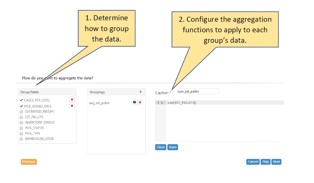
Creating Groups#
In the Group Fields column, select the fields by which the rows will be grouped. You can search Group Fields through a search bar in the Grouping window. A group will be created for each set of rows that have values in common across all selected fields.
Drag and drop the selected groupings to reorganize their order.
Note
 If you don’t select any fields, a group will be created for each set of rows that have values in common across all fields that are not in an aggregation function.
Adding ‘Groupings’ (Aggregation Functions)#
In the Caption field, enter a grouping name.
In the code editor underneath the Caption field, start typing the code of the aggregation function. As you type, a dropdown appears with auto filled options that you can choose from. For more information on functions you can use at this stage, see Widget Building Function Reference.
Select the function and fill in the arguments. Field names are in ALL CAPS.
Click ‘Save’. The grouping appears in the Groupings column.
When you’re finished setting up all your groupings, click ‘Next’.
If you are in guided mode, you are at Sorting the Data. Otherwise, you are shown a menu of stages that you can add next to your custom sequence.
Sorting the Data#
In this widget builder stage, you can set the sort order of the widget’s data. Sorting records in a table allows you to better understand the data that you are working with. You can discover the largest and smallest values or perhaps the most and least significant features. Sorting is also an efficient means for organizing your data in alphabetical or sequential order.
You can sort the rows by multiple columns, sorting them first based on one column and sorting again by another column the subsets created by previous sorts. Sorting would most often be applied to data to be presented in a grid, but the sort order affects the placement of items in other chart types too.
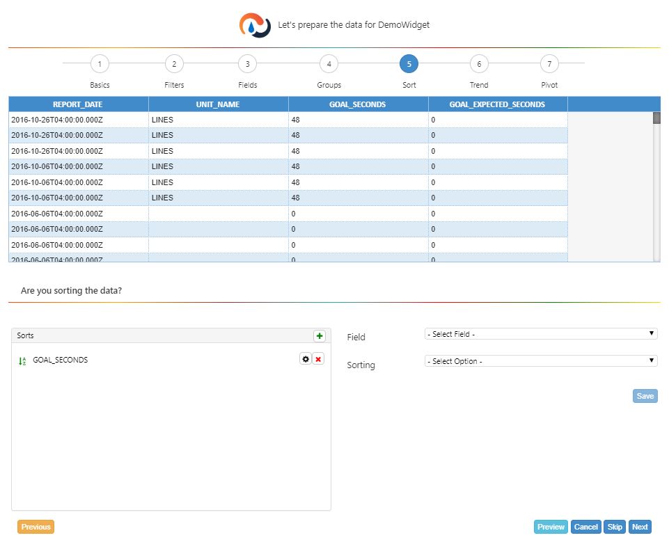
Add a sort:
In the Field dropdown, select the column by which to sort.
In the Sorting dropdown, select the sort order. ASC= Ascending and DESC = Descending.
Click Save. The Sort is added to the Sorts column.
Decide whether to add more sorts to the data.
I want to add more Sorts… |
I’m finished adding Sorts… |
|---|---|
Repeat steps 1 to 3. |
Click ‘Preview’. The grid’s sort order is refreshed. |
When you are finished creating sort orders, click ‘Next’. You are shown a menu of stages that you can add next to your custom sequence.
Assigning Profiles to Widgets#
In this widget builder stage, you can assign profiles to the widget: next to ‘Profiles’, select the profile(s) to assign to the widget. You can also select ‘Select All’.
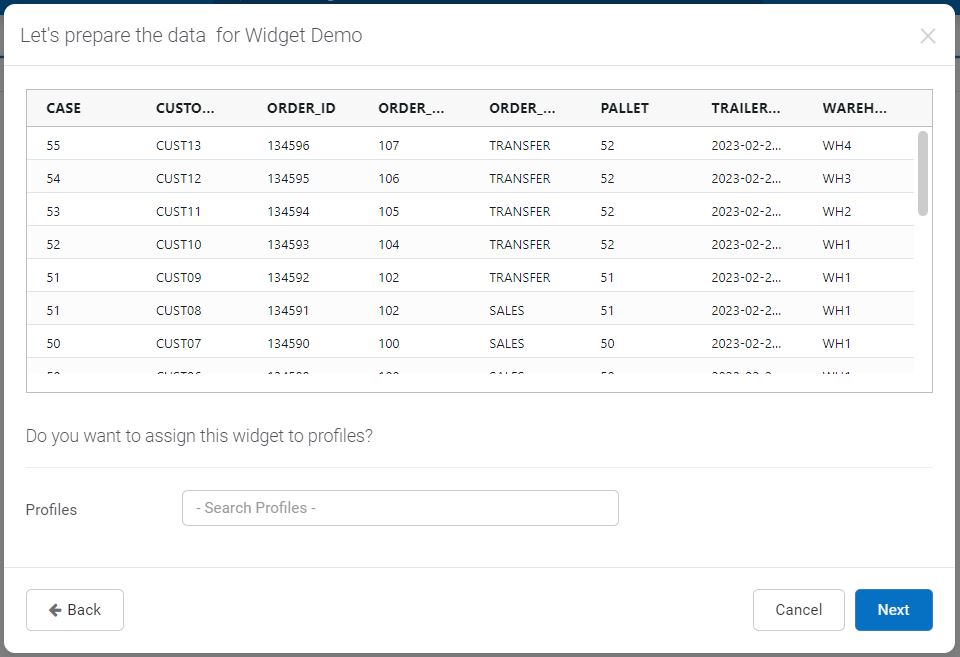
You can add or remove profiles at any time after creating the widget. For more information, see Editing/Copying/Deleting Widgets.
Join Collection#
You can use this stage if you want to filter the data set based on values from one data source, but you also want the widget to display related values from another data source. The widget builder’s Join Collection stage lets you connect the widget’s currently selected data source to another data source based on a common field that can be found in both sources (i.e., a regular join). You can also set up an enhanced join to connect several data sources so that you can use fields from more than one source in a single widget. Joining on multiple fields lets you join data sources that don’t have a single common field. Instead, you can connect the data sources on fields whose combined values match.
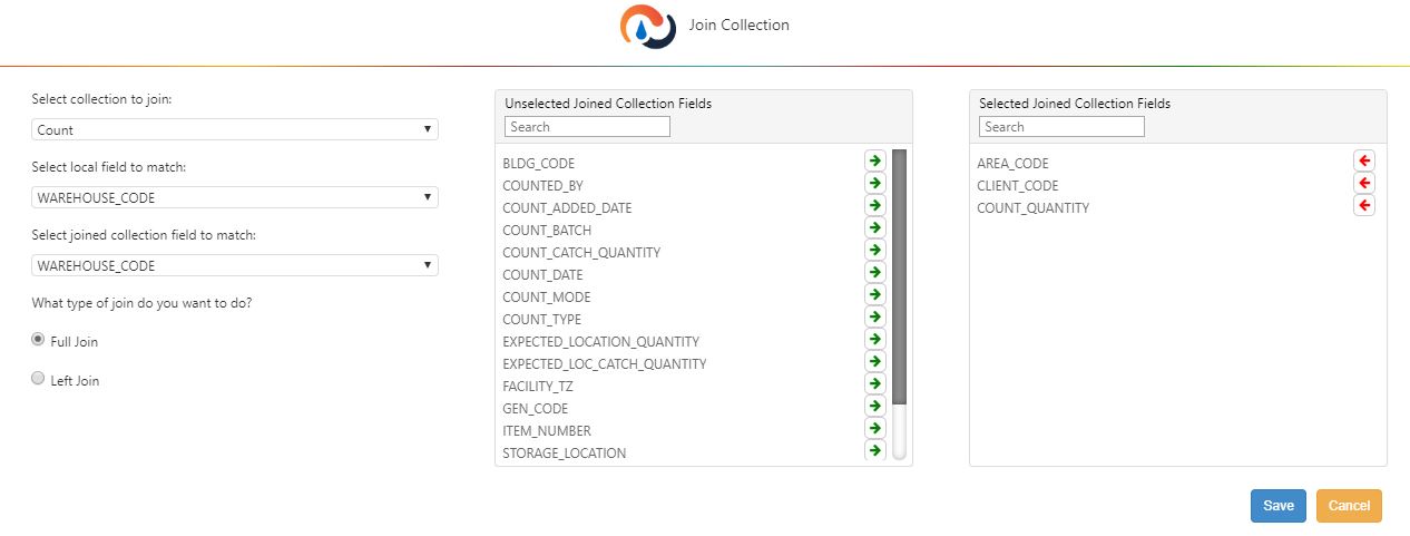
Setting up Regular Joins#
Fill out the Join Collection Stage form.
Field |
What You Enter… |
|---|---|
Select a Collection to Join |
From the drop down, select the data source that you want to connect to the data set. |
Select Local Field to Match |
From the drop down, select the field from the currently active data source whose definition and values match those of a corresponding field in the data source you’re going to connect to. |
Select joined collection field to match |
From the drop down, select the field from the other data source whose definition and values match those of the field selected in ‘Local Collection Field to Match’. |
Select how you want the tables to be joined.
Full Join:
A full join is table that includes only matching records from both collections.
Left Join:
A table that includes all records from the first table (i.e., the left table) and the matching records from the second table. However, the left join will exclude rows from the left table that have a null value in the field used to join both tables.
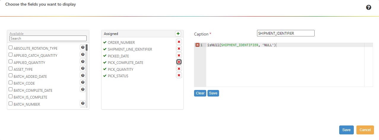
If you want to include rows with null values in the joining field, then you need to convert all null values to a non-null value. One way to do this is by creating a Adding Custom Calculated Fields, where you replace all null values with any other value such as a string (e.g. ‘NULL, ‘EMPTY’).
For example, if you want to join on SHIPMENT_IDENTIFIER, but the field has null values, create a new display field and replace the null values with string values using an isNull() function.
Select which fields from the joined collection to include in the data set. To include a field in the data set, click its arrow to move it from the Unselected Join Collection Fields list to the Selected Join Collection Fields list. Fields from a joined collection have a naming convention of [Name of collection]_[name of field].
Click ‘Save’.
Setting up Enhanced Joins#
For each enhanced join created, you can also set up all non-guided mode widget builder stages, such as filters and display fields to process the data set created by the enhanced join.
Steps#
Note
You cannot create enhanced joins on superwidgets.
Part 1: Join Collection Stage
Toggle the Enhanced Join toggle flag to ‘Yes’. Two radio buttons, ‘Full Join’ and ‘Left Join’, appear.
In the ‘Select the collection to join’ dropdown, select the data source that you want to join to the widget’s currently selected data source.
Select the type of join you want to make.
Full Join:
A full join is table that includes only macthing records from both collections.
Left Join:
A table that includes all records from the first table (i.e., the left table) and the matching records from the second table. However, the left join will exclude rows from the left table that have a null value in the field used to join both tables.
If you want to include rows with null values in the joining field, then you need to convert all null values to a non-null value. One way to do this is by creating a Adding Custom Calculated Fields, where you replace all null values with any other value such as a string (e.g. ‘NULL, ‘EMPTY’).
For example, if you want to join on SHIPMENT_IDENTIFIER, but the field has null values, create a new display field and replace the null values with string values using an isNull() function.
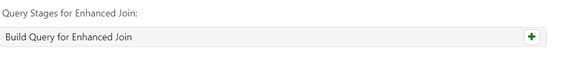
Click on the green + sign next to ‘Build Query for Enhanced Join’.
In the roadmap of widget builder stages, the Join Collection stage is re-labelled ‘Enhanced Join’. You are taken to the first step of the Enhanced Join process, which is a Join Condition stage where you specify which fields are to be matched to build the joined collection.
Part 2: Setting up the Join Condition Stage of the Enhanced Join Query
The join condition stage lets you join the two data sources by using two or more fields. You can compare the two fields using one of several operators, such as =, =>, <=, etc.
Feature |
Description |
|---|---|
Logical Operator |
Can choose between AND, OR. |
Add Join Condition |
Select field, operator, and parent field. |
Add Group |
To add a group of join conditions nested under a new logical operator. |
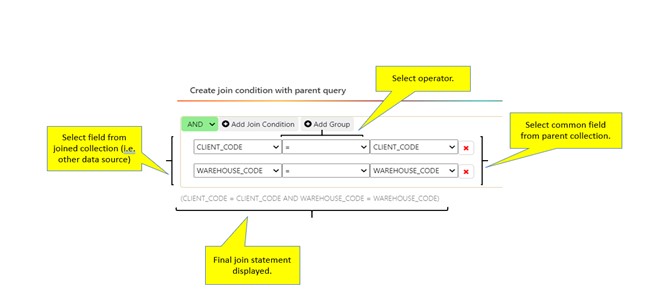
In the Join Conditions stage, click ‘Add Join Condition’. A ‘Select Field’ dropdown menu appears.
2. Using the dropdown menus, create ‘join conditions’ to build the joined collection. The first dropdown lists the fields of the data collection selected in the Join Collection stage. The second dropdown lists the operators that define a relationship between the two fields. The third dropdown lists the fields of the widget’s originally selected data source. The rows of the two data collections are evaluated according to the type of the join (i.e., full join vs left join) and the join conditions; The matching rows are selected to be part of joined collection.
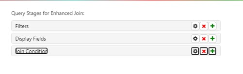
Click ‘Finish Join’. You are at the Enhanced Join stage. The ‘Query Stages for the Enhanced Join’ section lists all stages set up in the enhanced join query.
Note
At any point, you can click on Cancel Join to discard the current join and return to the Join Collection stage.Part 3: Setting up the Other Stage of the Enhanced Join
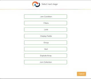
You can now add widget builder stages to the Enhanced Join Query: Filters, Limit, Display Fields, Group, Sort, Join Collection, and Explode Array work the same way as they do in the Widget Builder Stages.
Note
You can add another nested Join Collection stage within an enhanced join to join more than two data sources. A Join Collection stage in an Enhanced Join process lets you create a regular join or another enhanced join.
To add another stage… |
To finish the Enhanced Join… |
|---|---|
Find the Enhanced Join Query stage label where you want to insert a stage and then click its ‘+’ button. A dialog appears with stage options |
Click ‘Save’. |
Limit#
You can restrict the number of rows from the data set that’s used to populate a widget. The Limit stage lets you specify the number of rows to select. A Limit stage takes the data set that’s been passed on from the previous stage, selects the specified number of rows from the top of the data set, and passes only these to the next stage. You can use a Sorting the Data stage to sort the data set into a preferred sort order before passing it to a Limit stage. You can set up a Limit stage to restrict the number of rows of data you want users to access through a widget at any one time.
Note
Adding a Join Collection stage after a Limit stage undoes the Limit stage and creates a new data set that’s populated by the results from the joined tables as if the Limit stage had never been set up.
Combine Widgets#
You are brought to this stage if you toggled the Combine button to ‘Yes’ at the Filling in the Basics stage.
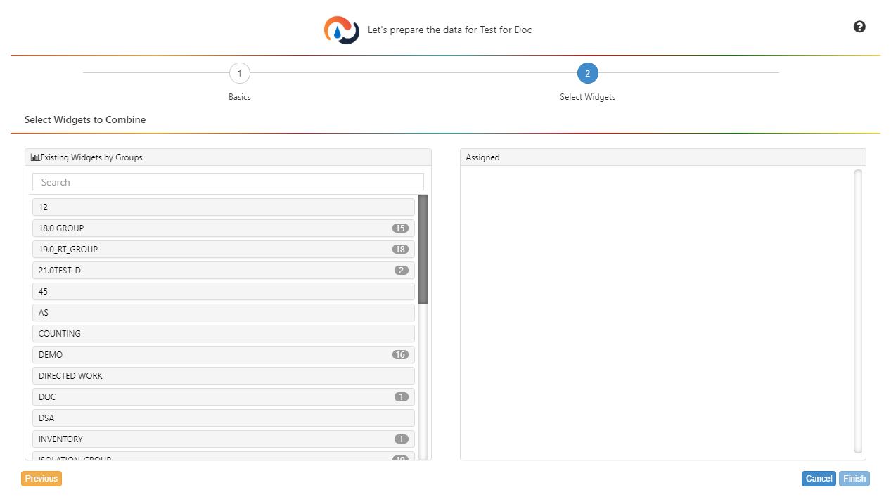
At the Combine Widgets stage, you select the active widgets whose data sets will be combined to create a superwidget.
In the Select Widgets to Combine box, select the active widgets whose combined data will be shown in the superwidget . You can change the order of the component widgets by clicking and dragging the widget name in the Assigned box. After the Select Widgets stage, you can open the Chart Designer to select the chart type to show the data. A widget can be added to more than one superwidget. For more background information about superwidgets, see Combining Multiple Widgets into a Single Widget.
Using the Same Stage Multiple Times#
You can use multiple instances of a widget builder stage.
Using Multiple Filter Stages#
Each widget needs at least one initial filter stage that has at least one date parameter, but you can also add additional filter stages to reduce the data set to just the rows that matter. You can set up conditions or use functions. One very flexible method involves the following:
Adding a Selecting the Display Fields stage and in it creating a a calculated field that has a condition function that returns a ‘1’ if the record meets specified criteria and ‘0’ otherwise. This lets you flag all the records that meet your criteria.
Adding a Filtering Data stage and adding a condition so that the data set only includes those rows that have a ‘1’ in the calculated field set up at the field stage.
Note
You can use this method to refine a data set before performing a join to another table using the Join Collection.
Using Multiple Group Stages#
You can also use run the data set through multiple Grouping the Data stages if you need to create aggregates of data and then create further aggregates of those aggregates. E.g., using one group stage to group orders or picks into pallets and another group stage to figure out how many area codes that pallet was in (i.e., how often it moved around).
Using Multiple Display Field Stages#
You can use a Filtering Data stage after a filter stage to fill the data set with the records that you want to be processed and then add a final Display Fields stage that lets you pick the fields that will be displayed in the widget.
Chart Designer#
Chart designer lets you configure a chart that shows the data you prepared through the widget builder stages. Open it after you’ve completed building a widget or by opening the Widget Builder screen, selecting a widget and then clicking the ‘Try the new Chart Designer’ button next to the old ‘Design Chart’ button.
This version of Chart Designer is redesigned from the original Chart Designer. You can find information on using the old Chart Designer and Chart Properties at Legacy Chart Designer and Chart Properties.
Navigating Chart Designer#
The Chart Designer page consists of three main panels and the top navigation bar. The navigation bar has 4 action buttons.
The Back to Widgets chevron navigates back to Widget Builder. This will also cancel your current edits.
The Activate/Deactivate button activates and deactivates your widget.
The Reset button resets your widget to its last saved state.
The Save button saves your current progress.
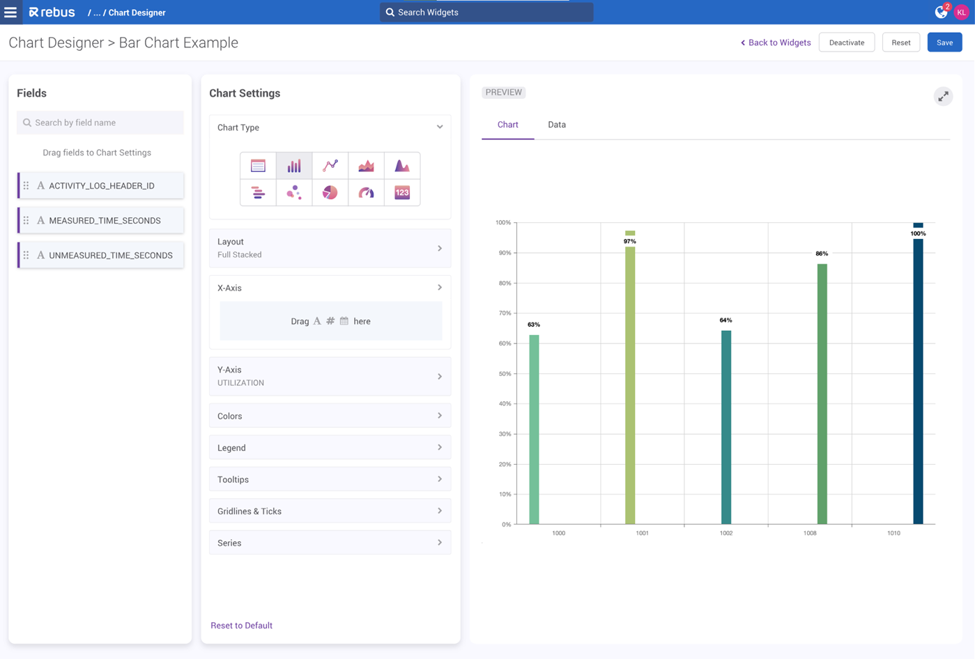
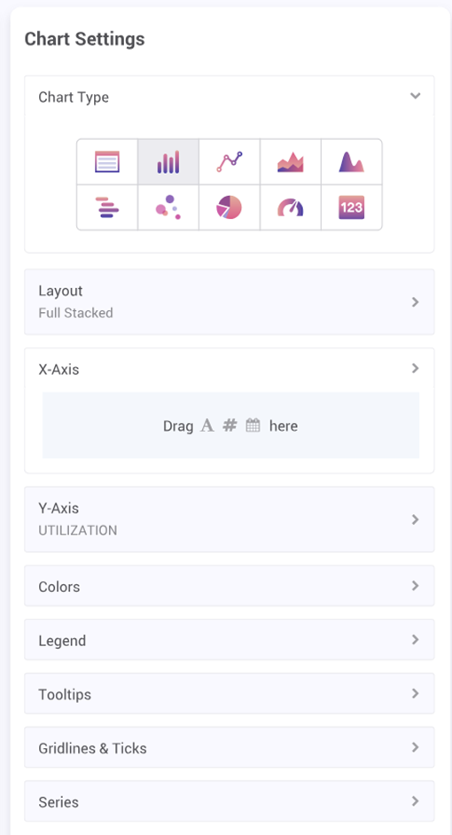
The main page of the new Chart Designer is divided into 3 main panels: Fields, Chart Settings, and Preview.
Fields
The Fields section contains the data fields from your widget that you use to create your chart. For example, this is where you would select your x and y axis values when setting up a bar chart.
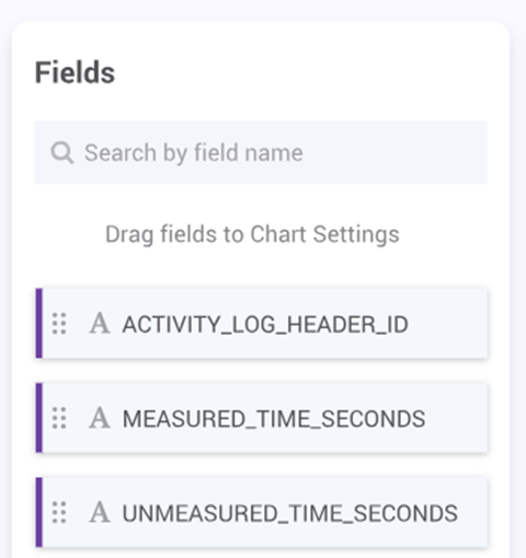
You can search by field name in the search bar at the top of the fields section. Each field has a data type icon and can be dragged and dropped into the Chart Settings panel, depending on the chart type’s accepted data types.
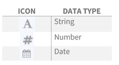
Chart Settings
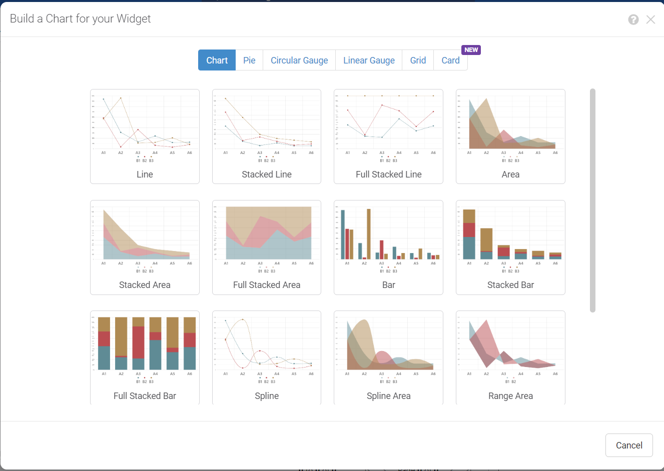
The Chart Setting panel is where you choose your chart type and set up the details of your chart, such as the color pallet, legend, series, axes, etc. There are 10 different chart types to choose from, each with their own set of customizable features.
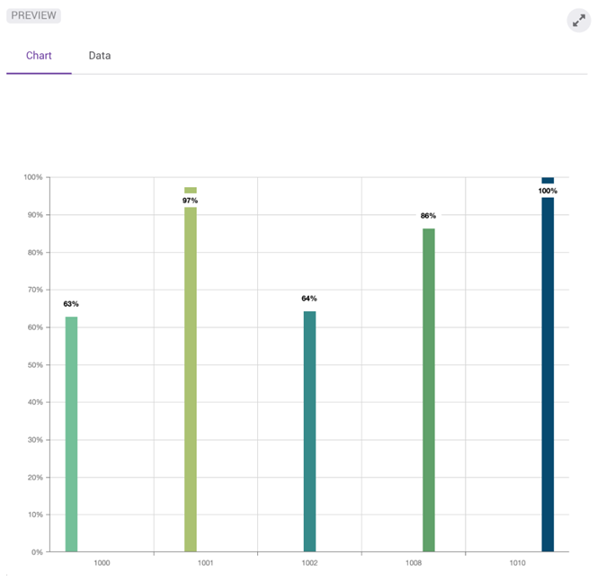
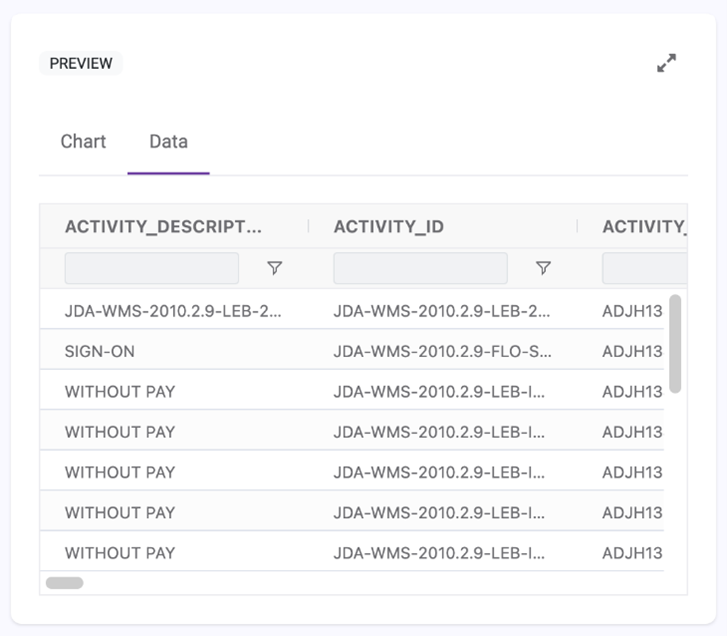
Preview
The Preview panel consists of two tabs that you can flip between: the Chart tab and the Data tab.
Tab |
Description |
Image |
|---|---|---|
Chart |
The Chart tab displays your chart preview in real-time. When you make changes in the Chart Settings panel, your chart preview will automatically update. |
|
Data |
The Data tab displays the widget’s underlying data in a grid format. The columns are resizable, sortable, and pin-able. This allows you to easily see and organize the data you want to use in your chart. |
|
Setting Up a Chart#
This procedure explains how to create charts in Chart Designer, which lets you configure a chart that shows the data you prepared through the widget builder stages.
Steps
In the Chart Settings panel, select the image representing your preferred chart type. For more information on how to choose a chart type, see Selecting the Right Chart Type to Present the Data.
Select the fields you wish to use. For example, the fields for the x and y axes of a bar chart. Drag and drop the fields from the Fields panel into the Chart settings panel.
Set up the remaining details of your chosen chart. These options vary depending on your chosen chart type. For more information relating to specific chart type settings, see Advanced Chart Settings. Your chart preview will update automatically in the Preview panel.
To undo all of your changes, click the Reset to Default button.
To reset your widget to its last saved state, click the Reset button on the top right navigation bar..
Save your chart.
Finally, activate your widget using the Activate button on the top right navigation bar.
Note
When a chart’s dataset varies significantly in values, scale breaks are automatically added to the chart.
Advanced Chart Settings#
Each chart type has their own setup options in the Chart Settings panel.
Grid  #
#
Setting |
Function |
|---|---|
COLUMNS |
Drag and drop your desired columns from the Fields panel. Drag and drop your columns in the Chart Settings panel to reorder them. |
GENERAL |
Click the checkbox to turn off the following functionalities: Column filtering, Sorting, Resizing, Range Selection |
SIDEBAR |
Click the checkbox to hide the sidebar. Select whether you want the sidebar on the right or left side of the grid. |
PAGINATION |
Select the checkbox to show pagination. Select the checkbox to fit rows to grid height. |
Bar  Line
Line  Area
Area  Spline
  #
#
Setting |
Function |
|---|---|
LAYOUT |
Select Stacked, Full Stacked, or Rotated. Type a unit between 0 and 1 to determine bar padding. Type a number between 0 and 25 to determine rounded corners. |
X AND Y AXIS/SERIES |
Drag and drop your desired fields from the Fields panel into each dropdown. You can add up to 5 series. |
AXES TITLES |
Type out your Axes titles. Choose the axis title alignments. |
SERIES POINT LABELS |
Deselect the checkbox to turn off labels for the X-Axis, Y-Axis and Series. These are selected by default. In the Rotation Angle field, type out the degree at which you want your labels to appear. In the Color field, select the background color of your labels, and in the Font Size field, select the font size. Change the position of the labels in the Position dropdown. |
LINES & TICKS |
Select the Crosshair checkbox to turn on crosshairs. Select the Grid Lines check boxes for the X and Y axes to turn on gridlines. Add a constant line by imputing a number value for either the X or Y axis value. |
COLORS |
Select your desired color pallet from the available options. |
TOOLTIPS |
Deselect the checkbox to hide the tooltip. |
LEGENDS |
Select the checkbox to show the legend. Adjust the horizontal and vertical alignments. |
Range  #
#
Setting |
Function |
|---|---|
LAYOUT |
Select the Area checkbox to change the chart to an area graph. Select the Rotated checkbox to rotate the chart. Type a unit between 0 and 1 to determine bar padding. |
ARGUMENT |
Drag and drop your desired fields from the Fields panel into the dropdown. |
FIRST RANGE |
Drag and drop a number type field. |
SECOND RANGE |
Drag and drop a number type field. |
AXES TITLES |
Type out your Axes titles. Choose the axis title alignments. |
SERIES POINT LABELS |
Deselect the checkbox to turn off labels for the X-Axis, Y-Axis and Series. These are selected by default. In the Rotation Angle field, type out the degree at which you want your labels to appear. In the Color field, select the background color of your labels, and in the Font Size field, select the font size. Change the position of the labels in the Position dropdown. |
LINES & TICKS |
Select the Crosshair checkbox to turn on crosshairs. Select the Grid Lines check boxes for the X and Y axes to turn on gridlines. Add a constant line by imputing a number value for either the X or Y axis value. |
COLORS |
Select your desired color pallet from the available options. |
TOOLTIPS |
Deselect the checkbox to hide the tooltip. |
LEGENDS |
Select the checkbox to show the legend. Adjust the horizontal and vertical alignments. |
Bubble  #
#
Setting |
Function |
|---|---|
LAYOUT |
Select the Rotated checkbox to rotate the chart. |
ARGUMENT |
Drag and drop your desired field from the Fields panel into the dropdown. |
SERIES |
Drag and drop your desired fields from the Fields panel into each dropdown. You can add up to 5 series. |
BUBBLE SIZE FIELD |
Drag and drop a number type field. |
AXES TITLES |
Type out your Axes titles. Choose the axis title alignments. |
SERIES POINT LABELS |
Deselect the checkbox to turn off labels for the X-Axis, Y-Axis and Series. These are selected by default. In the Rotation Angle field, type out the degree at which you want your labels to appear. In the Color field, select the background color of your labels, and in the Font Size field, select the font size. Change the position of the labels in the Position dropdown. |
LINES & TICKS |
Select the Crosshair checkbox to turn on crosshairs. Select the Grid Lines check boxes for the X and Y axes to turn on gridlines. Add a constant line by imputing a number value for either the X or Y axis value. |
COLORS |
Select your desired color pallet from the available options. |
TOOLTIPS |
Deselect the checkbox to hide the tooltip. |
LEGENDS |
Select the checkbox to show the legend. Adjust the horizontal and vertical alignments. |
Pie  #
#
Setting |
Function |
|---|---|
LAYOUT |
Select the Donut checkbox to turn the pie chart into a donut. Choose a number for the diameter of the chart. Select a Hole Size % from 10 to 90. |
ARGUMENT |
Drag and drop your desired field from the Fields panel into the dropdown. |
SERIES |
Drag and drop your desired fields from the Fields panel into the dropdown. |
LABELS |
Deselect the checkbox to turn off labels. These are selected by default. In the Rotation Angle field, type out the degree at which you want your labels to appear. In the Background Color field, select the background color of your labels. |
COLORS |
Select your desired color pallet from the available options. |
TOOLTIPS |
Deselect the checkbox to hide the tooltip. |
LEGENDS |
Select the checkbox to show the legend. Adjust the horizontal and vertical alignments. |
Gauge  #
#
Setting |
Function |
|---|---|
LAYOUT |
Select either Circular or Linear. Select your desired Value Indicator from the dropdown. |
VALUE |
Drag and drop your desired field from the Fields panel into the dropdown. |
LABELS |
Deselect the checkbox to turn off labels. These are selected by default. In the Rotation Angle field, type out the degree at which you want your labels to appear. In the Background Color field, select the background color of your labels. |
LINES AND TICKS |
Select Minor Ticks to include minor ticks. Choose the Tick Interval. |
RANGES |
Set the Start and End Value of the Scale. Add your desired number of Range Containers. You can add up to 5. Set the Start and End Value(s) of the Range Container(s). |
COLORS |
Select your desired color pallet from the available options. |
TOOLTIPS |
Deselect the checkbox to hide the tooltip. |
Card  #
#
Setting |
Function |
|---|---|
LAYOUT |
Select the Auto Text Size checkbox to automatically size the card text. |
VALUE |
Drag and drop your desired field from the Fields panel into the dropdown. |
VALUE SETTINGS |
Choose your font and color preferences for your selected value. |
LABEL |
Write the Text of your Label. Select the Font, Weight, Color, Font Size and Position. |
COLORS |
Select your desired color pallet from the available options. You can also add a background color by using a hex code. |
NUMBER FORMAT |
Select the format of the widget from the dropdown (fixed, date, decimal, dollar, million, percentage, thousand). Select the number to indicate the precision of the decimal that will be displayed (ex. 2). |
Legacy Chart Designer and Chart Properties#
The chart designer lets you configure a chart that shows the data you prepared through the widget builder stages. You can open it after you’ve completed setting up the stages or by opening the Widget Builder screen, selecting a widget and then clicking ‘Design Chart’.
Selecting the Chart Type#
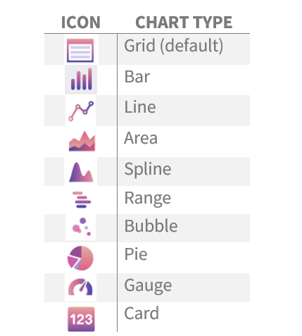
In the chart designer, select the tab of the preferred chart type category. For more information on how to select a chart type, see Selecting the Right Chart Type to Present the Data.
Select the image representing the preferred chart type and go through the setup steps:
Chart Type |
Set Up Steps - General |
|---|---|
Decide the type of series and what fields are going to be used for the x and y axes. For information on the different series types, see Chart Types |
|
Select the field to be used as the body of the pie and the field that represents the factor by which the pie is going to be sliced. |
|
Select the gauge’s starting value and end value and then select the field whose value is to be presented in the gauge. |
|
Select the gauge’s starting value and end value and then select the field whose value is to be presented in the gauge. |
|
Select the card’s data source and modify the card widget’s chart properties to customize appearance. |
3. Click ‘Apply’. The preview of the widget appears on the left side of the Widget Builder screen. You can now do the following:
Advanced Design through Chart Properties#
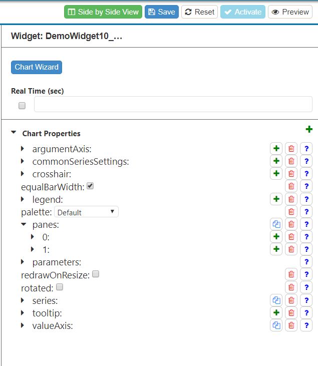
The Chart Properties panel in the Widget Builder screen lets you customize the appearance and behavior of interactive elements in the widget including tooltips, crosshairs, and the axes. To access it, go to Administration -> Widget Administration -> Widget Builder, select a widget to edit and then click ‘Design Chart’. The Widget Builder screen is in Design Chart mode. It shows a preview of the widget and the Chart Properties panel.
The properties are organized as an expandable and collapsible menu of options. Each property can have its own set of child properties that you can add to the menu and configure its settings. A property can apply to an entire set of elements on a chart (e.g., all axes, all labels, or all tooltips) or just to a particular element (e.g., a particular axis or a particular series). For those charts that can have more than one instance of a particular element (e.g., multiple series, panes, axes), each instance and its set of properties is denoted by a number, which start at ‘0’.
Each property has one of the following form elements through which you can change its value:
Form Element |
Description |
Example |
|---|---|---|
Checkbox |
For options that are either on or off. |
|
Dropdown Menu |
Lets you select from a list of accepted values. |
|
Textbox |
Lets you enter a text or number value. |
|
Color Picker |
Lets you select a color by clicking a hue or specifying a code like RGB or hexadecimal. |
|
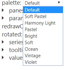
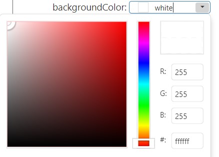
Chart Properties Tasks#
Task |
What You Do… |
|---|---|
Add a property or child property. |
Click the ‘+’ button across from the property to which you want to add child properties. A form appears that shows the properties you can add as child properties. Then select the property to add and click ‘OK’. The property is added as a child property. |
Delete a property. |
Click the red garbage pail |
Copy the first element’s properties and create a new instance of that element. This option is available only for sets of properties applied to elements that can have multiple instances. |
Click the copy |
Preview the effect of your changes in the Chart Properties |
Click ‘Preview’. The widget preview refreshes to show the effect of your latest changes to the chart properties. |
See the widget’s data set and the widget preview at the same time. |
Click ‘Side by Side View’, which is above the Chart Properties panel. The widget preview is pushed to the right and a grid showing the data set appears on the left side of the screen. |
Make the widget ‘real time’. |
Click the ‘Real Time (sec)’ checkbox and specify in seconds how often the widget’s data is to be refreshed. N.B., If a real-time widget on a dashboard has a date range that’s over 32 days, it will be automatically frozen and will have to be manually refreshed. |


For points on how use the Chart Properties for advanced setup, see Advanced Setup - Widgets.
There is a set of chart properties for each chart type:
For more on the chart properties see Widget Properties.
Adding Conditional Formatting on the Chart Properties page#
You can use conditional formatting when creating a chart on the Chart Properties page. This is done by adding functions in the chart properties panel. You can use color to present data more clearly.
Select a widget or create a new widget in Widget Builder. Create a bar chart.
Add the custom function customizePointWidgetFunction.
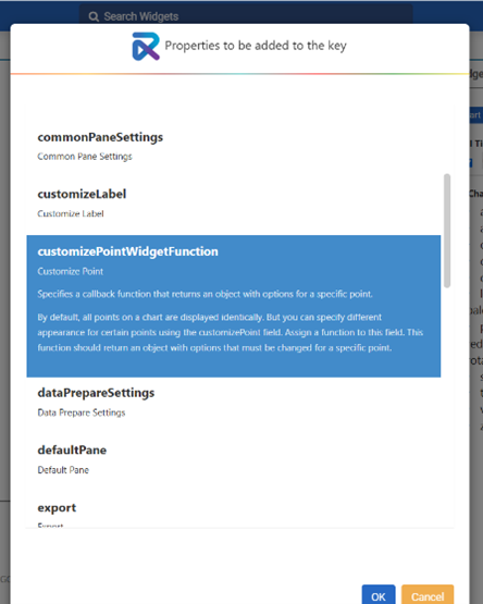
Within the customizePointWidgetFunction there are several built-in functions. Select one of the Bar Chart colour options- for example, BAR CHART GREEN YELLOW RED. This gives you several new fields:
RedThresholdStart
YellowThresholdStart
Here, you select where your thresholds start based on your data. For example, if you’re dealing with a chart that represents time spent per delivery, you can set your red threshold to start at 60 minutes, and your yellow threshold to start at 45 minutes. This way, any delivery taking over 60 minutes will be represented in red, any delivery taking between 45-60 minutes will be yellow, and any delivery taking less than 45 minutes will be green.
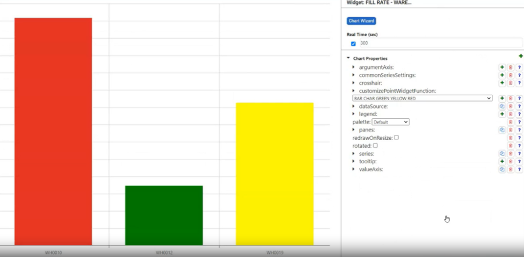
To undo the changes, delete the function.
Publishing Widgets#
When you are finished setting up the widget and applying the chart type, go to the widget’s Chart Properties and then click ‘Activate’. The widget is now activated, but for a user to access it, it needs to be added to his or her My Account screen.
Editing/Copying/Deleting Widgets#
Through the Widget Builder screen, you can edit/copy/delete widgets that were created through the Widget Builder screen. A superwidget is denoted by an orange diamond.
Note
If you change a widget stage (e.g., adding or removing a field), make the same change to all subsequent stages. Otherwise, the widget may not work as expected.
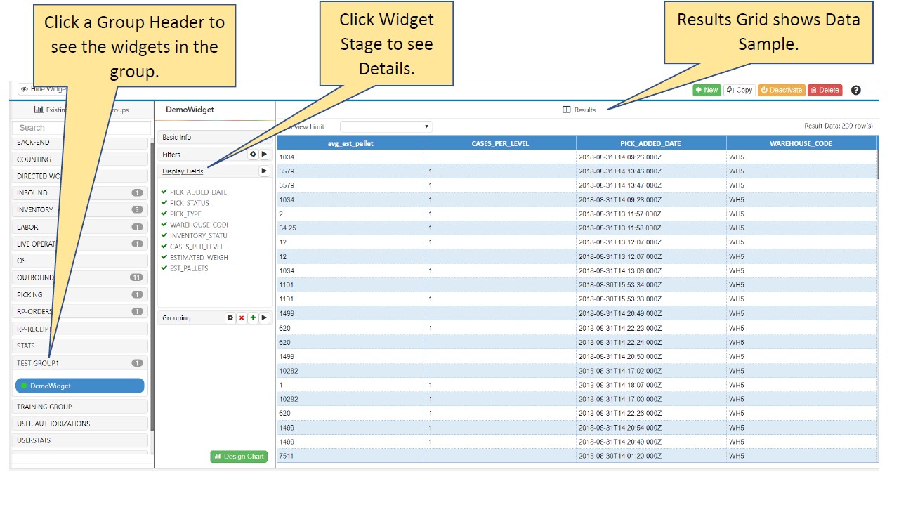
Go to Administration -> Widget Administration -> Widget Builder.
From the Existing Widgets by Groups accordion menu, select the widget that you want to edit. The panel to the right of the menu is populated with labels representing the stages that were completed when the widget builder wizard was filled out. To see a stage’s details, click the stage label. The Results grid is populated with a sample of data that’s used to populate the widget. For a superwidget, the Widget Builder screen shows a menu with the top item representing the Basic Info stage and the component widgets listed beneath it.
If it’s an active widget (denoted by a green circle), in the upper right, click ‘Deactivate’. The widget is removed from all dashboards and can no longer be added to any dashboard.
Make your desired changes to the widget:
Goal |
What You Do… |
|---|---|
Modify the Widget Description or Widget Group. |
NOTE: You can’t change the data source. In the widget stages panel, click ‘Basic Info’. Make your desired changes and then click the Update Basic Info |
Rename the widget |
In the widget stages panel, click ‘Basic Info’. Enter the new ‘Widget Name’ and then click the Update Basic Info |
Modify a Stage. |
N.B. Any change you make to a stage (e.g., adding or removing a field.) should be done to all subsequent stages. In the widget stages panel, click the Edit Stage button |
Add a Stage. |
In the widget stages panel, click the Insert Stage Below |
Delete a Stage. |
Click the ‘x’ |
Add and remove profiles |
Both actions are done under the ‘Profile’ stage. To add a profile, select it from the dropdown list. To remove a profile, click the ‘x’ next to its name. When you’re done editing the stage, click the checkmark |
Edit the Chart Type. |
At the bottom of the widget stages panel, click Design Chart. |
Copy a Widget. |
In the upper right, click ‘Copy’. A Copy Widget form appears. Enter the widget name and click ‘Save’. You have created a copy that is the same as the copied widget except for the name. |
Refresh Sample Data in Results Area for a Stage. |
In the widget stages panel, click the Run up to this Stage |
Set Number of Rows of Sample Data in Results Area. |
At the top of the Results area, in the Preview Limit dropdown menu, select the desired number of rows of sample data you want in the Results Area. |
Delete a Widget. |
N.B., Deleting a widget also deletes all its associated alerts. In the upper right, click ‘Delete’ and then click ‘Yes’ to confirm the deletion. The widget is removed from all dashboards and can no longer be added to any dashboard. |


Goal |
What You Do… |
|---|---|
See a sample of the data set produced by one component widget. |
Click the chevron |
Seeing a sample of the data set produced by a series of component widgets starting at the top and ending at a selected widget. |
Click the play |
Changing the component widgets that make up the superwidget. |
Click the gearwheel button of the Combine Widgets stage. The Combine Widgets stage opens and you can change the widgets that make up the superwidget. |
Add widget builder stages after the Combine Widget stage. |
Click the ‘Add Stage’ button underneath the Combine Widgets stage label. For more information on adding stages to superwidgets, see Adding/Editing Stages to Superwidgets. |

If you want to activate this widget, click ‘Activate’. The widget can now be added to dashboards of users set up to access it through their My Account screen and is restored to any dashboard that had it when it was de-activated.