Managing Widgets#
Viewing a Widget’s Parameters#
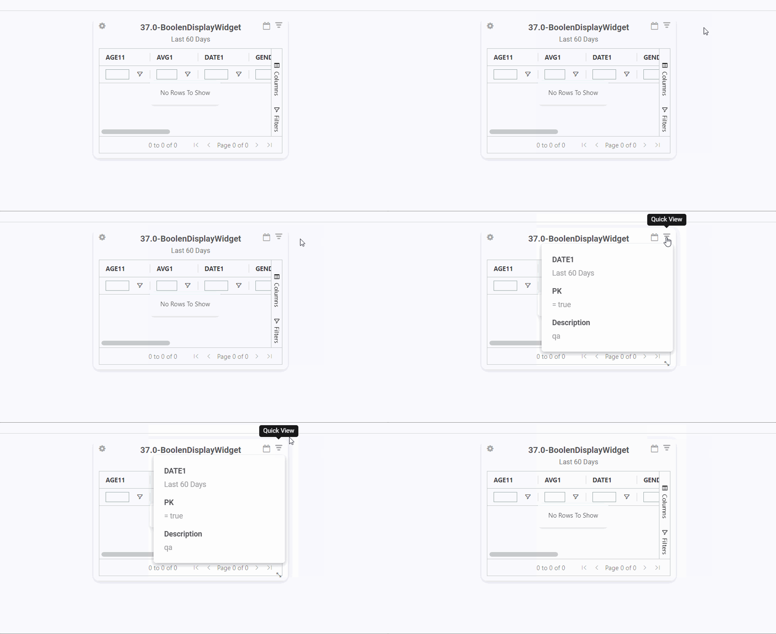
On a dashboard, you can quickly and easily see the parameter values that are filtering a widget’s data.
Hover your pointer over ‘Quick View’  to see the widget’s refresh rate, description, parameters, and their values.
Note
 You can also apply filters to all widgets on a dashboard at once. For more information, see Applying Global Filters to a Dashboard .
Managing Widgets through the Properties Drop Down#
Through the widget’s properties menu, you can set up alerts, display widgets on the home screen, manage the widget’s properties, and export its data to a graphics file or Excel spreadsheet.
Steps#
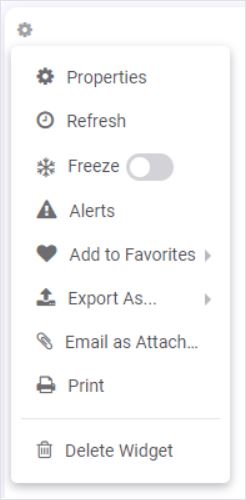
From the widget you want to set up on the dashboard, select the ‘Options’ icon  . The options dropdown menu appears with the following options.
Option |
What to Do |
|---|---|
Change the widget’s parameter values or its other properties. |
Select ‘Properties’. The Widget Properties Form appears. Through this dialog, you can edit the widget properties like its title, parameters, and auto re-fresh rate. |
Manually refresh the data on the widget |
Select the ‘Refresh’ option under the gear icon menu. If the widget’s date range covers more than 32 days, the widget is frozen and won’t refresh. |
Stop the widget from automatically refreshing |
Turn on the ‘Freeze’ toggle. A snowflake |
Set Up Alert |
Select ‘Alerts’. For more information, see Setting Up Alerts. |
Add to the Home screen |
Select ‘Add to Favorites’. For more information, see Favorite Widgets. |
Export Data to a File Format |
Hover your pointer over the ‘Export As…’ option, and from the list select the format in which you wish to export the widget’s data. The widget’s data is exported to your computer’s Downloads folder in the selected format. |
Email an image of the widget. NOTE: Rebus must be integrated with Office 365 and you must be signed in as an FS user. |
Select ‘Email as Attachment’. A compose email form appears. An image of the widget as it appears on the dashboard is already attached and the subject line is the widget name with a time stamp. Fill in the ‘To’ field with the recipient email addresses and then click ‘Send’. For more on how to email all widgets on a dashboard at once, see Emailing Images of all Widgets on a Dashboard. |
Print the widget |
Select the ‘Print’ option. Only the widget is printed. |
Remove a widget |
Select the ‘Delete Widget’. The widget is removed from the dashboard. |
Changing the Widget’s Date Filter#
Note
Changes to the date filter are not persistent. The widget reverts to the default date parameter when you open the dashboard again.
Note
If you set a date range of more than 32 days, the widget will be frozen.
A label describing the currently applied date filter appears in a light gray font underneath the widget title.

Steps#
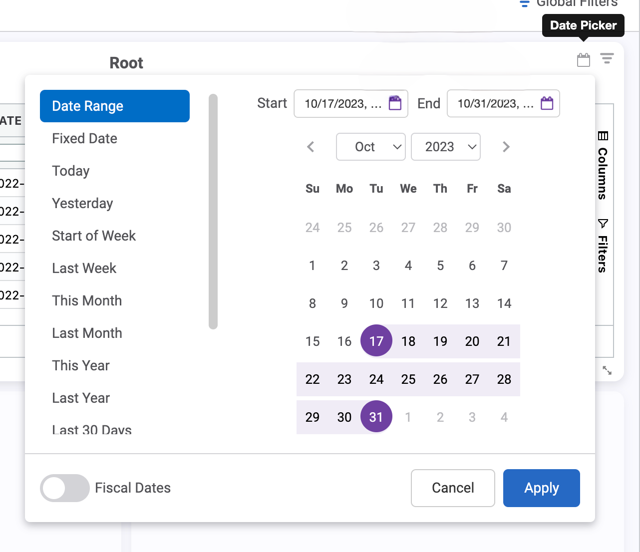
Access a widget’s date dropdown form by clicking the new Date Picker button  in the top right of the widget’s title bar. The date dropdown form lets you specify the widget’s date filter. You can select any of the following date filters:
Date Range
Fixed Date
Last Month
Last Week
Last Year
Next Month
Next Week
Start of Week
This Month
This Year
Today
Tomorrow
Yesterday
For a date range, you can select the start and end dates by selecting dates on a calendar.
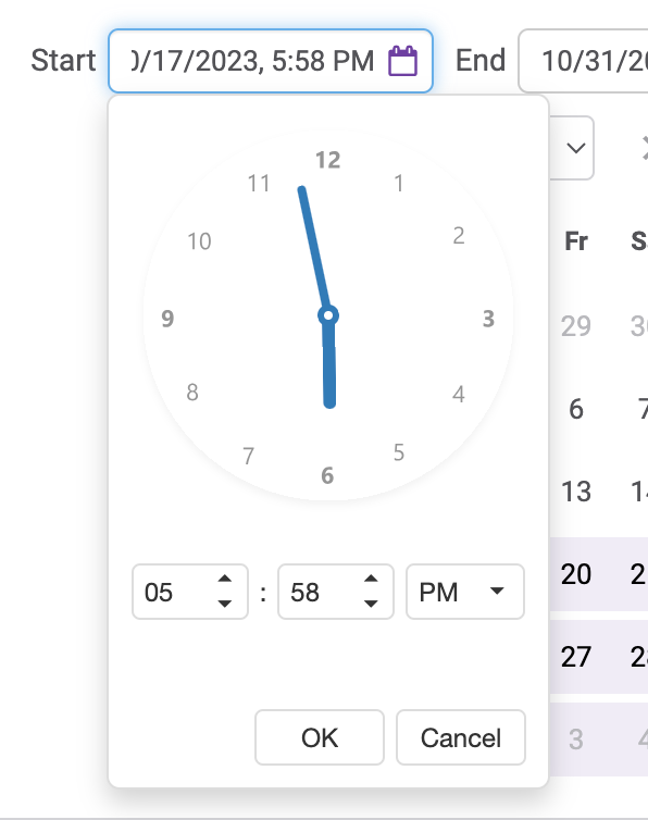
When you select the start and end date, click on the purple calendar icons and the time picker will appear. Select your start and end times in hours and minutes.
Result#
The widget displays… |
||
|---|---|---|
Its status is not frozen. |
The widget re-populates the data based on the selected date range. |
|
Its status is frozen. |
The widget’s data is not refreshed. |
A widget’s date dropdown form won’t be accessible if any of the following applies to the widget:
Global filters toggle is on AND a there’s a global date filter,
In App Mode (Cordova),
On the Home Screen ,
On a restricted dashboard, or
Is a ‘Child’ Widget of a:term:cascading widget group or a drill down path.
To learn about more setting date parameters, see Editing a Date Parameter - Advanced.
Widget Properties Form#
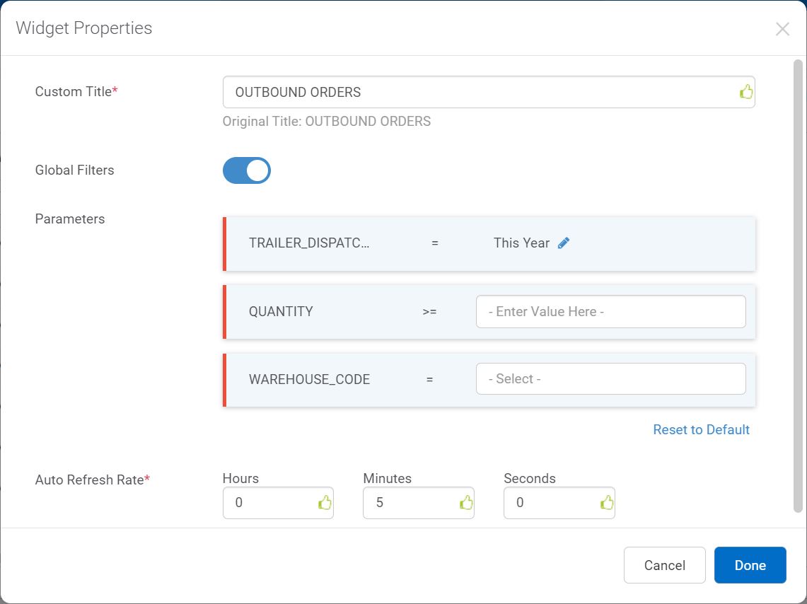
The Widget Properties form is used to set up a widget’s properties which are explained in the table below.
To open the Widget Properties form, from a widget on a dashboard, select the widget’s ‘Options’  button, and then select ‘Properties’.
Field |
What to Enter |
|---|---|
Custom Title |
The label that’s displayed for this widget on the dashboard. |
Global Filters |
Whether to turn the widget’s parameters into global filters to apply to all widgets on a dashboard at once. For more information about global filters, see Applying Global Filters to a Dashboard. |
Parameters |
Parameters that filter the records that populate the widget. These are defined in the Widget Builder’s Filter Stage as part of creating the widget. Each widget has its own custom set of parameters. Date Parameters have their own specific set of options. |
Auto Refresh Rate |
How often the data is automatically refreshed. NOTE: If the widget is frozen, the Auto Refresh Rate will be ignored. |
Editing Parameters#
Through the widget’s properties form, you can edit parameters that were configured during the widget’s creation. To learn more about parameters, see Constants vs Parameters.
Note
 A parameter can take multiple values only if it’s set up in the widget builder with either an ‘In’ or a ‘Not In’ operator.
When editing parameters, you can:
Changing a Value#
From the parameter’s value field, remove the value with the ‘x’.
Select the new value from the checkbox list. To search for a value, you can use the ‘Search or Add Option’ text box. If the entered value does not appear in the list, just click ‘Add’ to add it as a parameter value.
From the parameter’s value field, delete the value.
Enter the new value.
Result: Records that match the revised selection criteria will be displayed in the widget.
Adding Multiple Values#
Select the parameter’s value field. The checkbox list of parameter values appears.
Select multiple values from the checkbox list. To search for a value, you can use the ‘Search or Add Option’ text box. If the entered value does not appear in the list, just click ‘Add’ to add it as a parameter value.
Enter multiple values in the parameter’s value field. Values must be separated by commas and there should be no space after a comma.
Result: Records that mach the revised selection criteria will be displayed in the widget.
Deleting a Value#
From the parameter’s value field, remove the value with the ‘x’.
From the parameter’s value field, delete the value.
Result: Two possible results:
For an ‘=’ operator, data corresponding to all the parameter values will be displayed in the widget.
For other operators, records that match the revised selection criteria will be displayed in the widget.
Editing a Date Parameter - Advanced#
To edit a widget’s date parameter, open its Widget Properties form and then click the ‘Edit’  button. You can specify a date and time range (i.e. specified in days, hours, and minutes) when setting up a widget’s parameters on a dashboard.
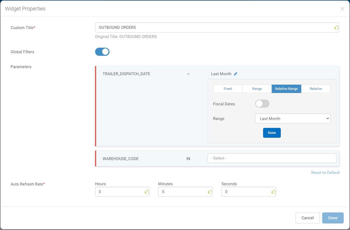
You have the following options when setting a date parameter:
Option |
Description |
|---|---|
Fixed |
To select a particular date. In the Fixed Date field, select a date/time and then click ‘Done’. |
Range |
To select a date and a time range (inclusive). Enter a Start Date and an End Date and specify a start time and an end time and then click ‘Done’. |
Relative Range |
To select a dynamic date range based on today’s date. If you select a weekly range, a Start Day field appears. From the dropdown, select which day of the week should be considered the first day of the week. Dynamic date ranges can be defined based on Rebus’ default calendar or the Fiscal Calendar’s setup. To filter the widget based on the organization’s fiscal calendar, click the ‘Fiscal’ button. For more information on relative ranges and fiscal relative ranges, see Relative Range Options. and Fiscal Relative Range Options. |
Relative |
To select a dynamic date range (inclusive) by specifying the number of days counting back from and after today. The ‘From’ value is the start date, and the ‘To’ value is the end date. Enter negative numbers for days counting back from today, and positive numbers for days counting after today. |
Note
 If the widget’s date range parameter covers a period of more than 32 days, the widget will be frozen.
Relative Range Options#
When entering a date parameter, you can select a relative range, which is a dynamic range based on today’s date. A day is considered to start at midnight (i.e., 00:00:00.0 hours in the 24 hour clock) and to end a millisecond before the next midnight (i.e., 23:59:59.999). The relative range options are described below:
Option |
Start of Range |
End of Range |
Notes |
|---|---|---|---|
Today |
Start of runtime day. |
End of runtime day. |
|
Start of Today |
Start of runtime day. |
||
Yesterday |
Start of previous day. |
End of previous day. |
|
Start of the Week |
Start of day set up as the current week’s first day. |
End of runtime day. |
If no day is specified as the week’s first day, then Monday will be used as a default. |
Last Week |
Start of first day of last full 7 day week that completed before runtime. |
End of last day of last full 7 day week that completed before runtime. |
If no day is specified as the week’s first day, then Monday will be used as a default. |
This Month |
Start of first day of calendar month. |
End of day of runtime date. |
|
Last Month |
Start of first day of previous calendar month. |
End of last day of previous calendar month. |
|
This Year |
Start of January 01 of this year. |
End of day of runtime date. |
|
Last Year |
Start of January 01 of last year. |
End of December 31 of last year. |
|
Last X Days |
Start of day X days before. |
End of day of day before runtime. |
User is prompted to enter a number of days (X) to determine the start date. N.B. Works only with widgets built in widget builder. |
Last 30 days |
Start of day 30 days ago. |
End of day of runtime date. |
|
Last 90 days |
Start of day 90 days ago. |
End of day of runtime date. |
|
Last 180 days |
Start of day 180 days ago. |
End of day of runtime date. |
|
Last 365 days |
Start of day 365 days ago. |
End of day of runtime date. |
|
Tomorrow |
Start of next day. |
End of next day. |
|
End of Today |
End of today. |
||
End of Week |
Start of next day. |
End of day specified as the last day of the week. |
If no day is specified as the week’s last day, then Sunday will be used as a default. |
Next X Days |
Start of next day. |
End of day X days in the future. |
User is prompted to enter a number of days (X) to determine the end date. N.B. Works only with widgets built in widget builder. |
Next 3 Days |
Start of next day. |
End of day 3 days in the future. |
|
Next 10 Days |
Start of next day. |
End of day 10 days in the future. |
|
Next 30 Days |
Start of next day. |
End of day 30 days in the future. |
|
Next 90 Days |
Start of next day. |
End of day 90 days in the future. |
|
Next Week |
Start of day specified as start day. |
End of day 7 days in the future. |
User is prompted to enter a start day. If no start day is specified, then Monday will be used as the default. |
Next Month |
Start of first day of next calendar month. |
End of last day of next calendar month. |
Fiscal Relative Range Options#
Fiscal relative ranges work like default relative ranges, except they are dynamically defined based on the Fiscal Calendar’s setup. The fiscal relative range options are described below:
Option |
Start of Range |
End of Range |
|---|---|---|
This Fiscal Week |
Start of the first day of the fiscal week. |
End of the last day of the fiscal week. |
This Fiscal Month |
Start of the first day of the fiscal month. |
End of the last day of the fiscal month. |
This Fiscal Quarter |
Start of the first day of the fiscal quarter. |
End of the last day of the fiscal quarter. |
This Fiscal Year |
Start of current fiscal year’s start date selected in the Fiscal Calendar |
End of the last day of the fiscal year. |
Fiscal Quarter 1 |
Start of first day of first fiscal quarter. |
End of last day of first fiscal quarter. |
Fiscal Quarter 2 |
Start of first day of second fiscal quarter. |
End of last day of second fiscal quarter. |
Fiscal Quarter 3 |
Start of first day of third fiscal quarter. |
End of last day of third fiscal quarter. |
Fiscal Quarter 4 |
Start of first day of fourth fiscal quarter. |
End of last day of fourth fiscal quarter. |
Start of Fiscal Week |
Start of first day of the current fiscal week. |
|
Start of Fiscal Month |
Start of the first day of the current fiscal month. |
|
Start of Fiscal Quarter |
Start of the first day of the current fiscal quarter. |
|
Last Fiscal Week |
Start of the first day of the previous fiscal week. |
|
Last Fiscal Month |
Start of the first day of the previous fiscal month. |
End of the last day of the previous fiscal month. |
Last Fiscal Quarter |
Start of the first day of the previous fiscal quarter. |
End of the last day of the previous fiscal quarter. |
Last Fiscal Year |
Start of the first day of the previous fiscal year. |
End of the last day of the previous fiscal year. |
Resetting Value to Default State#
You can reset a widget’s parameter values to the ones originally configured in the Widget Builder’s Filter Stage. To do so, from the Widget Properties form, select ‘Reset to Default’.
Frozen Widget#
A frozen widget is a widget whose data are not refreshed because:
it was manually frozen, or
its data range covers a period of more than 32 days.
A snowflake icon  next to the widget’s title displayed on a dashboard denotes that it is frozen.
Unfreeze a Widget#
To Unfreeze a Widget…
Manually
Open the Widget Properties Form and select a date range that covers 32 days or less.
Reduce the date range
Reduce the date range and select the ‘Refresh’ option in the gear icon menu.
A clock icon  next to the widget’s title displayed on a dashboard denotes that the widget’s data is refreshed according to the rate specified in the Widget Properties Form.
Viewing Different Types of Widgets#
Tips for Viewing a Grid#
Viewing preferences that you apply to a grid widget are automatically saved when you apply them so that when you re-open the dashboard with the grid, it’s displayed with your latest viewing preferences applied.
The following viewing preferences that you can apply to grids are saved:
Pivots
Filters
Sorting
Sorting Rows in a Grid#
Keep clicking the column header of the value you want to sort by until the rows are sorted in the order you want. Sorting indicators:
Filtering Grid Data#
Do one of the following:
Under the column heading whose data you want to filter, click the filter
 button. A filter dialog appears with two fields.
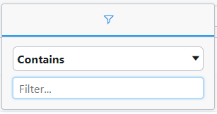
From the grid’s sidebar, click ‘Filters’. The Filters panel opens. Select the column heading whose data you want to fiter. You can use the search bar to find the desired heading. A filter dialog box appears.
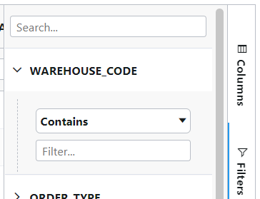
In the dropdown, select the operator that defines how you want the data to be filtered. The default operator for text data is ‘Contains’. I.e., the grid will be filtered to show only those rows that contain the search term somewhere in their value for this column. The default operator for numerical data is ‘Equals’. You can select another operator from the dropdown.
In the text box, enter the search term.
Press Enter. The grid data is filtered based on the search term and operator you specified.
Grouping Data#
This procedure goes over how to group rows by the values of a selected column.
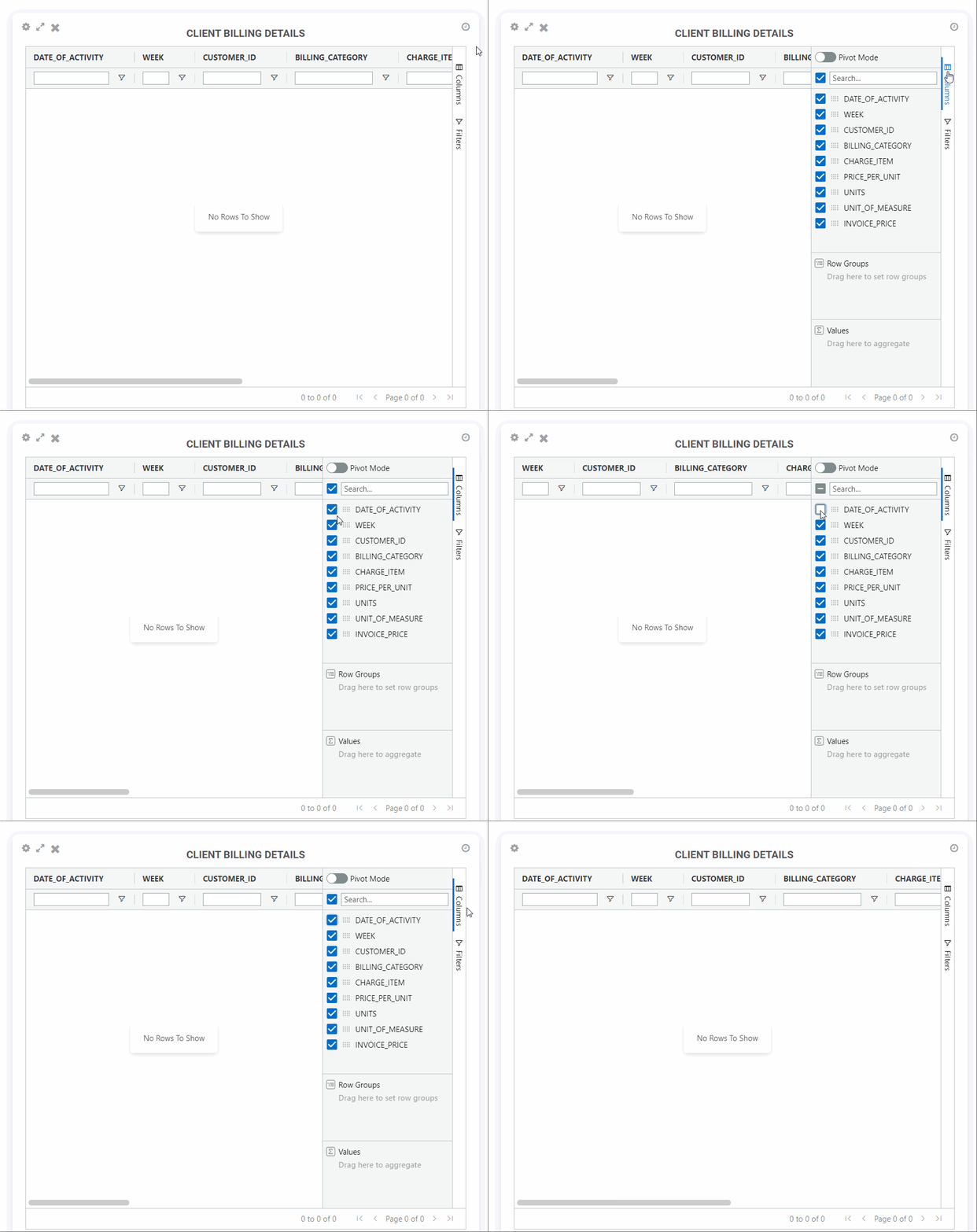
From the grid’s sidebar, click ‘Columns’. The Columns panel opens.
Drag the column heading to the ‘Row Groups’ section of the panel.
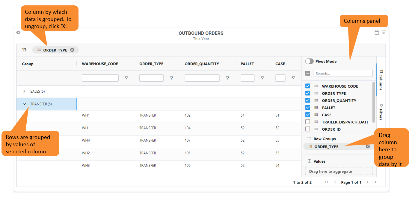
The rows are now grouped by the values of the selected column. Each value of the selected column has a section of rows that you can expand or collapse. To ungroup the data, click ‘x’ on the label representing the column by which the data is grouped.
Adding a “Total” Row to a Pivot Table#
This procedure goes over how to add a “Total” row in a pivot table for fields that have numeric data.
To have the pivot table dispay the “Total”, follow these steps:
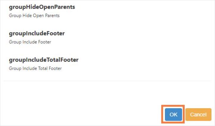
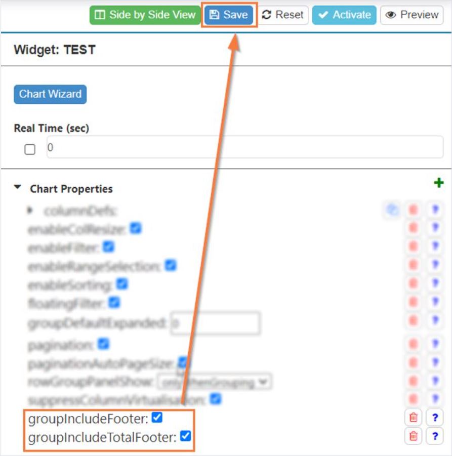
In the Design Chart, from the widget’s Chart Properties, select both the properties ‘groupIncludeFooter’ and ‘groupIncludeTotalFooter’.
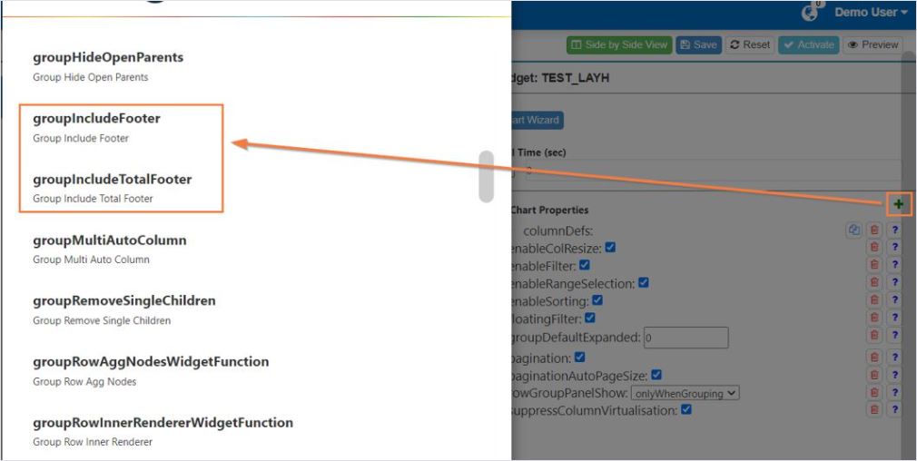
Click ‘OK’.
Select the checkboxes for these two properties, and click ‘Save’.
Pinning Columns#
To pin a column in place on the graph, do the following:
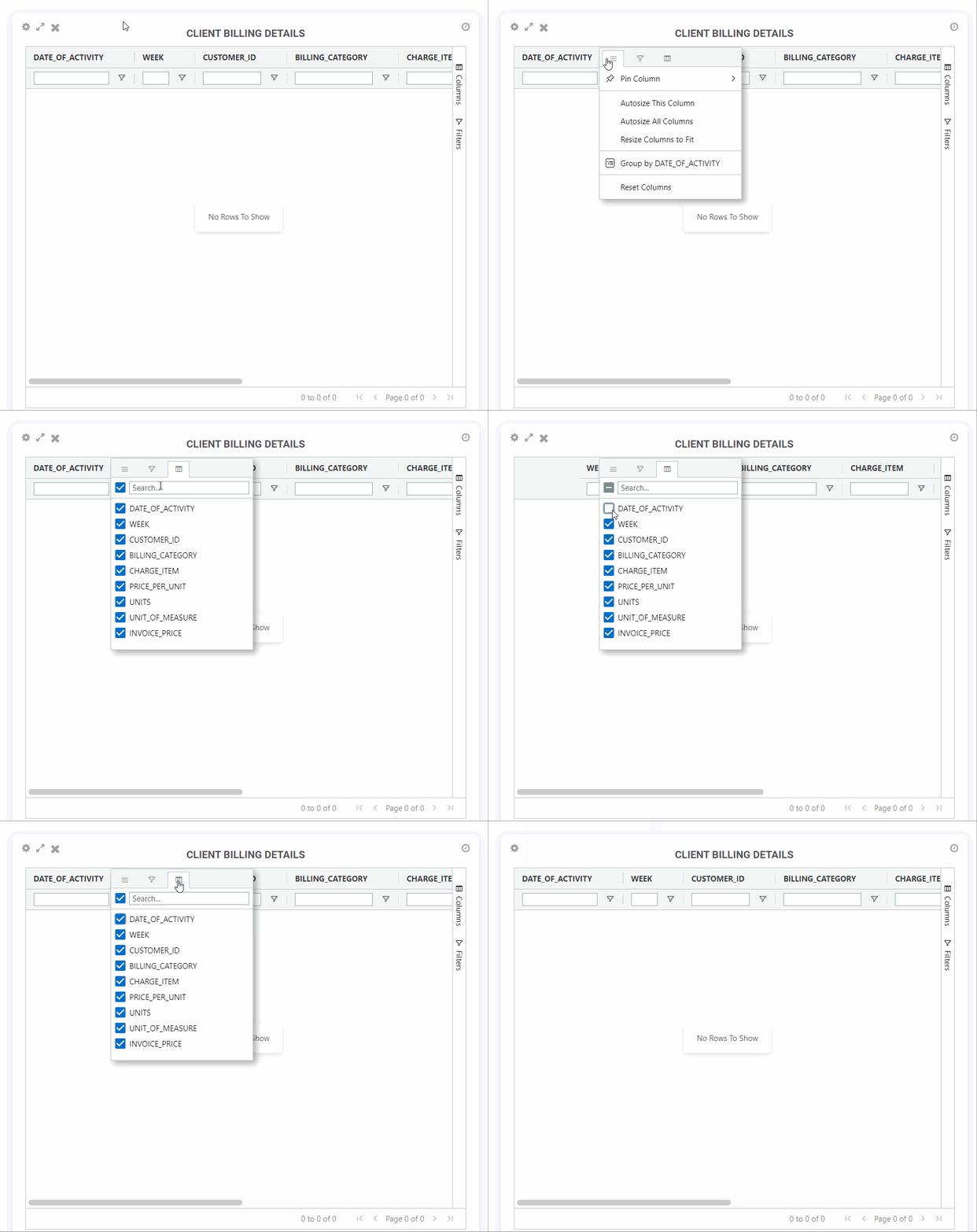
Hover over the column heading that you want to pin. A menu button
 appears.
Click the menu button and then hover over ‘Pin Column’. A drop down gives you the option of pinning the column to the right or left side of the grid.
Select the side you want the column to be pinned to. The column is pinned and will always remain visible until you open that same menu and remove the pin.
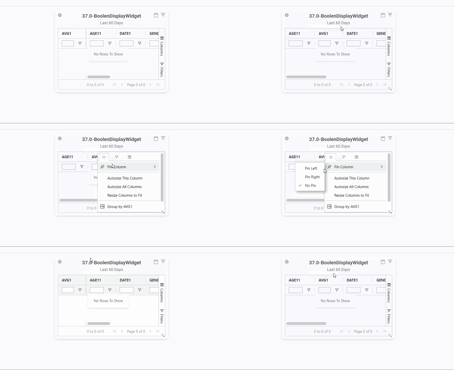
It’s possible to pin a column by moving the column in the following ways:
When other columns are pinned, drag the column to the existing pinned area.
When no columns are pinned, drag the column to the edge of the grid and wait for approximately one second. The system will create a pinned area and place the column in it.
Showing/Hiding Columns#
Do one of the following:
The columns checkboxes are selected by default. You can use the Search box to find the desired column heading.
To hide a column, clear its checkbox. To show a column, select its checkbox.
To close the column headings list, do one of the following depending on how you first opened it:
Click the columns
 icon. The list closes.
From the grid’s sidebar, click ‘Columns’. The Columns panel closes.
Resizing columns#
Columns on grids are automatically sized to the widest column value or the column header by default. If you want to resize the columns manually via the column menu, you can use the new ‘Resize Columns to Fit’ option. Auto-sizing columns are also applied to grids in a cascading widget group .
Drill Down Paths#
You can set up a widget so that clicking on a measurement opens another widget that shows the details behind the measurement. This is achieved by organizing a set of widgets into a drill down path. Once it’s set up, a drill down path can be used by all Rebus account users who have access to that path’s widgets.
A drill down path is a series of widgets, usually starting with a top-level widget that has a high level overview of enterprise-wide metrics (e.g., Inventory Counts by Warehouse) with each succeeding widget showing lower-level summaries and culminating in a widget showing transaction details in a grid.
The top-level widget is populated with data based on the parameters that you set up for it when you added it to your dashboard. When you click a measurement in the top-level widget, it passes parameter values to populate the next widget in the path.
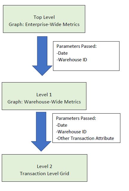
To continue to use Inventory Counts by Warehouse as an example, if you clicked on a measurement of inventory counts at warehouse WH1 on today’s date, the parameters of Count Date=’Today’ and Warehouse ID= ‘WH1’ would be used to populate the next widget down the path, Inventory Counts Accuracy Summary, which shows a summary of inventory counts at a warehouse. If you then click on a measurement of the correct inventory counts, the parameters of Count Date=’Today’, Warehouse ID= ‘WH1’, and Correct or Incorrect = ‘Correct’ would be used to populate the next widget down the path, Inventory Counts Detailed, which presents the details of each correct inventory count at warehouse WH1 on today’s date. Therefore each widget in a drill down path needs to have at least all the parameters of the widget immediately above it in the drill down path.
Using Drill Down Paths#
You can easily see whether a widget is part of a drill down path. A drill down indicator will appear at the right of a widget’s title if it’s part of a drill down path.
top level of drill down path.
in the middle of a drill down path.
bottom level of drill down path.
Widget drill down paths adapt themselves to the widget permissions specified in your My Account screen. If you open a widget that’s part of a drill down path, you’ll be able to drill down to the next widget down the path only if you have access to that widget. Otherwise, it will be as if you’re at the bottom end of the drill down path.
Setting up a Drill Down Path#
This procedure goes over how to organize a set of widgets into a drill down path.
Prerequisites#
All the widgets in the drill down path are already set up and none of them is part of another drill down path.
You know the order in which you want a user to move from one widget to another as they click on measurements to drill down for more detail.
Each widget in the planned drill down path has at least all the parameters of the widget immediately above it in the drill down path. To see a widget’s parameters while setting up a drill down path, click the widget label in the Available Widgets list.
Users who will be using this drill down path have access to all its widgets. To learn more about how to assign widgets to a user profile, see Assigning Widgets to a Profile.
Note
 If a parent widget in a drilldown series is automatically frozen, then all it’s child widgets will also be frozen.
Steps#
Go to Admin Tools -> Widgets -> Widget Drill Down Configuration.
Click ‘+New’. You are at the New Path screen.
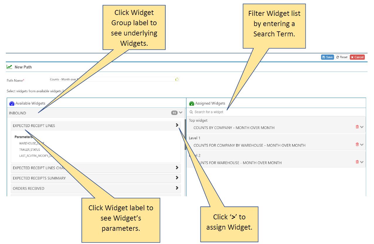
In the Path Name field, enter the name of the drill down path.
Starting with the top-level widget, add widgets to the drill down path in the order that a user would follow when drilling down. Move widgets from the Available Widgets list to the Assigned Widgets list.
To filter the list of widgets to those that match a search term, type a widget name in the search box at the top.
The widgets are listed under their widget groups. Click on the widget group label to expand the list and see the widgets that make up the group.
To see the parameters set up for a widget, click the widget’s label. A parameters list opens beneath the widget label.
To move a widget from the Available Widgets list to the Assigned Widgets list, click its ‘>’ button.
The first widget added to the Assigned Widgets list becomes the ‘Top Widget’ and each subsequently added widget takes the next level down the drill down path.
When you are finished adding all the widgets to the drill down path, click ‘Save’.
Result#
The drill down path is saved.
Editing Drill Down Paths#
This procedure goes over how to make changes to a drill down path like changing the widgets or deleting it.
Go to Admin Tools -> Widgets -> Widget Drill Down Configuration.
In the search box of the Existing Paths panel, start typing the name of the drill down path you want to edit. The list is filtered to have only those paths whose names match your search term.
Select the drill down path you want to edit and then decide the type of change you want to make.
I want to change the widgets that make up the path… |
I want to delete the path… |
|---|---|
Click ‘Edit’. You are at the New Path screen. Continue with the steps below. |
Click ‘Delete’ and then confirm your choice. The path is deleted. End of Procedure |
The Assigned Widgets list shows widgets that make up the drill down path and the Available Widgets list shows those that can be added to it.
To filter the list of widgets in a list, type a widget name in the search box at the top.
The widgets are listed under their widget groups. Click on the widget group label to expand the list and see the widgets that make up the group.
To see the parameters set up for a widget, click the widget’s label. A parameters list opens beneath the widget label.

Make your desired changes to the path’s Assigned Widgets list. When making changes to the path’s widgets, consider the following:
A widget can’t be part of more than one drill down path.
Each widget in the drill down path must have at least all the parameters of the widget above it in the drill down path. To see a widget’s parameters while setting up a drill down path, click the widget label in the Available Widgets list.
Users who will be using this drill down path must have access to all its widgets.
I want to remove a widget from the path… |
I want to add a widget to the path… |
|---|---|
Click the widget’s |
Click the widget’s ‘>’ button. The widget becomes the bottom level of the path. |
When you are finished changing the drill down path, click ‘Save’.
Cascading Widget Groups#
Setting up a cascading widget group lets you click a measurement on a ‘parent’ widget and have all the parameter values of the clicked item cascade to its ‘child’ widgets, which are updated based on the passed down values.
A cascading widget group works a lot like a drill down path except that you see all the related widgets at the same time on a dashboard.
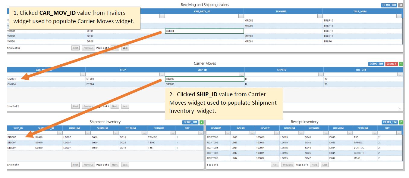
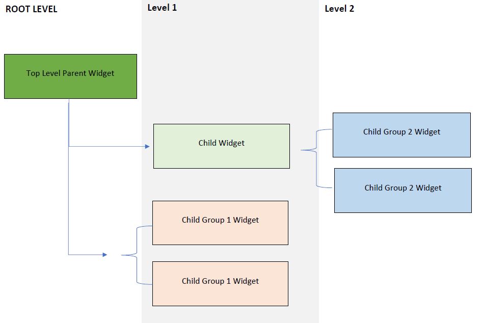
Each cascading widget group has a top-level parent widget, also known as a root widget. The root widget has child widgets, which can themselves be parents and have their own child widgets. Each child widget must have at least all the parameters of its parent widget. A child widget is updated when a measurement on its parent widget is clicked. The root widget of a cascading widget group can be configured with constants instead of parameters. Its child must have at least all the same conditions configured as parameters.
Widgets that are part of a cascading widget group have colored labels in the upper right that show the group’s name, the child group number, and the widget’s level (‘M’ is the root and then 1, 2, 3…).

Dynamic Display with Child Groups#
A widget in a cascading widget group can be a parent not just to single widgets, but to a group of widgets, called a child group, which is set up for dynamic display. Only one widget in the child group is displayed at a time, based on the measurement that is clicked in the parent widget. Each widget in a child group must meet all the criteria below:
Have all the parameters of its parent widget, and
- Have at least one additional parameter that meets both criteria:
Distinguishes it from other widgets in the child group and
Is displayed as a field in the parent widget.
This additional parameter determines which member of the child group is displayed when a measurement on the parent widget is clicked. On the dashboard, a child group appears grayed out until you click a measurement on the parent widget. If a widget in the child group has a parameter that matches the field value that was clicked in the parent, it will be displayed and populated.
Each widget that’s part of the group has the group label displayed in the top right of the widget. If you add a child widget to a dashboard and then add its cascading widget group, the previously added widget will continue to act like a widget independent of the group.
Setting Up Cascading Widget Groups#
This procedure goes over how to organize a set of widgets into a cascading widget group.
Prerequisites#
All the widgets to be in the cascading widget group are already set up and none of them is part of another group.
You know which parameters are going to be passed from higher level widgets to be used as queries to populate child widgets.
Each child widget in the planned cascading widget group has at least all the parameters of its parent widget. To see a widget’s parameters while setting up a cascading widget group, click the widget label in the Available Widgets list.
Each widget that’s going to be part of a child group is set up with at least one parameter that distinguishes it from other members of the child group.
Users who will be accessing this group have access to all its widgets. To learn more about how to assign widgets to a user profile, see Assigning Widgets to a Profile.
Note
 If a parent widget in a cascading widget group is automatically frozen, then all it’s child widgets will also be frozen.
Steps#
Go to Admin Tools -> Widgets -> Cascading Widget Configuration.
Click ‘+New’. You are at the New Group screen.
The Available Widgets lists has widgets listed under their widget groups. Click on the widget group label to expand the list and see the widgets that make up the group. To see the parameters set up for a widget, click the widget’s label. A parameters list opens beneath the widget label. To filter the list of widgets to those that match a search term, type a widget name in the search box at the top.

In the Group Name field, enter the name of the cascading widget group.
In the Available Widgets list, find the group’s root widget and click its ‘>’ button. It’s moved to the Assigned Widgets List.
- Add child widgets to the group. For each child widget, do the following:
Click the widget’s ‘>’ button. An Add Widget to the Group form appears:
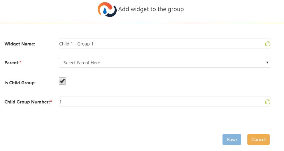
Field |
What You Enter… |
|---|---|
Widget Name |
Read only field. |
Parent |
From the drop down, select this child widget’s parent widget. I.e., the widget that passes its parameters to populate the child widget. |
Is Child Group |
Click the checkbox if this child widget is to be part of a child group. |
Child Group Number |
Enter the number that denotes the child group. All child widgets having the same number belong to the same child group. |
Click ‘Save’. The widget is added to the Assigned Widgets list.
When you are finished adding all the widgets to the group, click ‘Back’.
Result#
The cascading widget group is saved.
Adding Cascading Widget Groups to Dashboards#
To add a cascading widget group to a dashboard, add the group’s root widget to it.
On the dashboard to which you want to add the cascading widget group, click the Show/Hide Widget List button
 . The Available Widgets panel appears.
Find the group’s root widget and click and drag it onto the dashboard. You are prompted to specify whether you want to add just the root widget or the entire cascading widget group.
Click ‘Yes’. The widgets of the cascading widget group are added to the dashboard.
Removing Cascading Widget Groups from Dashboards#
To remove a cascading widget group from a dashboard, remove its root widget from the dashboard.
Editing Cascading Widget Groups#
This procedure goes over how to make changes to a cascading widget group like changing the widgets or deleting it.
Go to Admin Tools -> Widgets-> Cascading Widget Configuration.
In the search box of the Existing Groups panel, start typing the name of the group you want to edit. The list is filtered to have only those groups whose names match your search term.
Select the group you want to edit and then decide the type of change you want to make.
I want to change the widgets that make up the group… |
I want to delete the group… |
|---|---|
Click ‘Edit’. You are at the New Group screen. Continue with the steps below. |
Click ‘Delete’ and then confirm your choice. The path is deleted. End of Procedure |
The Assigned Widgets list shows widgets that make up the group and the Available Widgets list shows those that can be added to it.
To filter the list of widgets in a list, type a widget name in the search box at the top.
The widgets are listed under their widget groups. Click on the widget group label to expand the list and see the widgets that make up the group.
To see the parameters set up for a widget, click the widget’s label. A parameters list opens beneath the widget label.
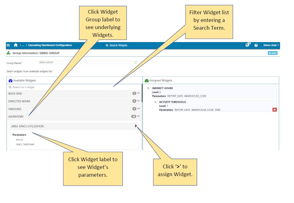
Make your desired changes to the group’s Assigned Widgets list. When making changes to the group’s widgets, consider the following:
A widget can’t be part of more than one cascading widget group.
Each widget in the group must have at least all the parameters of the group’s top-level parent widget, a.k.a., the root widget. To see a widget’s parameters, click the widget label in the Available Widgets list.
Each widget that’s going to be part of a child group is set up with at least one parameter that distinguishes it from other members of the child group.
Users who will be using this drill down path must have access to all its widgets.
I want to remove a widget from the group… |
I want to add a widget to the group… |
|---|---|
Click the widget’s Remove Node button |
Click the widget’s ‘>’ button and then fill out the Add Widget to Group form. |
When you are finished changing the group, click ‘Back’.
Custom Data Entry#
The Custom Data Entry functionality allows you to manually enter data that you want to use in a widget but that does not come from your system. The Data Entry Setup screen allows you to create a new collection in your Rebus database and specify the expected data format. The Custom Data Entry screen allows you to populate your new collection by adding data manually or in bulk. Once created and populated, your collection will be available in the widget builder.
Step 1 – Create a Form#
A form is a template that indicates the structure of the collection you’re creating and the expected format of the data that populates it.
Prerequisite:#
Have access to the Data Entry Setup screen
Know which fields should be set as unique fields
A unique field has a value that identifies a record in a table. It cannot contain duplicate values and cannot be edited or deleted once the form is created. The table in the example below shows two employees with the same name working on the same shift. The ‘ID’ unique field differentiates between them.

Steps:#
Go to Admin Tools > System > Data Entry Setup.
In the upper right corner, click ‘Create Form’.
Enter a name for your new Collection.
Click ‘Add Field’ and enter a name for your field.
Select a type for the data that will be entered in that field. You can add as many fields as you want.
Data Type |
Definition |
Example |
|---|---|---|
String |
Represents text, both characters and spaces. |
Start |
Date |
Date and time of the transaction. |
Selected through date picker or following UTC format if added in bulk |
Number |
Represents a number’s full or fractional value. |
5, 6.2 |
Boolean |
Either true or false. |
True |
Dropdown |
Creates a drop down with your own value. Click on ‘+Add Option’ to add a dropdown value. |
Slide the ‘Unique’ button to ‘yes’ to indicate that you want that field to be a unique field.
Click ‘Save.
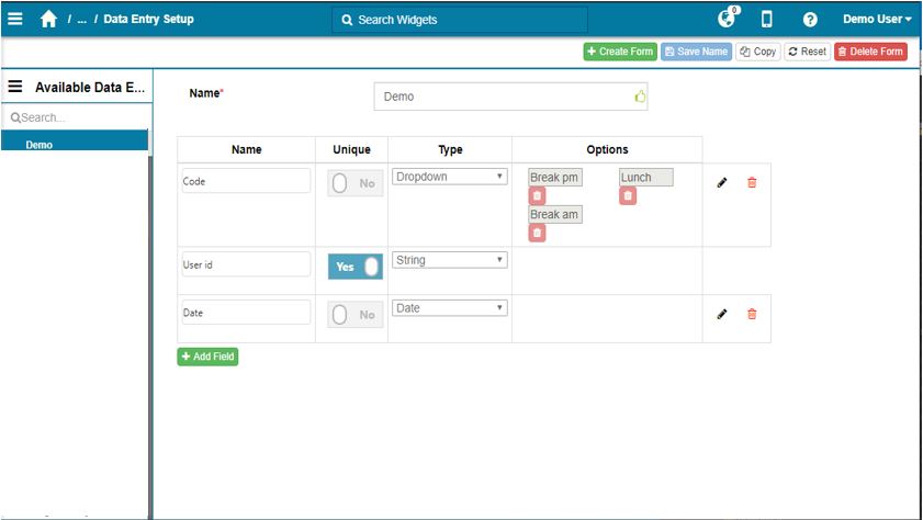
Result#
You have created a new collection and configured a form that indicates the expected format of the data.
Step 2 - Assign the New Form to a Profile#
The form needs to be assigned to a user’s profile to become accessible.
Prerequisite:#
Have access to the Profile Admin screen.
Make sure that the custom data does not conflit with the isolation rules for the profile it will be added to.
Steps:#
Go to Admin Tools > Users > Profile Admin.
Click the ‘Custom Data Forms’ tab.
In the ‘Existing Profiles’ panel, click on the profile to which you want to assign a form.
In the ‘Unassigned’ section, find the form you want to add and click on the chevron to move it to the ‘Assigned’ section.
Click on the form you just added and select the permission level you want to grant to the profile’s users.
Click on ‘Save’.
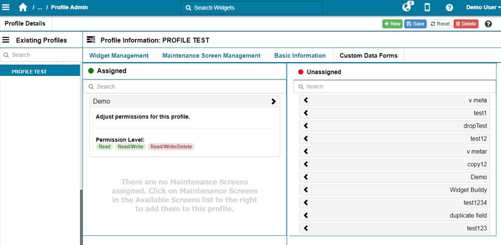
Result#
All the users who are part of that profile and who have access to the Data Entry Setup screen or the Custom Data Entry screen can access the form.
Step 3 – Populate the Form#
Populate your new collection by entering your own data. You can add data manually or in bulk using a CSV file.
Prerequisites:#
Have access to the Custom Data Entry screen.
Optional: Have a CSV file ready.
Steps:#
Go to Admin Tools > System > Custom Data Entry.
In the ‘Available Data Entry Forms’ panel, select the form for which you want to add data.
Click ‘New Entry’ and populate the fields according to the previously configured data type.
Click ‘Save’.
Your data has been added to the collection. To see it, refresh your collection by clicking on ‘Search’ in the Filters panel.
To add bulk data, you need to create a CSV file respecting the following criteria:
Headers must match the field names of your form.
All unique fields must have data. Non-unique fields can be left blank.
Date fields must follow the UTC format.
Click ‘Import From CSV’.
Select a CSV file from your computer and click ‘open’.
Your data has been added to the collection. To see it, refresh your collection by clicking on ‘Search’ in the Filters panel.
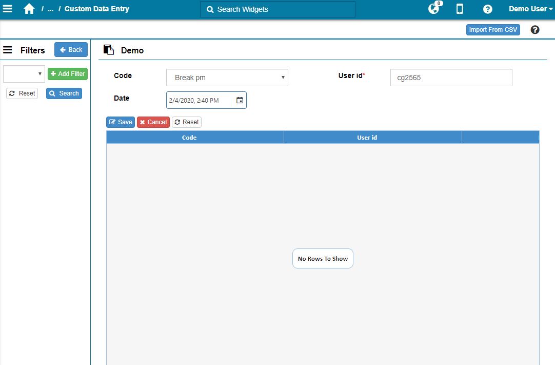
Result#
You have created a new collection, specified its structure and populated it. You can now access your new collection in the Widget Builder.
Filtering your Custom Data#
You can filter your custom data using the column values of your form to select only the rows that you need.
To filter your data:#
Go to Admin Toolsn > System > Custom Data Entry.
Select the form that you want in the ‘Available Data Entry Forms’ panel.
The ‘Available Data Entry Forms’ panel becomes the ‘Filters’ panel. To go back to the list of forms, click on ‘Back’.
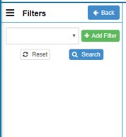
In the ‘Filters’ panel, click ‘Search’ to refresh your collection and see the data available.
In the ‘Filters’ panel, click ‘+Add Filter’ and select the column that you want to use. You can use multiple filters at once, but each column can only be used once.
Click ‘Search’.
Result#
Rebus only displays rows that have data for the configured filters.
Note
Data Isolation applies to custom data entry.
Editing a Custom Data Entry Collection#
This procedure covers how to edit or delete a data entry form and its data.
Editing a Data Entry Form#
You can add, modify or delete a field in a Data Entry form if that field was not set up as a unique field.
Steps:#
Go to Admin Tools > System > Data Entry Setup.
From the ‘Available Data Entry Form’, select the form that you want to modify.
Make your desired changes to the form:
Data Type |
Definition |
Example |
|---|---|---|
String |
Represents text, both characters and spaces. |
Start |
Date |
Date and time of the transaction. |
Selected through date picker or following UTC format if added in bulk |
Number |
Represents a number’s full or fractional value. |
5, 6.2 |
Boolean |
Either true or false. |
True |
Dropdown |
Creates a drop down with your own value. Click on ‘+Add Option’ to add a dropdown value. |
Editing Custom Data#
You can add, modify or delete the data in a data entry form.
Go to Admin Tools > System > Custom Data Entry.
From the ‘Available Data Entry Form’, select the form that you want to modify.
In the ‘Filters’ panel, click ‘Search’ to visualize all of your data. You can also apply a filter to select only the data that you want.
Make your desired changes to the data:
Type of Change
What You Do…
Add an entry manually
Click ‘+New Entry’ and enter data in the required fields. Click ‘Save’.
Add bulk entries
In the upper right corner click ‘import CSV’. Select a ‘CSV’ file from your computer and click ‘Open’.
Edit an entry
Select the entry that you want to edit and click ‘Edit Entry’. Make the desired changes and click ‘Save’.
Delete an entry
Select the entry that you want to edit and click ‘Delete Entry’.


