Creating Warehouse Map Widgets#
This procedure goes over setting up Warehouse Maps widgets.
Note
 We recommend that you be familiar with Warehouse Maps Creator concepts before starting this procedure.
Prerequisite: You have created the warehouse map.
Here’s an overview of the procedure:
Step |
Why do this? |
|---|---|
A Warehouse Maps widget must exist in the application to set it up. |
|
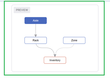
You must decide which layer to add to the Warehouse Maps widget and configure each with a data source, the data fields you want to see in a Warehouse Maps, and the data field’s color mapping. |
Step 1: Adding a Warehouse Maps Widget#
This step is essential because a Warehouse Maps widget must exist in the application to set it up.
From the Rebus menu, go to Admin Tools > Widgets > Warehouse Maps Widgets.
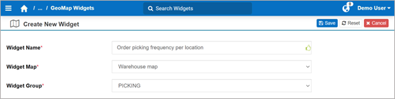
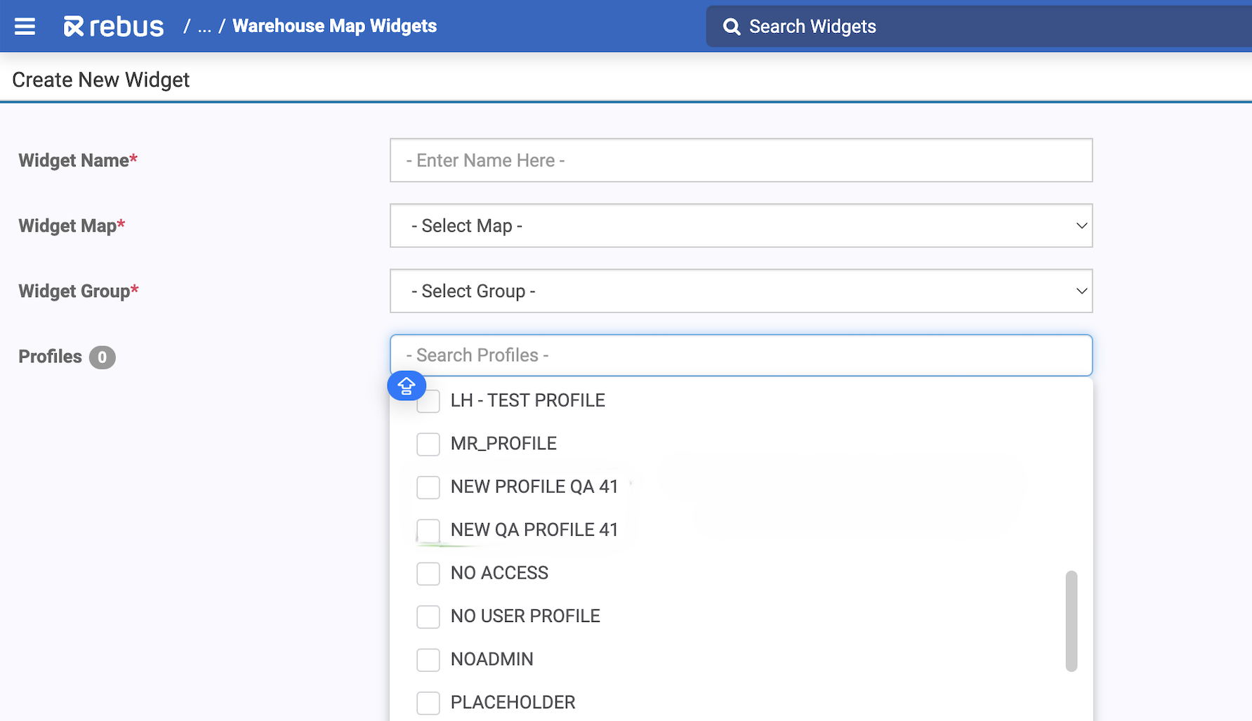
Click ‘New’. You’re at the Create New Widget screen.
Fill in the fields listed in the table below.
Field |
What You Enter… |
|---|---|
Widget Name |
Enter the name of the Warehouse Maps widget. |
Widget Map |
The designated map. |
Widget Group |
The widget group to include the Warehouse Maps widget in. |
In the Profiles field, assign one or more profiles to your selected widget by checking the box next to the profile name(s) in the dropdown.
Click ‘Save’. You’ve named and added a Warehouse Maps widget.
Step 2: Adding Layers to the Widget#
Click ‘Create Layers’.
Fill in the fields needed to configure a layer for the Warehouse Maps widget.
Field |
What You Enter… |
|---|---|
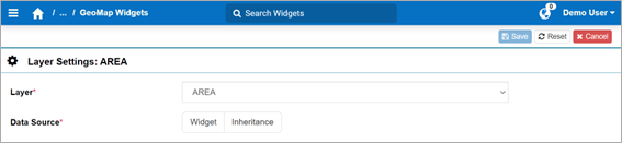
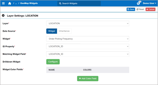
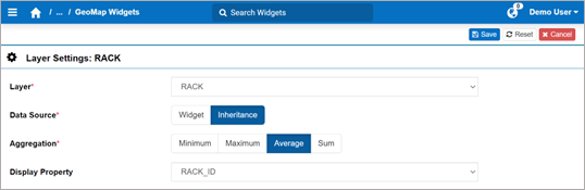
Layer |
Select the layer you want to include in the Warehouse Maps widget. |
Select Widget or Inheritance. |
Follow the next steps according to the selected data source:
Fill in the fields explained below.
Field
What You Enter…
Widget
Select the widget from which to retrieve the data field and its values.
ID Property
Select the property that you used to assign ID values to the map objects.
Matching Widget Field
Select the ID data field in your widget, that will be matched to the map object’s ID values.
Drilldown Widget
Drilldown widget so that clicking a map object opens it to show the details behind the map object’s measurement. To add a Drilldown Widget, click ‘Configure’. The Select Drilldown Widget form appears. Search the widget from the left panel and select it. Then, click ‘Done’.
Widget Color Fields
Go to step 4.
Fill in the fields explained below.
Field |
What You Enter… |
|---|---|
Aggregation |
The coloring option for how the parent layer should be colored based on the following child layer’s data:
|
Display Property |
The property that you used to assign ID values to the map objects. That way, the objects will be labelled with their corresponding ID on the Warehouse Maps widget. |
Widget Color Fields |
If you’ve selected Sum as the Aggregation, go to step 4. |
Click ‘Done’. You’ve configured a data field with its color values, and you’re brought back to the Layer screen.
Go to step 5.
Add color fields. To do so, follow these steps:
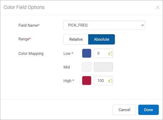
Click ‘+Add Color Field’. The Color Field Options form appears.
Fill in the fields explained in the table below:
Field |
What You Enter… |
|---|---|
Field Name |
The field in your source widget. |
Range |
Absolute or Relative according to whether you want the Warehouse Maps’s coloring to depend on absolute values, or relative values. |
Color Mapping |
The color to associate to the value. To define the color, click it. The color picker tool appears where you can define the color. The color requirements differ depending on the type of field to associate colors:
|
Click ‘Done’. You’ve configured a data field with its color values, and are brought back to the Layer screen.
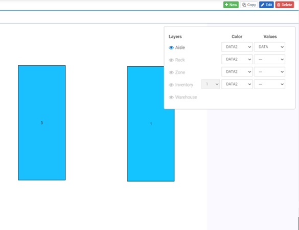
(Optional) Add a numeric overlay. To do so, follow these steps:
In the Widget Preview screen, click the Layers icon.
In the ‘Values’ column, select the value you want to display for each layer.
Click ‘Save’. You’ve added a layer to the Warehouse Maps widget’s configuration.
Result#
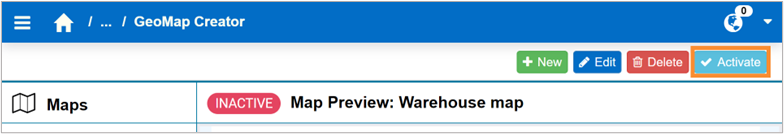
Once you’ve added all the layers to the Warehouse Maps, you can preview the widget in the same screen. Make sure you have activated the warehouse map from the Warehouse Maps Creator screen:
If you have defined more than one data field for the same layer, you can view one data field’s coloring on at a time in that layer. To view a data field’s coloring, do the following:
Hover over Layers icon.
Next to the desired layer, select the data field name to display its color values on the Warehouse Maps widget.
A preview box on the right of the Warehouse Maps Creator screen shows the Map Layers hierarchy.
Copying Warehouse Maps Widgets#
If you want to create a Warehouse Maps widget that’s similar to an existing one, you can copy the original widget and modify it to save time.
Steps#
From the Rebus menu, go to Admin Tools > Widgets > Warehouse Maps Widgets.
From the Widgets panel on the left, select the widget that you want to copy.
If it’s an active map (indicated by a green circle), in the upper right, click ‘Deactivate’.
In the upper right, click ‘Copy’. The Duplicate Map form appears.
Enter the Widget Name.
Select the Widget Group that the widget should be in.
Click ‘Save’.
Result#
The new Warehouse Maps widget is created based on an existing widget. All configurations from the original widget are copied to the new widget, except for the name and group.
Building a Widget that Measures Potential Congestion#
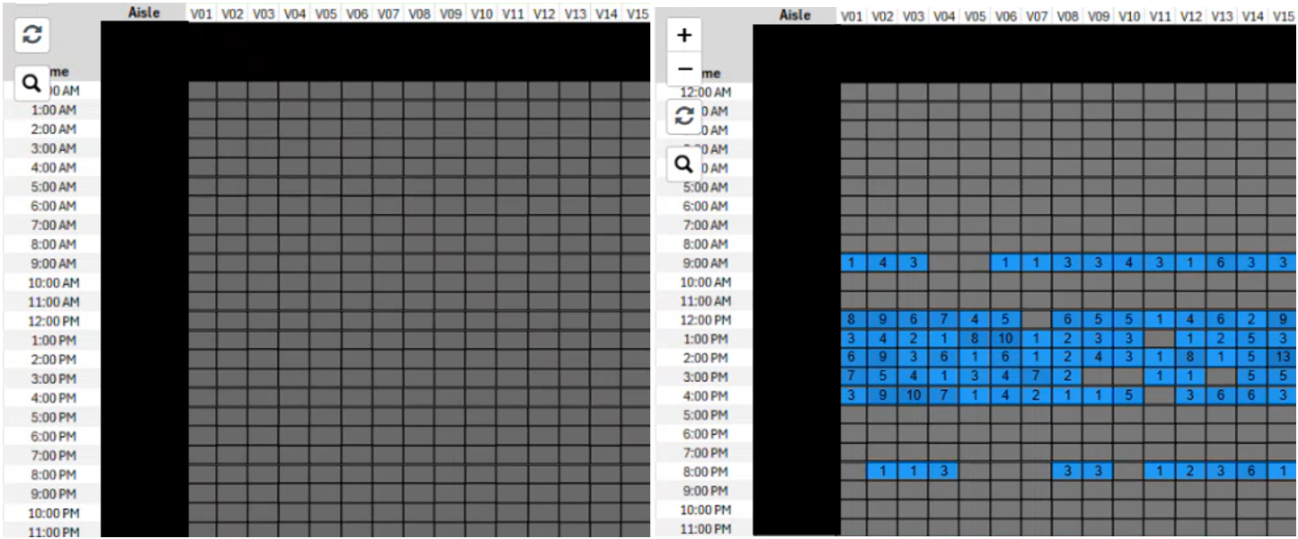
You can set up a Warehouse Maps widget that shows potential congestion in your warehouse. For example, this widget tells you which aisles are busy at what time of day based on the number of pallets picked in an aisle each hour. This is depicted through a colour heat map where the columns represent aisles and the rows represent hours during the day.
Prerequisites#
Before you start, you should be familiar with creating and editing Warehouse Maps and Warehouse Maps widgets. You should also know how to build a Warehouse Map using images.
Creating your Layout#
You must first create an image of your layout on which to overlay your map. We recommend you do this in Excel, but you can use any drawing tool you prefer.
Steps#
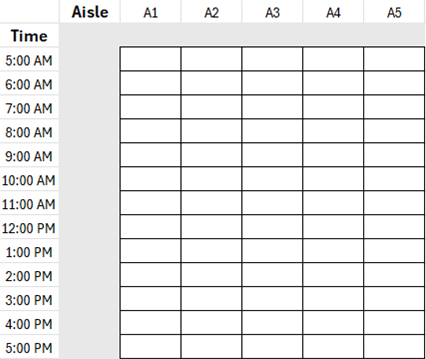
Create an excel sheet that lists the time of day on the Y axis and the Aisles on the X axis. Make sure you have the time slot for each aisle clearly outlined, and grey out any grid marks you do not want visible.
If your warehouse contains more aisles than pictured, or even different zones, you can set up your Excel grid accordingly. If your warehouse contains more aisles than pictured, or even different zones, you can set up your Excel grid accordingly.
Ensure that all cells are uniform in both height and width to simplify mapping.
Convert this sheet into an image format.
Follow the Adding a New Map procedure. In the Map Image field of the Create New Map screen, upload your created image after filling in the other required fields.
Click ‘Save’ to add the new warehouse map.
Importing your Map#
Next, you must import your Warehouse Map using a CSV. file. When creating this file, remember a few key points:
You want your map points to correspond to the image you built previously in Excel. Make sure your created image has cells that are uniform in height and width so it’s easy to make adjustments.
Use a concatenated ID that indicates Aisle and Time. For example, Aisle 1 at 5AM would be A1-05, Aisle 1 at 6AM would be A1-06, etc.
Follow the Importing Warehouse Maps With a .csv File procedure.
Adding a Warehouse Maps Widget#
Next, follow the steps to Adding a Warehouse Maps Widget. This is where you select your data source and link it to the map you’ve created. Your widget data source should contain data relating to number of order picks, aisles, and hourly pick rate.
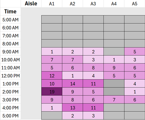
When adding color field options, choose ranges for levels of order picking you want represented in your widget. For example, anything over 15 can be represented by the darkest shade, and anything under 5 can be represented by the lightest shade to represent busy and slow times in an aisle.
Your finished widget will look like this. In this example, you can see that Aisle 1 is very busy around 2pm, and Aisle 4 has no picks at this time. This information allows you to make warehouse management decisions that can alleviate congestion in these busy spots.
Finish the remaining steps of the procedure and add your widget to your dashboard. Contact the implementation team if you need help setting up a Warehouse Maps Congestion widget.