Widget Properties#
Design
argumentAxis
Properties that let you configure the argument axis (horizontal axis) for individual axis. If your widget has multiple axis that should have the same configuration, see the commonAxisSettings section below.
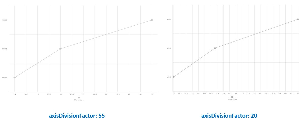
axisDivisionFactor
Specifies the minimum distance between major grid lines (also called tick) in pixel. By default, the argument axis is divided so that the labels do not overlap each other. This property does not apply if your are using string labels.
argumentType
Specifies the desired type of axis values. The type of the axis values is determined based on the type of the values specified in the corresponding data source field of the chart’s series. If arguments are specified as numeric values in a series data source, the argument axis values will also be of the numeric type. The same logic is used when string or date-time arguments are specified in the data source. In some scenarios, you may need the type of the arguments that are specified in the data source to be converted to another type.
categories
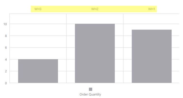
Specifies the order in which argument of the string type appear on the axis. There should be one subproperty for each argument value that you want to order.
To create more subcategories, click on the ‘copy property’ button.
color
Specifies the color of the argument axis.
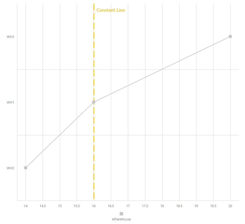
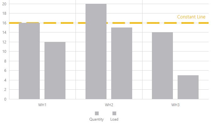
constantLine
Creates a constant line on the argument axis. The aspect of a line configures in this property overwrites the appearance configures in the constantLineStyle property.
This property only works with logarithm type axis.
constantLineStyle
Specifies the appearance of all the constant lines belonging to the argument axis.
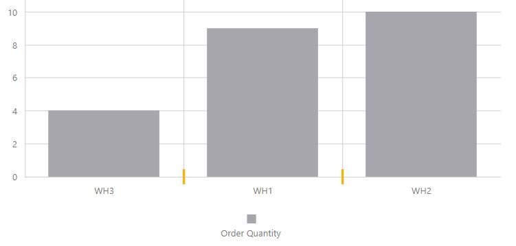
discreteAxisDivisionMode
Specifies whether the grid lines (ticks) of an axis with string values are located between labels or cross the labels. When a discrete axis is divided, its ticks/grid lines are located between labels by default.
endOnTick
Specifies whether to force the axis to start and end on ticks.
grid
A grid is a set of vertical and horizontal lines that span throughout the entire chart to improve its readability. The following properties apply to the vertical lines of the grid. To change the horizontal lines, see the grid property in the verticalAxis section.
color
Indicates the color of the vertical lines of the grid.
opacity
Indicates the opacity of the vertical lines of the grid.
visible
Indicated whether or not the vertical lines of the grid are visible.
width
Indicates the width of the vertical lines of the grid.
hoverMode
Specifies the elements that will be highlighted when the titles on the argument axis are hovered over.
Inverted
Specifies whether the axis is inverted. When an axis is inverted, the left-most and right-most values are reversed.
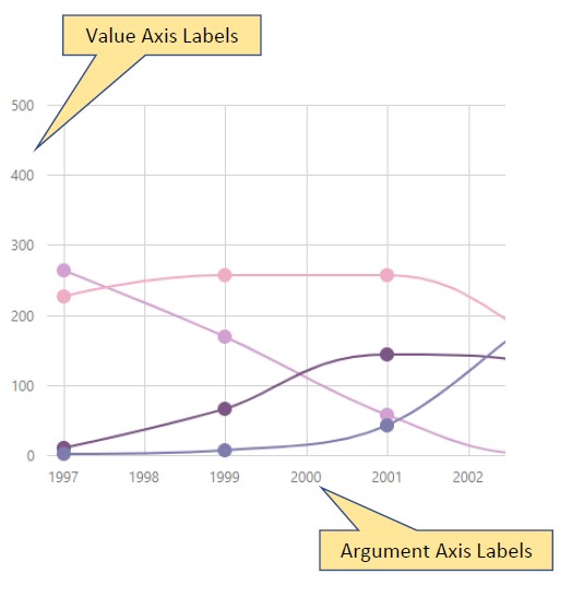
label
Configures the labels of the argument axis.
alignment
Aligns axis labels in relation to major grid lines (ticks).
format
Formats the type of a value before it is displayed and specifies the precision to use for the formatted value. Does not apply to string values.
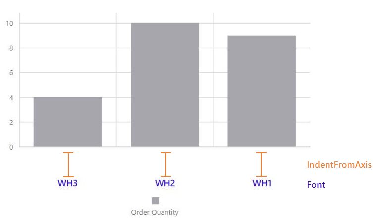
indentFromAxis
Specifies the spacing between an axis and it’s labels, in pixels.
overlappingBehavior
Specifies how to resolve overlapping labels on the argument axis.
mode
Specifies the overlap resolving algorithm to be applied to the series point labels.
rotationAngle
Specifies the angle used to rotate axis labels to resolve overlap.
staggeringSpacing
Specifies the spacing that must be set between staggered rows when the ‘stagger’ algorithm is applied to resolve label overlap.
visible
Indicates whether the labels of the argument axis are visible.
logarithmBase
By default, ticks on a numerical axis are generated on a base of 10, i.e., 0.1, 1, 10, 100, 1000 etc., but you can specify a different base. For example, if you set this option to 5, the ticks will be generated like this: 0.5, 5, 25, 125, 625, etc.
NOTE: The value assigned to the logarithmBase option should be greater than 1.
max
Deprecated use visualRange instead.
Specifies the maximum value on the argument axis. Does not apply if you are using string labels. If you do not specify this property, the maximum value on the argument axis corresponds to the maximum argument value in the chart’s data.
maxValueMargin
Specifies how much to expand the axes from the max value. This is helpful when you need to display a series with indents from the axes.
Since this property value is a coefficient, you can set a value for the axis expansion without knowledge of the actual axis values. The resulting end axis value is calculated using the following formula: max + (max - min)*maxValueMargin. Assume that the minimum value is 40 and the maximum value is 200. If you set maxValueMargin to 0.1, the resulting end axis value will be 216.
minorGrid
In addition to the major grid built on major ticks, the chart widgets provide a minor grid that is built on minor ticks.
color
Specifies the color of the minor grid’s lines.
opacity
Specifies an opacity for the lines of the minor grid.
visible
Specifies whether the minor grid is visible or not.
width
Specifies the width of the minor grid’s lines.
minorTick
Specifies the options of the minor ticks. In addition to major ticks, the chart widget provides the capability to draw minor ticks. Minor ticks divide an axis segment that lies between two neighboring major ticks. To specify how to generate minor ticks, use the minorTickInterval or minorTickCount options.
color
Specifies a color for the minor ticks.
length
Specifies a length for the minor ticks.
opacity
Specifies the opacity of the minor ticks.
visible
Indicates whether or not the minor ticks are displayed on an axis.
width
Specifies a width for the minor ticks.
minorTickCount
Specifies the number of minor ticks between two neighboring major ticks. Does not work for string values.
NOTE: If you set both the minorTickCount and the minorTickInterval options, the minorTickCount option will be ignored.
minorTickInterval
Specifies the interval between minor ticks.
To divide a lengthy chart axis into shorter segments, major and minor ticks are used. Minor ticks are required when major ticks are far from each other. If this option is not set, minor ticks are arranged automatically.
NOTE: The minorTickInterval option can be applied to a continuous axis only. For logarithmic axes, use the minorTickCount option.
minValueMargin
Specifies how much to expand the axes from the min value. This is helpful when you need to display a series with indents from the axes.
Since this property value is a coefficient, you can set a value for the axis expansion without knowledge of the actual axis values. The resulting end axis value is calculated using the following formula: min - (max - min) * minValueMargin. Assume that the minimum value is 40 and the maximum value is 200. If you set minValueMargin to 0.1, the resulting end axis value will be 24.
opacity
Specifies the opacity of the line that represents an axis. This functionality accepts value between1 and 0, where 1 is completely opaque.
placeholderSize
Specifies, in pixels, the space reserved for an axis. The scale’s height includes the space occupied by the axis labels, axis line and the space between the axis labels and axis line.
position
Specifies the position of the argument axis on the chart.
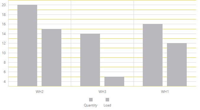
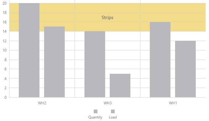
strips
Strips are the highlighted areas in a chart within the defined range of values (minimum and maximum) for an axis to which they belong. In general, strips are used to visually represent a range of values behind a series to trace whether the series points’ values fall in or out of that range.
Available Properties:
color
endValue
label
paddingLeftRight
paddingTopBottom
startValue
stripStyle
An object defining configuration options for strip style. Strips are the highlighted areas of a chart within a defined range of values (maximum and minimum) for an axis to which they belong. In general, strips are used to visually represent a range of values behind a series, to trace whether the series point values fall in or out of that range.
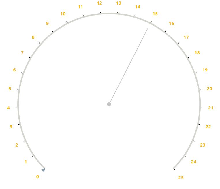
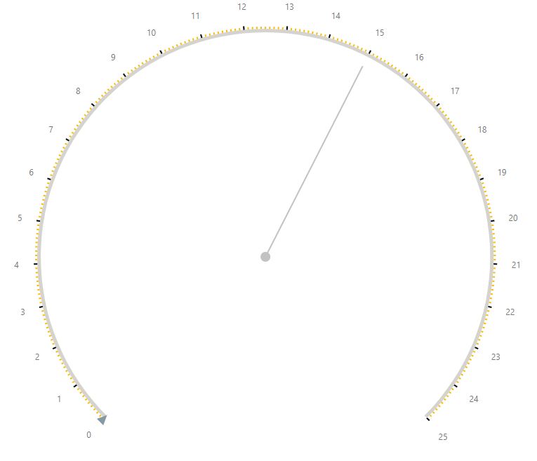
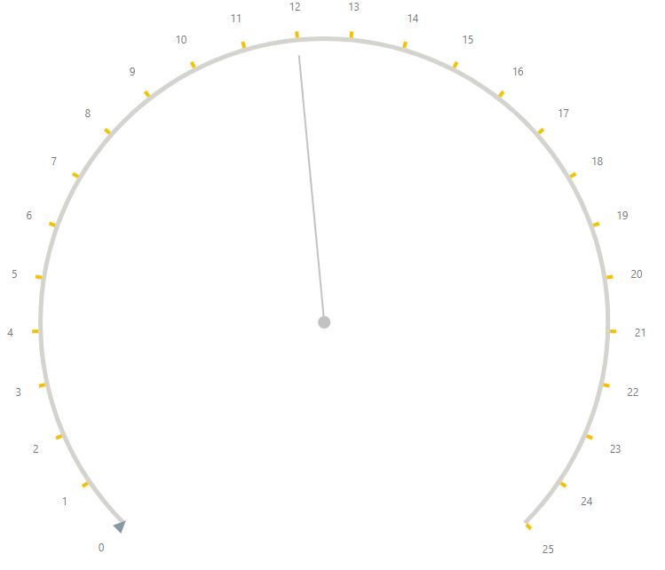
tick
Ticks divide an axis into equal sections by a step whose value is determined automatically, or by the tickInterval or axisDivisionFactor options. Ticks improve the readability of charts, but are not visible by default in the chart widget.
tickInterval
Specifies an interval between axis grid lines.If this option is not set, ticks are automatically arranged so that their labels do not overlap each other.
In case of a numeric axis, assign a numeric value to this option. If the axis is of the date-time type, assign one of the predefined string values or an object to this option.
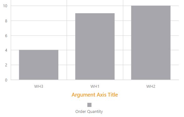
title
Specifies the title for the argument axis, its format and its position.
type
Specifies the required type of the argument axis.
discrete
Required when string arguments are used in the data source. The discrete axis is divided by the values that are specified as arguments in the data source.
If you require a discrete axis when numeric or date-time arguments are specified in the data source, set the type option to ‘discrete’ explicitly.
continuous
Required when numeric or date-time arguments are used in the series’ data source. The continuous axis is divided automatically.
For this type, ticks and grid lines are positioned so that their labels do not overlap each other.
logarithmic
The ‘logarithmic’ type can be set when numeric values are specified in the series data source.
For this type, ticks and grid lines are positioned so that their labels do not overlap each other.
valueMarginsEnabled
Indicates whether to display series with indents from axis boundaries.
visible
Indicates whether the line that represent the argument axis is visible.
visualRange
Specifies the axis’ displayed range.
endValue
The end value that should be displayed at the chart’s end, regardless of the data value.
startValue
The start value that should be displayed at the chart’s start, regardless of the data value.
visualRangeUpdateMode
Specifies whether the visualRange behavior should be kept when the widget is updated. Set this property to ‘keep’
auto
The mode changes depending on the visual range’s position on the axis.
keep
The visual range does not change. Choose this option to maintain the values configured when refreshing the widget or changing the date value through the date ribbon.
reset
Configures the visual range to equal the whole range.
shift
Configures the visual range to move to the axis’ end.
width
Specifies the width of the line that represents an axis in the chart.
wholeRange
Specifies the ranges where the axis can be zoomed and panned.
endValue
The end value for the range.
startValue
The start value for the range.
autoHidePointMarkers
Specifies whether series point markers should be automatically hidden when overlaping occurs to reduce visual clutter.
barWidth
DEPRECATED use barPadding under the commonSeriesSettings or series property instead.
Specifies a common bar width as a percentage from 0 to 1. Works only if the equalBarWidth option is selected.
commonAxisSettings
Has properties that let you configure common settings for the argument axis. Properties configured in the argumentAxis properties override the common settings.
color
Specifies the color of the argument axis.
constantLine
Creates a constant line on the argument axis. The aspect of a line configures in this property overwrites the appearance configures in the constantLineStyle property.
This property only works with logarithm type axis.
discreteAxisDivisionMode
Specifies whether grid lines (ticks) of an axis with string values are located between labels or cross the labels. When a discrete axis is divided, its ticks/grid lines are located between labels by default.
endOnTick
Specifies whether to force the axis to start and end on ticks.
grid
A grid is a set of mutually-crossing vertical and horizontal lines that stretch throughout the entire chart. Visually, grid lines can be considered extensions of major ticks. The grid improves the readability of chart data.
color
Indicated the color of the vertical lines of the argument axis.
opacity
Indicates the opacity of the vertical lines of the argument axis.
visible
Indicated whether or not the vertical lines of the argument axis are visible.
width
Indicates the width of the vertical lines of the argument axis.
Inverted
Specifies whether the axis is inverted. When an axis is inverted, the left-most and right-most values are reversed.
hoverMode
Specifies the elements that will be highlighted when the argument axis is hovered over.
label
Configures the labels of the argument axis. Axis labels display the values of major axis ticks.
alignment
Aligns axis labels in relation to ticks.
format
Formats a value before it is displayed.
indentFromAxis
Specifies the spacing between an axis and it’s labels, in pixels.
overlappingBehavior
Specifies how to resolve overlapping labels on the argument axis.
mode
Specifies the overlap resolving algorithm to be applied to the series point labels.
Available options
Auto
Ignore
Stagger
Rotate
EnlargeTickInterval
rotationAngle
Specifies the angle used to rotate the axis labels to resolve the overlap.
staggeringSpacing
When the stagger algorithm is applied in the mode setting, specifies the spacing that must be set between staggered rows.
visible
Indicated whether the labels of the argument axis are visible.
visible
Makes the axis line visible.
maxValueMargin
Specifies how much to expand the axes from the max value. This is helpful when you need to display a series with indents from the axes.
Since this property value is a coefficient, you can set a value for the axis expansion without knowledge of the actual axis values. The resulting end axis value is calculated using the following formula: max + (max - min)*maxValueMargin. Assume that the minimum value is 40 and the maximum value is 200. If you set maxValueMargin to 0.1, the resulting end axis value will be 216.
minorGrid
In addition to the major grid built on major ticks, the chart widgets provide a minor grid that is built on minor ticks.
color
Specifies the color of the minor grid’s lines.
opacity
Specifies an opacity for the lines of the minor grid.
visible
Specifies whether the minor grid is visible or not.
width
Specifies the width of the minor grid’s lines.
minorTick
Specifies the options of the minor ticks. In addition to major ticks, the chart widget provides the capability to draw minor ticks. Minor ticks divide an axis segment that lies between two neighboring major ticks. To specify how to generate minor ticks, use the minorTickInterval or minorTickCount options.
color
Specifies a color for the minor ticks.
length
Specifies a length for the minor ticks.
opacity
Specifies the opacity of the minor ticks.
shift
Shifts the minor tick from the reference position.
visible
Indicates whether or not the minor ticks are displayed on an axis.
width
Specifies a width for the minor ticks.
minValueMargin
Specifies how much to expand the axes from the min value. This is helpful when you need to display a series with indents from the axes.
Since this property value is a coefficient, you can set a value for the axis expansion without knowledge of the actual axis values. The resulting end axis value is calculated using the following formula: min - (max - min) * minValueMargin. Assume that the minimum value is 40 and the maximum value is 200. If you set minValueMargin to 0.1, the resulting end axis value will be 24.
opacity
Specifies the opacity of the line that represents an axis. This functionality accepts value between1 and 0, where 1 is completely opaque.
placeholderSize
Specifies, in pixels, the space reserved for an axis. The scale’s height includes the space occupied by the axis labels, axis line and the space between the axis labels and axis line.
position
Specifies the position of the argument axis on the chart.
setTicksAtUnitBeginning
DEPRECATED use tickInterval under the argumentAxis property instead.
Specifies whether date-time values should be rounded off to the nearest tick internal. Applies only to axes of the continuous (numeric or date-time) type arguments.
stripStyle
An object defining configuration options for strip style. Strips are the highlighted areas of a chart within a defined range of values (maximum and minimum) for an axis to which they belong. In general, strips are used to visually represent a range of values behind a series, to trace whether the series point values fall in or out of that range.
Available Properties:
label
paddingLeftRight
paddingTopBottom
tick
Ticks divide an axis into equal sections by a step whose value is determined automatically, or by the tickInterval or axisDivisionFactor options. Ticks improve the readability of charts, but are not visible by default in the chart widget.
color
Specifies the tick’s color.
length
Specifies the tick’s length.
opacity
Specifies the tick’s opacity where 0 makes a tick completely transparent and 1 maked them opaque.
shift
Shifts ticks form the reference position.
visible
Specifies whether ticks are visible.
width
Specifies the tick’s width.
title
Specifies the title for the argument axis.
valueMarginsEnabled
Indicates whether to display series with indents from axis boundaries.
visible
Indicates whether the line that represent the argument axis is visible.
width
Specifies the width of the line that represents an axis in the chart.
commonPaneSettings
Use these properties to set options for all panes at once. The values that are set individually override the corresponding common values.
backgroundColor
Specifies the background color for the chart’s panes.
border
Specifies the border options of a chart’s panes.
commonSeriesSettings
Specifies settings common for all series in the chart. These settings can be overridden by settings at the type or individual series level. To change individual series settings, see the series property.
argumentField
Specifies which data source field provides arguments for the argument field. This is usually set up in the chart wizard.
barPadding
Specifies the padding (width) of all bar series. Applies only to bar-type series.
border
Configures a border for all the series in the widget. Only applies to area, bar and bubble series.
color
Specifies a color for all the series in a widget.
cornerRadius
Makes bars look rounded in bar-like series.
dashStyle
Specifies the dash style of all the series’ line.
ignoreEmptyPoints
Prevents the chart from drawing unnecessary gaps between points whena data source has null arguments or values.
label
Defines the label configuration options for all chart’s point labels. This property overrides the common series label property. To set a label option for an individual series, use the label object within the series object.
line
Specifies settings that are common to all line series.
maxLabelCount
Specifies the maximum number of labels that can be displayed for a the series if that series has a large number of points. If the number of the points on a series exceeded the number assigned to the maxLabelCount field, the point labels for this series will not be displayed.
minBarSize
When you display data in a bar-like series with a wide range of values, the low values are often displayed by small bars that are difficult to click, select or hover over. In such cases, use the minBarSize option to set the minimal size of a displayed bar.
opacity
Specifies opacity for the series in the widget. Applies only to bubble, area, spline, and range series.
pane
Specifies the pane that will be used to display the series. To learn more about panes, see defaultPane and commonPaneSettings.
point
Specifies the options for points in line and area-like series for common series. The values that are set individually override their corresponding value configured in the commonSeriesSettings.
rangeValue1Field
Specifies the data source field that provides values for the end of all range series.To set the data source field for the other end of the range series, use the rangeValue2Field property.
rangeValue2Field
Specifies the data source field that provides values for the second end of a range series. To set the data source field for the other end of the range series, use the rangeValue1Field property.
selectionMode
Specifies the series elements to highlight when the series is selected. Make sure that the onPointClick function is selected for the onPointClickWidgetFunction property.
selectionStyle
Configures the appearance of a series when you select it.
showInLegend
Specifies whether to show the series in the chart’s legend.
sizeField
Specifies which data source field to use to define the sizes of bubbles in relation to each other
Each point in a bubble series has an argument, a value and a size value. Arguments are provided by the argumentField, values are provided by the valueField and size values are provided by the sizeField. Apart from a size value, the real, pixel-measured size of a bubble depends on the minBubbleSize and maxBubbleSize values and the size of the pane.
tagField
Specifies the data source field providing auxiliary data for series points. This allows you to associate any data with a series point and store the information in the tag field.
type
Sets the series’ chart type. Usually this is done through the Chart Wizard, but you can select a new value through the drop-down menu.
valueField
Specifies which data source field provides the value for the series points if you are using a series template. Otherwise, the value field is indicated individually in the series array. Used in Setting Up Overlapping Bar Charts and Setting Up Stacked Bar Charts.
valueErrorBar
Allows the configuration of error bars that indicate the uncertainty of a reported measurement.
This property only works for numeric axes using the area, bar, line, spline or step series.
visible
Specifies the visibility of the series. When this option is unchecked, all the series appears invisible.
width
Specified the width of the lines in a line-type series.
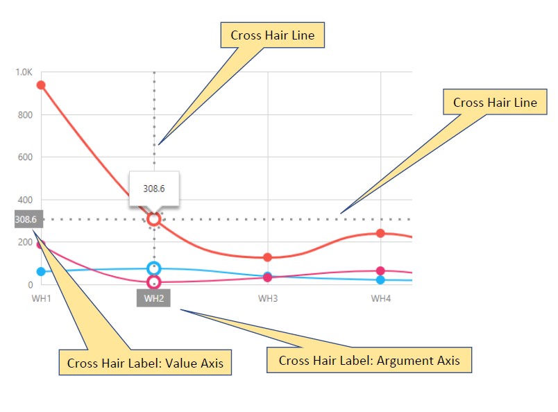
crosshair
Crosshair is a pointer represented by two mutually-crossing lines stretched over the entire chart plot. The crosshair helps a user identify the values of the series points precisely. When enabled, the crosshair follows the cursor and snaps to the nearest series point.
color
Specifies the color of the crosshair lines.
dashstyle
Specifies the dash style of the crosshair lines.
enabled
Enables the crosshair.
label
Configures the crosshair labels. Crosshair labels appear on the chart axes when a user pauses on a series point. They display the argument and the value of this series point.
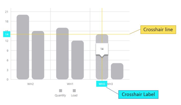
There are two crosshair labels on a chart - one for each crosshair line, and the label property described here configures both. Because the crosshair labels are hidden by default, you need to select the enable property first.
backgroundColor
Specifies the background color of the crosshair label.
font
Specifies the font option for the crosshair’s label
visible
Indicates whether crosshair labels are visible
opacity
Specifies how transparent the crosshair lines should be.
This option accepts a value from 0 to 1, where 0 makes the crosshair lines completely transparent, and 1 makes them opaque.
width
Specifies the width of the crosshair lines.
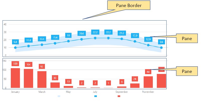
defaultPane
Specifies a default pane for the chart’s series. When there are several panes declared, be sure to specify on which pane each series must be displayed. If a pane is not specified for a series, the series is displayed on a ‘default’ pane. When there is only one pane in the chart, it’ s named ‘default’ and is considered to be the default one.
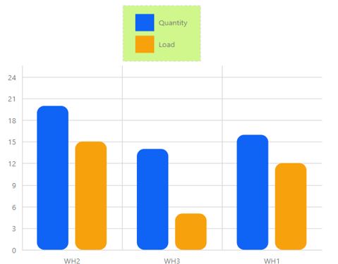
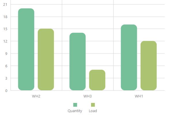
legend
The Chart widget can include a legend - an explanatory component that helps you identify a series. Each series is represented by an item on a legend. An item marker identifies the series color. An item label displays the series title.
backgroundColor
Specifies a color for the legend’s background.
border
Use this property to make a legend’s border visible/invisible and set up such border options as color, width etc.
columnCount
Specify how many columns should be used to organize the legend’s items.
columnItemSpacing
Specifies a blank space between the legend’s columns in pixels.
equalColumnWidth
Specifies whether or not item columns in the legend have an equal width. When this property is not selected, the width of the item column is determined by the longest text. When this property is selected, all item columns have an equal width.
font
Has properties that let you configure font options for the text displayed in the legend.
horizontalAlignment
Specifies a legend’s horizontal position on the chart.
hoverMode
Specifies what series elements to highlight when a corresponding item in the legend is hovered over. When a legend item is hovered over, the corresponding series is highlighted.To prevent this behavior, set the hoverMode property to ‘none’.
itemsAlignment
Specifies the alignment of legend items.
itemTextPosition
Specifies the position of the text relative to the item marker.
margin
Specifies the distance between the legend and surrounding widget elements or container borders in pixels.
markerSize
Specifies the size of item markers in the legend in pixels.
orientation
Specifies whether to place the legend items horizontally or vertically. When this option is set to ‘ vertical ‘, legend items are displayed in a column. When this option is set to ‘ horizontal ‘, legend items are displayed in a row. When this option is not defined, the legend orientation is chosen automatically.
paddingLeftRight
Specifies a blank space between a legend’ s left / right boundaries and the inner item boundaries in pixels.
paddingTopBottom
Specifies a blank space between a legend ‘s top/bottom boundaries and the inner item boundaries in pixels.
position
Specifies whether the legend is located outside or inside the chart’s plot.
rowCount
Specifies how many rows it takes to arrange the legend’s items.
rowitemSpacing
Specifies a blank space between legend rows in pixels.
verticalAlignment
Specifies a legend’s vertical position on the chart.
visible
Specifies the visibility state of the chart’s legend.
margin
Specifies the blank space in pixels between the widget’s extreme elements and the boundaries of the area provided for the widget.
maxBubbleSize
Determines the diameter of the largest bubble in a bubble chart. When defining a bubble series, you are required to specify a size field. The largest size value will be represented on the chart by the largest bubble. Its visual diameter will be calculated by the following formula: d = maxBubbleSize * min(height, width). Normally, the height and width from this formula equal the size of the widget container. However, when several panes are used in the widget, the height and width equal the pane size.
minBubbleSize
Specifies the diameter of the smallest bubble measured in pixels. When defining a bubble series, you are required to specify a size field. The smallest size value will be represented on the chart by the smallest bubble. To set its visual diameter, specify the minBubbleSize option.
onPointClickWidgetFunction
Lets you specify a function to execute when a series point is clicked or tapped. Select OnPointClick to indicate that a series should be highlighted and selected when clicked.
palette
Sets the palette to be used for colorizing series and their elements. This property is overriden by the commonSeriesSettings of the individual series settings.
panes
A pane is a chart area containing series. If there are multiple series in a chart, they can be distributed between multiple panes.
backgroundColor
Specifies the color of the pane’s background.
border
Has options that let you configure the pane’s border.
name
Specifies the name of the pane.
When there are multiple panes in a chart, a series needs to be assigned to a particular pane. By default, a series belongs to the defaultPane. To bind a series to another pane, name the pane and assign this name to the pane property of the series.
pointSelectionMode
Specifies whether a single point or multiple points can be selected at the same time in the chart. Make sure that the onPointClick function is selected for the onPointClickWidgetFunction property.
rotated
Swaps the axes around making the value axis horizontal and the argument axis vertical.
rtlEnabled
Specifies whether or not the widget supports right-to-left representation. The most common scenario is switching all the widgets to a right-to-left reading order.
scrollBar
The scroll bar allows a user to scroll the chart. In order to use the scroll bar, you need to enable the zoomAndPan property in your chart. You can adjust the scroll bar appearance settings, including color, width and opacity.
color
Specifies the color of the scroll bar.
offset
Specifies the spacing between the scroll bar and the chart, in pixel.
opacity
Specifies the opacity of the scroll bar.
position
Specifies the position of the scroll bar in the chart.
visible
Specifies whether the scroll bar is visible or not.
width
Specifies the width of the scroll bar, in pixel.
series
A series represents a grouping of related data points. The most important characteristic of a series is its type, which determines a particular visual representation of data. The options for each series are initially taken from the setup you specified in the chart wizard.
To configure settings that apply to all of your series, see the commonSeriesSettings property.
argumentField
Specifies which data source field provides arguments for the series points.
barPadding
Specifies the padding (width) of all a bar serie. Applies only to bar-type series.
border
Configures a border for the serie in the widget. Only applies to area, bar and bubble series.
color
Specifies a series’ color.
cornerRadius
Makes bars look rounded in bar-like series.
dashStyle
Specifies the dash style of the series’ line.
ignoreEmptyPoints
Prevents the chart from drawing unnecessary gaps between points whena data source has null arguments or values.
label
Specifies options for a series’ label. Each series point can be accompanied by a text label that represents data related to the point.
alignment
Specifies how to align point labels relative to the corresponding data points that they represent.
argumentFormat
Specifies a format for the text displayed in the series’ label.
backgroundColor
Specifies a background color for point labels
border
Specifies border options for point label.
connector
Specifies options to configure the connector that links the label to the series it represents.
font
Specifies font options for the series’ label.
format
Formats the point value before it will be displayed in the point label.
horizontalOffset
Specifies how to shift point labels horizontally from their initial positions.
percentPrecision
Specifies a precision for the percentage values displayed in the labels of a full - stacked - line series.
The property ‘s value must be an integer indicating the number of digits to show in the percentage values displayed in labels.
position
Specifies a label position in a bubble, range-like or bar-like series.
rotationAngle
Specifies the angle used to rotate point labels from their initial position.
showForZeroValue
Specifies whether to show a label when the point has a zero value. Applies to bar-type series.
verticalOffset
Specifies how to shift point labels vertically from their initial positions.
visible
Indicated whether labels are visible.
maxLabelCount
minBarSize
When you display data in a bar-like series with a wide range of values, the low values are often displayed by small bars that are difficult to click, select or hover over. In such cases, use the minBarSize option to set the minimal size of a displayed bar.
opacity
Specifies the opacity for the serie in the widget. Applies to bubble, area, spline, step and range series.
pane
Specifies the pane that will be used to display a series. See also defaultPane and commonPaneSettings.
point
Specifies the options for points in line and area-like series for an individual series. The values that are set individually override their corresponding value configured in the commonSeriesSettings.
rangeValue1Field
Specifies the data source field that provides values for the end of all range series. To set the data source field for the other end of the range series, use the rangeValue2Field property.
rangeValue2Field
Specifies the data source field that provides values for the second end of a range series. To set the data source field for the other end of the range series, use the rangeValue1Field property.
selectionMode
Specifies the series elements to highlight when the series is selected.
seriesSelectionMode
Specifies whether a single series or multiple series can be selected in the chart.
showInLegend
Specifies whether to show the series in the chart’s legend.
type
Sets the series’ chart type. Usually, this is done through the Chart Wizard, but you can select a new value through the drop-down menu.
valueErrorBar
Allows the configuration of error bars that indicate the uncertainty of a reported measurement.
This property only works for numeric axes using the area, bar, line, spline or step series.
visibility
Specifies the visibility of a serie. When this option is unchecked, the serie appears invisible.
width
Specified the width of the lines in a line-type series.
seriesTemplate
Defines options for the series template. A series template lets you specify exactly which data you want to display and can be used when you don’t knowhow many series will be added to your data source.
customizeSeries with individual settings.
Specifies a function that returns a serie’s object
nameField
Specifies a data source field that represents the series name.
size
Specifies the size of the widget in pixels if you want it to be different than the one from its container. The widget occupies the entire area of the container. If the container’s size (width or height) is set to zero, the widget is not displayed. If you need to set a particular size for the widget, use the size configuration properties.
synchronizedMultiAxes
Indicates whether or not to synchronize value axes when they are displayed on a single pane. When synchronized, the ticks (or grid lines) of all the value axes in a pane are located on the same line.
tooltip
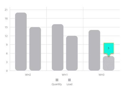
A tooltip is a small pop-up rectangle that displays information about a series point when you hover over them.
argumentFormat
Use this property to set a format for arguments when they are displayed in tooltips.
argumentPrecision
Specifies a precision for formatted arguments displayed in tooltips.This property ‘s value must be an integer indicating how many digits to show in the argument displayed in tooltips. This property value is considered when tooltips display arguments in one of the following numeric formats: ‘ fixedPoint ‘, ‘ exponential ‘, ‘ currency ‘, ‘ percent ‘.
arrowLength
Specifies the length of the tooltips’ arrow, in pixels.
border
Specifies the appearance of the tooltip’s border.
color
Specifies a color for the chart’s tooltips.
enabled
Specifies whether or not tooltips are enabled in the chart.
format
Specifies a format for the text displayed in crosshair labels.
font
location
Specifies whether the tooltip must be located in the center of a bar or on its edge. Applies only to the Bar series.
opacity
Specifies the opacity of tooltips.
paddingLeftRight
Specifies the blank space between a tooltip’s left/right boundaries and the inner text, in pixels.
paddingTopBottom
Specifies the blank space between a tooltip’s top/bottom boundaries and the inner text, in pixels.
shared
Specifies the kind of information to display in a tooltip. By default, a tooltip displays information about the currently hovered series point. If you select the shared option, the tooltip will display information about all the points that have the same argument as the hovered point at once.
shadow
Specifies options of the tooltip’s shadow.
blur
Specifies the blur of a tooltip’s shadow.
color
Color a tooltip’s shadow
offsetX
Indicates the horizontal offset of a tooltip’s shadow, in pixel.
offsetY
Indicates the vertical offset of a tooltip’s shadow, in pixel.
opacity
Specifies the opacity of a tooltip’s shadow. Accept a value between 0 and 1, where 0 is transparent and 1 is opaque.
valueAxis
Properties that let you configure the value axis (horizontal axis) for individual axis. Used in Setting up Constant Lines in Bar Graphs and Line Charts.
axisDivisionFactor
Specifies the minimum distance between major grid lines (also called tick) in pixel. By default, the argument axis is divided so that the labels do not overlap each other. This property does not apply if your are using string labels.
Categories
Specifies the order in which argument of the string type appear. There should be one subproperty for each argument value that you want to order.
To create more subcategories, click on the ‘copy property’ button.
color
Specifies the color of the value axis.
constantLine
Creates a constant line on the value axis. The aspect configured in this property overwrites the appearance configured in the constantLineStyle property.
This property only works with logarithm type axis.
constantLineStyle
Specifies the appearance of all the constant lines belonging to the value axis.
endOnTick
Specifies whether to force the axis to start and end on ticks.
discreteAxisDivisionMode
Specifies whether the grid lines (ticks) of an axis with string values are located between labels or cross the labels. When a discrete axis is divided, its ticks/grid lines are located between labels by default.
grid
A grid is a set of vertical and horizontal lines that span throughout the entire chart to improve its readability. The following properties apply to the horizontal lines of the grid. To change the vertical lines, see the grid property in the argumentAxis section.
color
Indicates the color of the horizontal lines of the grid.
opacity
Indicates the opacity of the horizontal lines of the grid.
visible
Indicated whether or not the horizontal lines of the grid are visible.
width
Indicates the width of the horizontal lines of the grid.
Inverted
Specifies whether the axis is inverted. When an axis is inverted, the top and bottom values are reversed.
label
Configures the labels of the value axis.
alignment
Aligns axis labels in relation to major grid lines (ticks).
format
Formats the type of a value before it is displayed and specifies the precision to use for the formatted value. Does not apply to string values.
indentFromAxis
Specifies the spacing between an axis and it’s labels, in pixels.
overlappingBehavior
Specifies how to resolve overlapping labels on the value axis, when your chart is rotated. Overlapping behavior can only be corrected for axis in the horizontal position.
mode
Specifies the overlap resolving algorithm to be applied to the series point labels.
rotationAngle
Specifies the angle used to rotate axis labels to resolve overlap.
staggeringSpacing
Specifies the spacing that must be set between staggered rows when the ‘stagger’ algorithm is applied to resolve label overlap.
visible
Indicates whether the labels of the value axis are visible.
logarithmBase
By default, ticks on a numerical axis are generated on a base of 10, i.e., 0.1, 1, 10, 100, 1000 etc., but you can specify a different base. For example, if you set this option to 5, the ticks will be generated like this: 0.5, 5, 25, 125, 625, etc.
NOTE: The value assigned to the logarithmBase option should be greater than 1.
maxValueMargin
Specifies how much to expand the axes from the max value. This is helpful when you need to display a series with indents from the axes.
Since this property value is a coefficient, you can set a value for the axis expansion without knowledge of the actual axis values. The resulting end axis value is calculated using the following formula: max + (max - min)*maxValueMargin. Assume that the minimum value is 40 and the maximum value is 200. If you set maxValueMargin to 0.1, the resulting end axis value will be 216.
minorGrid
In addition to the major grid built on major ticks, the chart widgets provide a minor grid that is built on minor ticks.
color
Specifies the color of the minor grid’s lines.
opacity
Specifies an opacity for the lines of the minor grid.
visible
Specifies whether the minor grid is visible or not.
width
Specifies the width of the minor grid’s lines.
minorTick
Specifies the options of the minor ticks. In addition to major ticks, the chart widget provides the capability to draw minor ticks. Minor ticks divide an axis segment that lies between two neighboring major ticks. To specify how to generate minor ticks, use the minorTickInterval or minorTickCount options.
color
Specifies a color for the minor ticks.
length
Specifies a length for the minor ticks.
opacity
Specifies the opacity of the minor ticks.
visible
Indicates whether or not the minor ticks are displayed on an axis.
width
Specifies a width for the minor ticks.
minorTickCount
Specifies the number of minor ticks between two neighboring major ticks. Does not work for string values.
NOTE: If you set both the minorTickCount and the minorTickInterval options, the minorTickCount option will be ignored.
minorTickInterval
Specifies the interval between minor ticks.
To divide a lengthy chart axis into shorter segments, major and minor ticks are used. Minor ticks are required when major ticks are far from each other. If this option is not set, minor ticks are arranged automatically.
NOTE: The minorTickInterval option can be applied to a continuous axis only. For logarithmic axes, use the minorTickCount option.
minValueMargin
Specifies how much to expand the axes from the min value. This is helpful when you need to display a series with indents from the axes.
Since this property value is a coefficient, you can set a value for the axis expansion without knowledge of the actual axis values. The resulting end axis value is calculated using the following formula: min - (max - min) * minValueMargin. Assume that the minimum value is 40 and the maximum value is 200. If you set minValueMargin to 0.1, the resulting end axis value will be 24.
multipleAxesSpacing
Specifies the empty space in pixel that should be displayed between side-by-side value axes.
name
Specifies the name of the value axis. This is usefull when there are multiple value axes in a chart and series need to know exactly which axis they are bound to. To bind a series to another axis, name the axis and assign this name to the axis series property.
opacity
Specifies the opacity of the line that represents the value axis.
placeholderSize
Specifies, in pixels, the space reserved for an axis. The scale’s height includes the space occupied by the axis labels, axis line and the space between the axis labels and axis line.
position
Specifies the position of the value axis on the chart.
Accepted Value
right
left
setTicksAtUnitBeginning
DEPRECATED use tickInterval under the valueAxis property instead.
Specifies whether date-time values should be rounded off to the nearest tick internal. Applies only to axes of the continuous (numeric or date-time) type arguments.
showZero
Specifies whether the number 0 should be displayed on the value Axis.
strips
Strips are the highlighted areas in a chart within the defined range of values (minimum and maximum) for an axis to which they belong. In general, strips are used to visually represent a range of values behind a series to trace whether the series points’ values fall in or out of that range.
stripStyle
An object defining configuration options for strip style. Strips are the highlighted areas of a chart within a defined range of values (maximum and minimum) for an axis to which they belong. In general, strips are used to visually represent a range of values behind a series, to trace whether the series point values fall in or out of that range.
synchronizedValue
Synchronizes multiple axis with each other at a given value. This option adds an extra tick on the value axis for all the series in your widget, synchronizing the axes with each other.
Note: If used with a full-stack series, this option only recognize value from 0 to 1, where 0 denotes 0% and 100 denotes 100%.
tick
Ticks divide an axis into equal sections by a step whose value is determined automatically, or by the tickInterval or axisDivisionFactor options. Ticks improve the readability of charts, but are not visible by default in the chart widget.
tickInterval
Specifies an interval between axis grid lines.If this option is not set, ticks are automatically arranged so that their labels do not overlap each other.
In case of a numeric axis, assign a numeric value to this option. If the axis is of the date-time type, assign one of the predefined string values or an object to this option.
title
Specifies the title for the value axis, its format and its position.
type
Specifies the required type of the value axis.
discrete
Required when string arguments are used in the data source. The discrete axis is divided by the values that are specified as arguments in the data source.
If you require a discrete axis when numeric or date-time arguments are specified in the data source, set the type option to ‘discrete’ explicitly.
continuous
Required when numeric or date-time arguments are used in the series’ data source. The continuous axis is divided automatically.
For this type, ticks and grid lines are positioned so that their labels do not overlap each other.
logarithmic
The ‘logarithmic’ type can be set when numeric values are specified in the series data source.
For this type, ticks and grid lines are positioned so that their labels do not overlap each other.
valueMarginsEnabled
Indicates whether to display series with indents from axis boundaries.
valueType
Casts value to a specified data type.
visible
Indicates whether the line that represent the value axis is visible.
visualRange
Specifies the axis’ displayed range.
endValue
The end value that should be displayed at the chart’s end, regardless of the data value.
startValue
The start value that should be displayed at the chart’s start, regardless of the data value.
visualRangeUpdateMode
Specifies whether the visualRange behavior should be kept when the widget is updated. Set this property to ‘keep’
auto
The mode changes depending on the visual range’s position on the axis.
keep
The visual range does not change. Choose this option to maintain the values configured when refreshing the widget or changing the date value through the date ribbon.
reset
Configures the visual range to equal the whole range.
shift
Configures the visual range to move to the axis’ end.
width
Specifies the width of the line that represents the value axis in the chart.
wholeRange
Specifies the ranges where the axis can be zoomed and panned.
endValue
The end value for the range.
startValue
The start value for the range.
zoomAndPan
This option allows you to control the zooming and panning capabilities in your chart. By default, this capability is off and must be selected for either the argument or the value axis, or both. You can define the range within which zooming and panning is allowed under the wholeRange property.
allowMouseWheel
Specifies if users can use the mouse wheel to zoom on the chart. This is usefull if your widget is seen on a computer screen.
allowTouchGestures
Specifies if users can use touch gestures to zoom or pan the chart. This is usefull if your widget is seen on a mobile device.
argumentAxis
Specifies whether users can use zoom or pan on the argument axis.
dragBoxStyle
Configures a box that appears when a user zooms on the chart by selecting an area with the drag gesture.
Only applies if dragToZoom is used.
dragToZoom
Allows users to zoom in the chart by selecting an area with the drag gesture.
This only applies if allowMouseWheel is selected.
Available option:
alt
ctrl
meta
shift (default)
panKey
Specifies which key should be use to trigger panning. This property only applies if dragToZoom and allowMouseWheel is selected.
valueAxis
Specifies whether users can use zoom or pan on the value axis.
Behavior
adaptiveLayout
Specifies adaptive layout options. When your scenario provides the capability to change the size of the widget container, this container may become too small for the widget to display all of its elements. In this case, the adaptive layout removes accessory widget elements, thus saving space for the most important ones. The elements are being removed in the following sequence.
adjustOnZoom
Specifies whether the value axis should be adjusted when zooming the widget.
animation
Has options that let you specify how the gauge indicator is animated.
duration
Determines how long the animation runs in miliseconds.
enabled
Whether animation is enabled.
easing
Specifies the type of animation easing.
Available options:
easeOutCubic
linear
maxPointCountSupported
Specifies how many series point the widget should display before the animation ends. When there is a very large number of series points, animation reduces the chart’s performance. So, it is better to set an optimal number for the chart to disable animation when the point count exceeds this number.
dataPrepareSettings
Processes data before visualizing it.
checkTypeForAllData
Specifies whether each data source should be checked before being displayed. This is usefull if your data source has different data type, but you wish to display it in the same axis.
Selecting this property affects the performance of your widget. To cast arguments to a specified data type, see argument type under the argument axis property or value type under the value axis property.
convertToAxisDataType
Specifies whether or not to convert the values from a data source into the data type of an axis. If this option is selected, all data source values will be converted from their initial type into the data type of an axis. To specify the axis data type, use the argumentType or valueType option of the argumentAxis or valueAxis object respectively. If the axis data type is not specified explicitly, it will be determined automatically on the base of the first data source value.
sortingMethod
Specifies the sorting order in which series points should be drawn. if the series’ type is String, the categories property overrides the sorting method.
export
Configures the exporting and printing features of the widget. These features allow a user to export your widget into a document and print it. When exporting is enabled, the ‘export’ button appears in the widget. A click on it invokes a drop-down menu containing a list of available formats for exporting into.
loadingIndicator
Specifies the appearance of the loading indicator. Usually, the widget is quick enough to draw itself instantly for a viewer. There are, however, cases, when the widget takes longer to be drawn. In such cases, displaying the loading indicator is recommended. To display the loading indicator, select the ‘show’ option and select it.
backgroundColor
Specifies a color for the loading indicator background.
font
show
Specifies whether to show the loading indicator or not.
text
Specifies a text to be displayed by the loading indicator.
redrawOnResize
Specifies whether to redraw the widget when the size of the browser window changes or a mobile device rotates.
Design
commonSeriesSettings
Specifies settings common for all series in the chart. These properties are overridden by individual series settings. To change individual series settings, see the series property.
aggregation
Specifies whether to filter the series points depending on their quantity. By default, a chart displays all series points, but to improve performance you may want to aggregate the series points rather than display them all.
argumentField
Specifies which data source field provides arguments for the argument field. This is usually set up in the chart wizard.
argumentType
Specifies the desired type for the argument. The type of the values is determined based on the type in the corresponding data source. If arguments are specified as numeric values in a series data source, the argument axis values will also be of the numeric type. The same logic is used when string or date-time arguments are specified in the data source. In some scenarios, you may need the type of the arguments that are specified in the data source to be converted to another type.
border
Configurs a border for the chart.
color
Specifies a color for all the series in a widget.
hoverMode
Specifies the elements that will be highlighted when the argument axis is hovered over for all the series in the widget. The hoverMode property of the series property overrides this configuration.
hoverStyle
Specifies the style of an hovered series.
label
Configures the label of the pie chart.
argumentFormat
Format the point argument before it is displayed in the point label.
backgroundColor
Specifies the color for the point label’s background.
border
Specifies the border for the point labels.
connector
Specifies the connector options for the series point labels.
font
Specifies the font options for the text displayed in the point labels.
format
Specifies the value format before it is displayed in a point label.
position
Specifies the position of the label on the chart.
radialOffset
Specifies how to shift labels from their initial position in a radial direction in pixels.
rotationAngle
Specifies the angle used to rotate point labels from their initial position.
visible
Specifies whether the point labels are visible.
maxLabelCount
Specifies the maximum number of labels that can be displayed for a the series if that series has a large number of points. If the number of the points on a series exceeded the number assigned to the maxLabelCount field, the point labels for this series will not be displayed.
minSegmentSize
Specifies a minimal size of a displayed pie segment.
selectionMode
Specifies the chart elements to highlight when the series is selected.
selectionStyle
Specifies options for the series when it is selected.
smallValuesGrouping
Specifies chart segment grouping options. Use this property if you need to group specific chart segments into one.
groupName
Specifies the name of the groups chart segment.
mode
Specifies the segment grouping mode.
topN: Groups all segments that have an index that is equal to or greater than the value of the topCount option.
smallValueThreshold: Groups all segments with a value less than the value indicated in the threshold option.
threshold
topCount
tagField
Specifies the name of the data source field that provides extra information about a data point.
valueField
Specifies the data source field that provides values for series points.
customizeLabelWidgetFunction
Specifies a function that customizes the appearance of a point label.
customizePointWidgetFunction
Specifies a function that customizes the appearance of a series point.
diameter
Specifies the diameter of the pie. This option accepts a number that identifies the ratio between the pie’s diameter and the container’s width or height using the following equation: 0.5 * min(300,500) = 0.5 * 300
For example, if the widget’s size is 300x500 pixels and the diameter option is set to 0.5, the resulting diameter of the pie will be 150 pixels.
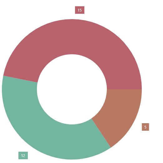
innerRadius
Specifies the fraction of the inner radius relative to the total radius in the series of the ‘donut’ type. The value should be between 0 and 1.
To change the type of circular widget, open the type property of the series.
legend
Specifies the chart’s legend option - an explanatory component that helps you identify a series. Each series is represented by an item on a legend. An item marker identifies the series color. An item label displays the series title.
backgroundColor
Specifies a color for the legend’s background.
border
Use this property to make a legend’s border visible/invisible and set up such border options as color, width etc.
columnCount
Specify how many columns should be used to organize the legend’s items.
columnItemSpacing
Specifies a blank space between the legend’s columns in pixels.
customizeHintWidgetFunction
Specifies a function that determines the text that appears as a hint when a user hovers the mouse pointer over a legend item.
customizeTextWidgetFunction
Specifies a function that determines the text to be displayed by a legend item.
font
Has properties that let you configure font options for the text displayed in the legend.
horizontalAlignment
Specifies a legend’s horizontal position on the chart. To specify the vertical position, see verticalAlignment.
hoverMode
Specifies whether series element should be highlighted in the chart when you hover over a legend’s item. To change the appearance of the highlighted series, change the hoverStyle property under commonSeriesSettings or series.
itemsAlignment
Specifies the alignment of legend items in the last column or row. This property only applies when legend items are not divided into columns or rows equally.
itemTextPosition
Specifies the position of the text relative to the item marker.
margin
Specifies the distance between the legend and surrounding widget elements or container borders in pixels.
markerSize
Specifies the size of item markers in the legend in pixels.
orientation
Specifies whether to place the legend items horizontally or vertically. When this option is not defined, the legend orientation is chosen automatically.
paddingLeftRight
Specifies a blank space between a legend’s left/right borders and its items, in pixel.
paddingTopBottom
Specifies a blank space between a legend’s top/bottom and its items, in pixel.
rowCount
Specifies how many rows it takes to arrange the legend’s items.
rowitemSpacing
Specifies a blank space between legend rows in pixels.
verticalAlignment
Specifies a legend’s vertical position on the chart. To specify the horizontal position, see horizontalAlignment
visible
Specifies whether the chart’s legend is visible.
margin
Specifies the blank space around the widget, in pixels.
onPointClick
A function that is executed when a series point is clicked or tapped.
onPointClickHoverChanged
A function that is executed after the pointer enters or leaves a series point.
onPointSelectionChanged
A function that is executed when a series point is selected or selection is canceled.
palette
Sets the palette to be used for colorizing series and their elements.
pointSelectionMode
Specifies whether a single point or multiple points can be selected in the chart.
rtlEnabled
Specifies whether or not the widget supports right-to-left representation. The most common scenario is switching all the widgets to a right-to-left reading order.
segmentDirection
Specifies the direction that the pie chart segments will occupy.
series
Specifies settings for a series in the chart. To configure series properties that apply to all the series, see the commonSeriesSettings property.
argumentField
Specifies which data source field provides arguments for the argument field. This is usually set up in the chart wizard.
argumentType
Specifies the desired type for the argument. The type of the values is determined based on the type in the corresponding data source. If arguments are specified as numeric values in a series data source, the argument axis values will also be of the numeric type. The same logic is used when string or date-time arguments are specified in the data source. In some scenarios, you may need the type of the arguments that are specified in the data source to be converted to another type.
border
Configures a border for the series.
color
Specifies a color for the serie.
hoverMode
Specifies the elements that will be highlighted when the argument axis is hovered over.
hoverStyle
Specifies the style of an hovered series.
label
Configures the label of the pie chart.
argumentFormat
Format the point argument before it is displayed in the point label.
backgroundColor
Specifies the color for the point label’s background.
border
Specifies the border for the point labels.
connector
Specifies the connector options for the series point labels.
customizeText
font
Specifies the font options for the text displayed in the point labels.
format
Specifies the value format before it is displayed in a point label.
name
Specifies a name for the series.
position
Specifies the position of the label on the chart.
radialOffset
Specifies how to shift labels from their initial position in a radial direction in pixels.
rotationAngle
Specifies the angle used to rotate point labels from their initial position.
type
Specifies whether the circular chart should appear as a pie or a donut.
visible
Specifies whether the point labels are visible.
maxLabelCount
Specifies the maximum number of labels that can be displayed for a the series if that series has a large number of points. If the number of the points on a series exceeded the number assigned to the maxLabelCount field, the point labels for this series will not be displayed.
minSegmentSize
Specifies a minimal size of a displayed pie segment.
selectionMode
Specifies the chart elements to highlight when the series is selected.
selectionStyle
Specifies options for the series when it is selected.
smallValuesGrouping
Specifies chart segment grouping options. Use this property if you need to group specific chart segments into one.
groupName
Specifies the name of the groups chart segment.
mode
Specifies the segment grouping mode.
topN: Groups all segments that have an index that is equal to or greater than the value of the topCount option.
smallValueThreshold: Groups all segments with a value less than the value indicated in the threshold option.
threshold
Specifies a threshold for segment values. All segments with a value less than the threshold will be grouped into the “others” segment.
topCount
Specifies how many segments must not be grouped.
tagField
Specifies the name of the data source field that provides extra information about a data point.
valueField
Specifies the data source field that provides values for series points.
size
Specifies the height and width of the widget in pixels.
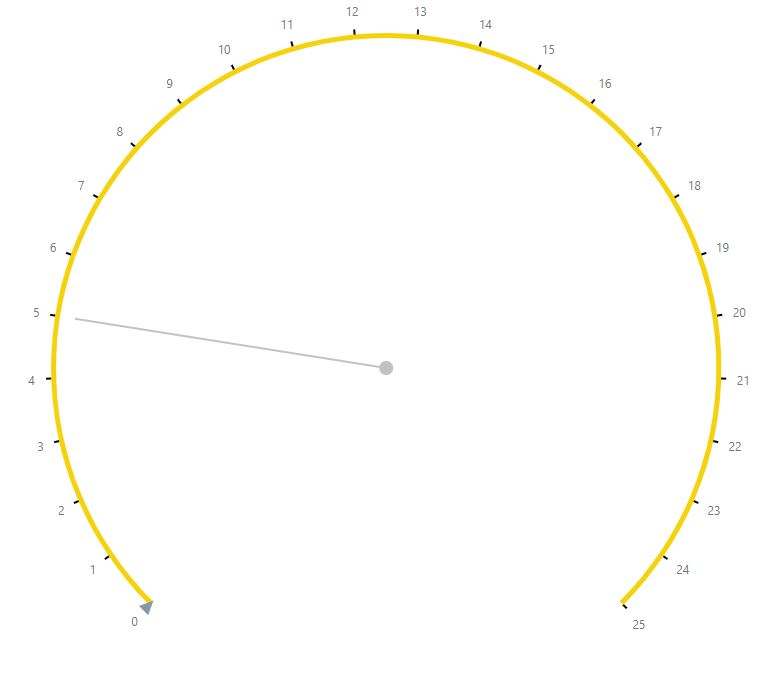
startAngle
Specifies a start angle for a pie chart in arc degrees.
tooltip
A tooltip is a small pop-up rectangle that displays information about a series point when you hover over them.
argumentFormat
Specifies the format of the point argument before it is displayed.
argumentPrecision
DEPRECATED use argumentFormat instead.
Specifies a precision for formatted arguments displayed in tooltips.
arrowLength
Specifies the length of the tooltips’ arrow, in pixels.
border
Specifies the appearance of the tooltip’s border.
color
Specifies a color for the chart’s tooltips.
customizeTooltipWidgetFunction
Specifies a function that customizes the appearance of the tooltip.
enabled
Specifies whether or not tooltips are enabled in the chart.
font
Specifies the appearance of the tooltip’s text.
format
Specifies the format of a tooltip before it is displayed.
opacity
Specifies the opacity of tooltips.
paddingLeftRight
Specifies the blank space between a tooltip’s left/right boundaries and the inner text, in pixels.
paddingTopBottom
Specifies the blank space between a tooltip’s top/bottom boundaries and the inner text, in pixels.
shadow
Specifies options of the tooltip’s shadow.
blur
Specifies the blur of a tooltip’s shadow.
color
Color a tooltip’s shadow
offsetX
Indicates the horizontal offset of a tooltip’s shadow, in pixel.
offsetY
Indicates the vertical offset of a tooltip’s shadow, in pixel.
opacity
Specifies the opacity of a tooltip’s shadow. Accept a value between 0 and 1, where 0 is transparent and 1 is opaque.
Behavior
adaptiveLayout
Specifies adaptive layout options. When your scenario provides the capability to change the size of the widget container, this container may become too small for the widget to display all of its elements. In this case, the adaptive layout removes accessory widget elements, thus saving space for the most important ones. The elements are being removed in the following sequence.
animation
Has options that let you specify the widget’s animation.
duration
Determines how long the animation runs in miliseconds.
easing
Specifies the type of animation easing.
Available options: * easeOutCubic * linear
enabled
Whether animation is enabled.
maxPointCountSupported
Specifies how many series point the widget should display before the animation ends. When there is a very large number of series points, animation reduces the chart’s performance. So, it is better to set an optimal number for the chart to disable animation when the point count exceeds this number.
export
Configures the exporting and printing features of the widget. These features allow a user to export your widget into a document and print it. When exporting is enabled, the ‘export’ button appears in the widget. A click on it invokes a drop-down menu containing a list of available formats for exporting into.
loadingIndicator
Specifies the appearance of the loading indicator. Usually, the widget is quick enough to draw itself instantly for a viewer. There are, however, cases, when the widget takes longer to be drawn. In such cases, displaying the loading indicator is recommended. To display the loading indicator, enable the show option.
backgroundColor
Specifies a color for the loading indicator background.
font
Specifies the font options for the loading indicator.
show
Specifies whether to show the loading indicator or not.
text
Specifies a text to be displayed by the loading indicator.
redrawOnResize
Specifies whether to redraw the widget when the size of the browser window changes or a mobile device rotates.
resolveLabelOverlapping
Specifies how the chart must behave when series point labels overlap. Series point labels display series point values. If the series in your pie chart contains a large number of points, point labels may overlap. In this case, specify how the chart must resolve overlapping using the resolveLabelOverlapping option. To hide certain labels, set this option to ‘hide’. Labels to be hidden will be determined automatically. To resolve overlapping by shifting labels from their positions, set the resolveLabelOverlapping option to ‘shift’. In this case, we recommend displaying label connectors so that pie segments are connected with their labels.
NOTE: If there is not enough space for all labels after they are shifted, labels with the smallest values will be hidden.
Design
geometry
Specifies the options required to set the geometry of a Circular Gauge widget. Specify the startAngle and endAngle options to customize the shape of the circular gauge’s arc. Used in How do I set up a Circular Gauge to be a half circle?.
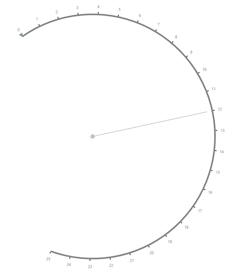
endAngle
Specifies the end angle of the circular gauge’s arc.
startAngle
Specifies the start angle of the circular gauge’s arc.
margin
Specifies the blank space in pixels around the widget.
rangeContainer
Used only for Circular Gauge widgets.
You can combine values into ranges and color each range differently. You can also specify the orientation of the ranges. Used in Setting Up Color Ranges for Gauges.
backgroundColor
Specifies a range container’s line color to show behind ranges if their size differs from the scale’s size.
offset
Specifies the offset of the range container in pixels.
orientation
This property specifies the range container’s orientation in relation to the gauge.
palette
Sets the palette of colors to be used for coloring the gauge range container. Use this option to set a predefined or custom palette. If the number of the ranges is greater than the number of colors in the palette, palette colors are repeated, but slightly modified. You can override the color of an individual range by specifying a color option of this specific range in the range property.
ranges
Ranges allow you to mark certain value ranges in the gauge. Visually, the ranges are displayed as bars along scales. Each range is denoted by a number under the ranges property. Specify a start value, an end value and a color for each range.
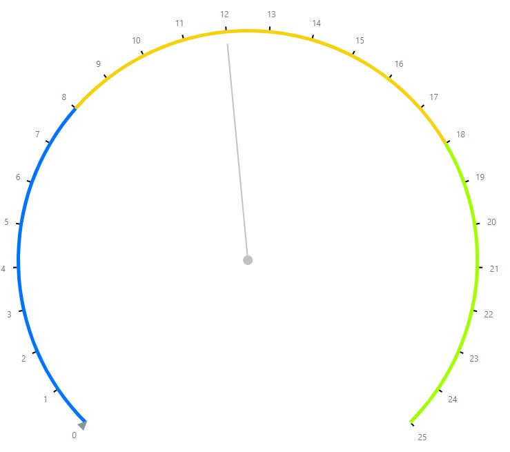
color
Specifies a color of a range.
endValue
Specifies an end value of a range.
startValue
Specifies a start value of a range.
width
Specifies the range container’s width in pixels.
scale
Specifies a gauge’s scale options. To divide a scale, set its startValue and endValue properties. The scale’s major and minor ticks will be calculated automatically, so that the tick labels do not overlap each other. Major ticks are shown by default.
customMinorTicks
Specifies an array of custom minor ticks.
customTicks
Specifies an array of custom major ticks.
endValue
Specifies the end value for the scale of the gauge. This is usually configured in the widget builder.
horizontalOrientation
Specifies the orientation of scale ticks. Applies only for Linear Gauge.
label
Specifies common options for scale labels. Scale labels represent textual values for major scale ticks.
customTextWidgetFunction
Specifies a function to use to display the labels.
font
Specifies font options for the text displayed in the scale labels of the gauge.
format
Specifies a format for the text displayed in scale labels.
indentFromTick
Specifies the spacing between scale labels and ticks.
overlappingBehavior
Specifies the overlap resolving options to be applied to scale labels when your widget displays a lot of values.
Available options:
hideFirstOrLast
useAutoArrangement
useRangeColors
Specifies whether or not scale labels should be colored similarly to their corresponding ranges in the range container. To paint all scale labels in a single color, use the color option of the font object.
visible
Specifies whether or not scale labels are visible on the gauge.
minorTick
Specifies options of the gauge’s minor ticks. Minor ticks are calculated automatically based on the scale’s startValue and endValue.
minorTickInterval
Specifies an interval between minor ticks. Minor ticks are the intermediate ticks between major ticks. If this property is not set, minor ticks are arranged automatically.
orientation
Specifies the orientation of scale ticks. Applies to Circular Gauge only.
startValue
Specifies the start value for the scale of the gauge.
scaleDivisionFactor
Specifies the minimum distance between major ticks in pixel when you don’t know what the scale’s measurement units are. Otherwise, use tickInterval.
tick
Specifies options of the gauge’s major ticks. Major ticks are calculated automatically based on the scale’s startValue and endValue. They are visible by default.
tickInterval
Specifies an interval between ticks. If this property is not set, major ticks are automatically arranged so that labels do not overlap each other.
verticalOrientation
Specifies the orientation of scale ticks. Apples only to Linear Gauge.
size
Specifies the size of the widget in pixels. The widget occupies the entire area of the parent container. If the container size (width or height) is set to zero, the widget is not displayed.
subvalue
Specifies a set of subvalues to be designated by the subvalue indicators. Each value should be separated by a comma.
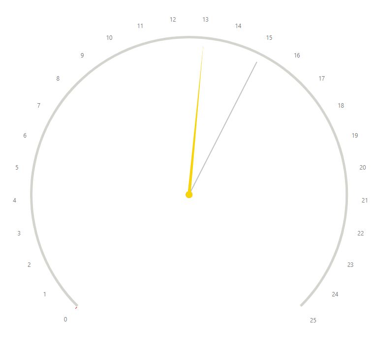
subvalueIndicator
The Gauge widget can display one main value and several subvalues. The subvalue indicator is a pointer which designates a fixed value on a scale. It applies to
backgroundColor
Specifies the background color for the indicator of the rangeBar type.
baseValue
Specifies the base value for the indicator of the rangeBar type.
color
Specifies the color of the subvalue indicator.
indentFromCenter
Specifies the distance between the needle and the center of a gauge for the indicator of a needle-like type.
offset
Specifies the distance between the indicator and the invisible scale line.
secondColor
Specifies the second color for the indicator of the twoColorNeedle type.
secondFraction
Specifies the length of a twoNeedleColor type indicator tip as a percentage.
size
Specifies the range bar size for an indicator of the rangeBar type.
spindleGapSize
Specifies the inner diameter in pixels, so that the spindle has the shape of a ring. Applies to twoColorNeedle, resctangleNeedle and triangleNeedle type.
spindleSize
Specifies the spindle’s diameter in pixels for the indicator of a needle-like type. Applies to twoColorNeedle, resctangleNeedle and triangleNeedle type.
text
Specifies the appearance of the text displayed in an indicator of the rangeBar type.
type
Specifies the type of subvalue indicators.
width
Specifies the width of an indicator in pixels.
tooltip
A tooltip is a small pop-up rectangle that displays information about a series point when you hover over the value indicator.
arrowLength
Specifies the length of the tooltips’ arrow, in pixels.
border
Specifies the appearance of the tooltip’s border.
color
Specifies a color for the chart’s tooltips.
customizeTooltip
Allows you to change the appearance of specified tooltips.
enabled
Specifies whether or not tooltips are enabled in the chart.
format
Specifies a format for the text displayed in crosshair labels.
font
Specifies font options for the tooltip.
opacity
Specifies the opacity of tooltips.
paddingLeftRight
Specifies the blank space between a tooltip’s left/right boundaries and the inner text, in pixels.
paddingTopBottom
Specifies the blank space between a tooltip’s top/bottom boundaries and the inner text, in pixels.
shadow
Specifies options of the tooltip’s shadow.
blur
Specifies the blur of a tooltip’s shadow.
color
Color a tooltip’s shadow
offsetX
Indicates the horizontal offset of a tooltip’s shadow, in pixel.
offsetY
Indicates the vertical offset of a tooltip’s shadow, in pixel.
opacity
Specifies the opacity of a tooltip’s shadow. Accept a value between 0 and 1, where 0 is transparent and 1 is opaque.
rtlEnabled
Inverses the widget’s right and left components.
values
Specifies the main value on a gauge. The main value is designated by the value indicator. You can obtain and change the gauge value at runtime.
valueField
Specifies the data field providing the value on the gauge. This is usually configured in the Widget Builder. To specify other values, see the subvalues property.
valueIndicator
Specifies the appearance options of the value indicator.
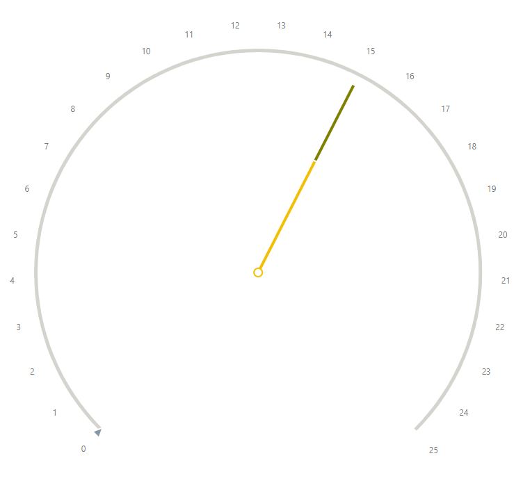
backgroundColor
Specifies the color for the indicator’s background of the rangeBar type.
baseValue
Specifies the start value for the indicator of the rangeBar type.
color
Specifies the color of the subvalue indicator.
indentFromCenter
Specifies the distance between the needle and the center of a gauge for the indicator of a needle-like type.
offset
Specifies the distance between the indicator and the invisible scale line.
secondColor
Specifies the second color for the indicator of the twoColorNeedle type.
secondFraction
Specifies the length of a twoNeedleColor type indicator tip as a percentage.
size
Specifies the range bar size for an indicator of the rangeBar type.
spindleGapSize
Specifies the inner diameter in pixels, so that the spindle has the shape of a ring. Applies to twoColorNeedle, resctangleNeedle and triangleNeedle type.
spindleSize
Specifies the spindle’s diameter in pixels for the indicator of a needle-like type. Applies to twoColorNeedle, resctangleNeedle and triangleNeedle type.
text
Specifies the appearance of the text displayed in an indicator of the rangeBar type.
type
Specifies the type of value indicator. The options available for a Circular Gauge differ from those available for a Linear Gauge.
Accepted Values for Linear Gauge:
rectangle
circle
rhombus
rangeBar
Accepted Values for Circular Gauge:
rectangleNeedle
triangleNeedle
twoColorNeedle
rangeBar
triangleMarker
textCloud
width
Specifies, in pixels, the width for a value indicator of a needle-like type.
verticalOrientation
Specifies the orientation of a rangeBar indicator.
Behavior
animation
Has options that let you specify how the gauge indicator is animated.
duration
Determines how long the animation runs in miliseconds.
enabled
Whether animation is enabled.
easing
Specifies the type of animation easing.
Available options:
easeOutCubic
linear
export
Configures the exporting and printing features. These features allow a user to export your widget into a document and print it. When exporting is enabled, the ‘export’ button appears in the widget. A click on it invokes a drop-down menu containing a list of available formats for exporting into.
Available properties:
backgroundColor
enabled
fileName
formats
printingEnabled
loadingIndicator
Specifies the appearance of the loading indicator. Usually, the widget is quick enough to draw itself instantly for a viewer. There are, however, cases, when the widget takes longer to be drawn. In such cases, displaying the loading indicator is recommended. To display the loading indicator, enable the show option.
backgroundColor
Specifies a color for the loading indicator background.
font
Specifies font options for the loading indicator.
text
Specifies a text to be displayed by the loading indicator.
show
Specifies whether to show the loading indicator or not.
redrawOnResize
Specifies whether to redraw the widget when the size of the browser window changes or a mobile device rotates.
Design
autoGroupColumnDef
Specifies the column def that should be displayed as the first column when grouping is applied.
columnDefs
Has options that let you configure and manage each column in the grid. Each column is denoted by a number under the columnDefs property. To configure properties that apply to all the columns
aggFunc
Specifies the aggreagtion function to use.
Specifies a built-in function used to aggregate the column together.
Available options:
sum
min
max
count
avg
first
last
cellRendererWidgetFunction
Specifies how to render data in a cell if you od not want to use the default setting. By default, data in cells are rendered as strings.
cellStyle
This property configures the appearance of the cells of a column.
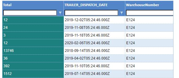
checkboxSelection
Select this property to render a selection checkbox in the columns.
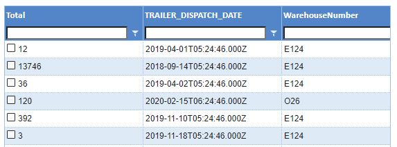
colld
The unique ID to give the column. This is optional. If missing, the ID will default to the field. If both field and colId are missing, a unique ID will be generated.
columnGroupShow
Whether to show the column when the group is open / closed.
field
Specifies the data field that provides the data for that column.
filter
Specifies the data type filter to apply to the column.
floatingFilter
Whether to show an additional row under the column header where users can see and edit a filter for each column. If you want to disable this property, clear its checkbox.
editable
Select this property to allow users to edit a column.
headerClass
Class to use for the header cell. Can be string, array of strings, or function.
headerName
Specifies the name that appears at the top of the column. If not specified, the name of the data field will be used.
headerTooltip
Tooltip for the column header.
headerValueGetterWIdgetFunction
Specifies a custom function to use to get the values to display in the header.
hide
Select this property to hide the column.
maxWidth
Specifies the max width for the cell, in pixel.
minWidth
Specifies the min width for the cell, in pixel.
pinned
Specifies whether rows should be pinned. A row pinned to the left always appear as the first row of the grid. A row pinned to the right always appears as the last column in the grid.
pivotComparatorWidgetFunction
Specifies a function defining how to override the column’s order.
resizable
Clear the property’s checkbox to disable the ability to resize this column by dragging its edge.
rowGroup
Specifies whether to group the data by that row.
rowGroupIndex
Specifies the index of the group column this cell is for if you want to group by. If only grouping by one column, set this to 0. If grouping by multiple columns, set this to where you want this column to be in the group (e.g. 0 for first, 1 for second, and so on). This will always be the same as the level, unless we are collapsing groups, i.e. groupRemoveSingleChildren=true.
sort
Indicates whether you want to sort your data in an ascending or descending order.
sortable
Clear the property’s checkbox to disable the ability to sort through this column.
suppressMenu
Select this property to hide the menu from the widget.
suppressMovable
Select this property to disable the ability to move that column by dragging.
suppressSizeToFit
Select this property to have the size of the widget determined during ‘size to fit’ operation.
suppressNavigable
Select this property to disable navigation using the arrow keys for this column.
tooltipField
Specifies which field’s data should be displayed in the tooltip.
unSortIcon
Specifies whether to show the unsorted icon when no sort is applied to a column.
valueFormatterWidgetFunction
Specifies which custom function to use to format how values are displayed.
valueGetterWidgetFunction
Specifies which custom function to use to get values for the data to display.
width
Specifies the initial width of the cell, in pixel.
defaultColDef
Has options that let you configure properties for all the columns in your grid. To configure properties only for one column, see columnDef
defaultColGroupDef
Specifies properties that apply to all column groups. Properties defined in the column’s group definition override these properties.
excelStyles
This property allows you to specifies the excel style your exported data should have.
getRowClassWidgetFunction
Specifies which custom function to apply to each row individually.
groupDefaultExpanded
If grouping is used, this property sets the number of levels to expand by default. The default value is 0 (expand none). To expand everything, set to -1.
groupDisplayType
Provides a list of options for how grouped rows are displayed on a grid that is on a dashboard.
Available options:
multipleColumns: If selected, one column is created for each individual group.
groupRows: If selected, a group row will span all columns across the entire width of the table. If false, the cells will be rendered as normal and you will have the opportunity to include a grouping column (normally the first on the left) to show the group.
custom: If selected, you have to manually configure which column shows which group.
groupHeaderHeight
Specifies the height of the row containing header column groups. If not specified, the headerHeight height is used.
groupHideOpenParents
If selected, the highest level of grouping will be hidden when the lower levels are expanded.
groupIncludeFooter
If there is grouping in your grid, this option specifies whether the footer should display aggregate data instead of the header when expanded.
groupSuppressBlankHeader
Select this property to show the aggregated data in the header and the footer at the same time.
groupSuppressRow
If selected, the group row won’t be displayed and the groups will be expanded by default with no ability to expand / contract the groups. Useful when you want to just ‘group’ the rows, but not add parent group row to each group.
headerHeight
Specifies the height for the row containing the column label header. The default value is 25 pixels.
pagination
Whether to enable pagination.
paginationAutoPageSize
Whether to have the grid adjust the number of rows to load per page so each page shows enough rows to just fill the area designated for the grid.
paginationPageSize
Specifies how many rows to load per page. The default value is 100. Is paginationAutoPageSize is specified, this property is ignored.
quickFilterText
Specifies a text to use as a quick filter for the rows.
rowGroupPanelShow
A setting for grouping done at the pivot stage. Whether to show the ‘row group panel’ (where you drag rows to group) at the top of the grid.
rowHeight
Specifies the height of the row in pixel. The default value is 25 pixel.
sideBar
Has options that let you configure the sidebar’s appearance.
position
Indicates the position of the sidebar on the grid—left or right.
hiddenByDefault
Indicates if the sidebar should be hidden by default.
toolPanel
Has options for the ‘Columns’ and ‘Filters’ tool panels.
labelDefault
Displays the labels of the tool panels that compose the sidebar: Columns and Filters labels. You can enter a different name for one or both labels. For example, you might want to enter the Spanish/French translation of these labels.
toolPanelParam
suppressSyncLayoutWithGrid
If selected, the column headings won’t be reordered in the tool panel when the grid’s columns are rearranged.
unsortIcon
Specifies whether the ‘no sort’ icon is displayed.
Behavior
allowDragFromColumnsToolPanel
Allows dragging a column directly from the sidebar and placing it in any desired position on the grid. For example, you could drag a column and place it between two others already displayed on the widget.
autoSizePadding
Specifies how many pixels should be added to a column after the auto-size calculation.
editType
Specifies how rows should be editable. To only edit one field at a time, select ‘”’. To edit all the rows at one, select ‘fullRow’.
enableGroupEdit
Specifies whether row groups should be editable.
enableRangeSelection
Whether to allow an Excel-like range selection of cells.
functionsReadOnly
If this property is selected, group, pivot ans value aggregation will not be editable from the dashboard.
groupRemoveSingleChildren
Specifies whether a groupd with one child should be collapsed.
groupRowAggNodesWidgetFunction
Function that defines how to aggregate data. If the aggFunc property of the column does not allow you to perfom aggregation properly for the data you have, you can specify a function to customize the way the aggregation should be done.
groupRowInnerRendererWidgetFunction
Specifies a function that overrides the rendering of groups, but does not affect the outside properties of the renderer (expand, collapse, etc.).
groupRowRendererParam
innerRendererParamsWidgetFunction
Specifies a function that overrides the rendering of groups but does not affect the outside properties of the renderer (expand, collapse, etc.).
groupSelectsChildren
Specifies whether to select the children in a group when the group is selected.
groupSelectsFiltered
Specifies whether to only select the filtered children in a group when the group is selected.
pivotMode
Select this property to enable the pivot mode.
rowDeselection
Specifies whether to allow deselecting rows by holding ‘ctr’ and clicking the row.
add rowSelection
Specifies the type of row selection.
singleClickEdit
Specifies whether editing should be allowed with a single click.
sortingOrder
By default, clicking on the sorting button will sort a column in asceding order. Clicking it again will sort in descending order and clicking on it a third time removes the sort.
The sortingOrder property let’s you configure your own sorting order.
suppressColumnVirtualization
A setting that affects horizontal scrolling in grids that have a large number of columns. If you want all columns to be rendered instead of just those that are currently visible, select this property.
suppressAnimationFrame
Specifies whether animation frames should be used when drawing rows while scrolling. Use this if the grid is working fast enough that you don’t need animations frame and you don’t want the grid to flicker.
suppressAutoSize
specifies whether double cliking a column headers edge auto-sizes a colum.
suppressCellSelection
Specifies whether cells are selectable.
suppressClickEdit
Specifies whether cliking on a cell start editing.
suppressColumnMoveAnimation
Specifies whether animation should take place when a column is moved.
suppressColumnsToolPanel
If selected, disables the ability to move columns in the grid to change their order.
suppressFieldDotNotation
Specifies whether dot can be used in field names or not.
suppressHorizontalScroll
Specifies whether horizontal scroll should be displayed.
suppressMenuHide
Specifies whether the column menu button shoud always be displayed or should appear only when hovered over the column’s header.
suppressMovableColumns
Specifies whether columns should be fixed or not.
more suppressMultiSort
Specifies whether to suppress multisort when a using shift-clicks a column header.
suppressPaginationPanel
Specifies whether the navigation control should be hidden.
suppressRowClickSelection
Specifies whether row selection should happen when rows are clicked. Enable this property if you wish to use checkbox selection only.
suppressScrollOnNewData
Specifies whether the grid scrolls to the top when new data is provided.