Release 40.1 Notes 21 April 2024#
Summary#
In this release, we’ve developed the following improvements:
A new ‘Card’ chart type, that can display a single important metric.
In the user dropdown, you can now see the email address associated with your account.
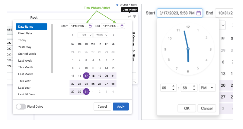
When using a widget’s Date Picker, you can now select a start and end time.
Improvements#
Displaying a Single Metric on a Dashboard#
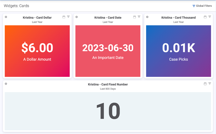
A new chart type, Card, lets you set up a widget that displays a single data point, like an important metric, on your dashboard. Previously, you could create a similar effect by modifying a bar chart.
Setting up Card Widget Data#
Set up data for the new Card Widget in the same way you would for other widget types using Widget Builder, where you will select and filter a data source. If you leave the data as-is, the first value in the selected value column will display in the Card Widget. For this example, if you use Pallet as the value field, 14 will be the data point that displays in the card. The data field is selected when creating your Card in the Chart Wizard.

Alternatively, you can transform and aggregate the data (by adding stages such as Filter, Display Fields, Grouping, Sort, etc.), to have more control over which exact data point will display in the Card Widget.
Creating Card Widgets#
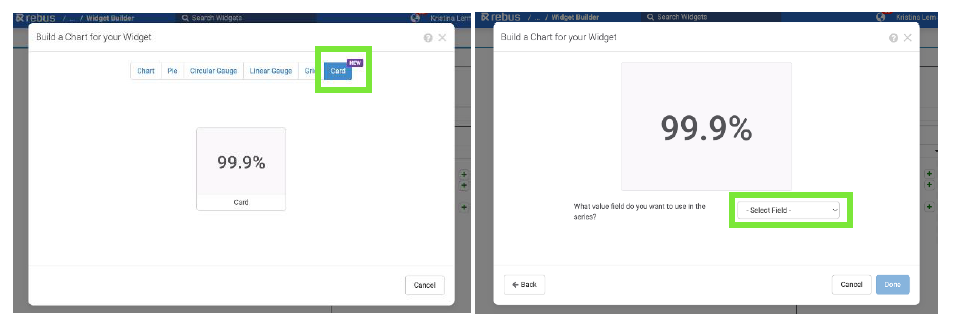
The new Card option is available under Chart Types in Widget Builder>Design Chart>Chart Wizard. Upon clicking the Card option, you can select which value field to use using the dropdown. The available fields are pulled from the data source you set up in Widget Builder.
Card Widget Chart Properties#
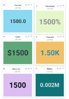
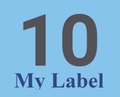
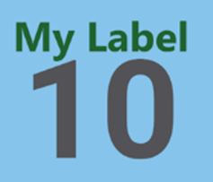
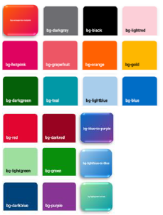
The Card Widget’s chart properties allow customization over background color, font, and format (fixed, decimal, percentage, dollar, thousand or million). You can also choose a theme, which will override your individual presets. You can add a label to your data or ONLY display a label using the Label chart property. You can customize label fonts and colors.
Chart Property |
Description |
Example |
|---|---|---|
BackgroundColor |
Background color for value. Default: #fff |
|
Font -> Color |
Font color of the value. Default: #535357 |
|
Font -> Family |
Font family used to display value Default: Roboto |
|
Font -> Size |
Font size of the value. Works only if ‘responsiveSize’ is false. Default: 65px |
|
Font -> Weight |
Font weight of the value. Default: Bold |
|
Format -> Type |
Value format (e.g., decimal, dollars, percentage):Default: fixed |
|
Format -> Precision |
Number of decimal places to show. Will not work with Type = ‘Fixed’ Default: 2 |
|
Format -> showSeparators |
Whether to put commas between every three digits.Default: true |
|
hideValue |
Lets you display only a label. Default: false |
|
Label -> Color |
Font color of the label. Default: #A0A0A4 |
|
Label -> Family |
Font family of the label.Default: Roboto |
|
Label -> Position |
Position of the label: (Bottom or Top) Default: bottom |
|
Label -> Size |
Font size of the label. Only works if ‘responsiveSize’ is false. Default: 65px |
|
Label -> Text |
Label text. |
|
Label -> Weight |
Font weight of the label. Default: normal |
|
responsiveSize |
If set to true, Rebus dynamically sizes the content to fit in the widget Default: true |
|
Theme |
A theme defines a background and a font color. Selecting a theme will override ‘backgroundColor’ , ‘font.color’ and ‘label.color’ Default: None |
|
valueField |
Which field to display as the value. This is set during the widget creation. |
Adding a Card Widget to the Dashboard + Home Screen#
From the Home Screen, you can add a Card Widget via the ‘New Tab’ or ‘Edit Tab’ button. From the dashboard, you can add a Card Widget to Favorites via ‘Widget Options dropdown > Add to Favorites’ option.
Seeing Email Address of Your Rebus Account#
The pathbar and user dropdown have been improved to make it easier and quicker to navigate Rebus. The changes include a new appearance, new clickable links, and the relocation of some clickable links from the user dropdown menu.
Appearance#
In the pathbar, your username has been replaced by a colored User Avatar containing your first and last initials.

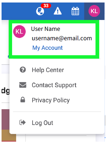
When you click the new User Avatar, you can see the name and email address associated with your account. Clicking on your username, email, avatar, or My Account will bring you to your user profile.
User Dropdown#
In the User Dropdown menu, there are now only 4 options available under your user profile link. They include:
Help Center - links to /helpcenter
Contact Support - links to /support
Privacy Policy - links to /privacyPolicy
Log Out - logs out and redirects to /login
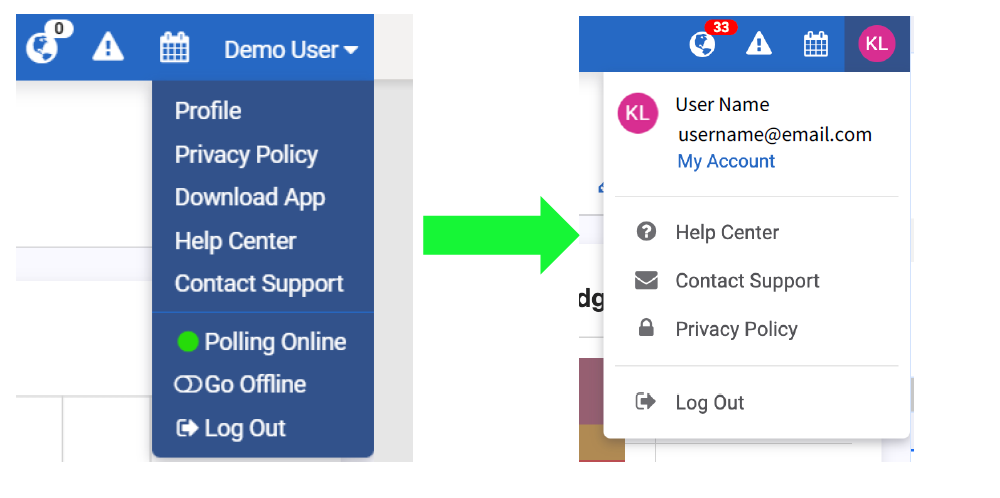
The options of Polling Online and Go Offline have been removed from the dropdown menu. The option to download the mobile app has been moved from the dropdown menu. In the User Profile screen, a new box displays with the option to download the Rebus mobile app.
Filtering Widget’s Date Range by Start & End Time#
When using a widget’s Date Picker, you can now select a start and end time. Previously, Global Filters, Widget Properties, and Widget Builder had a time picker, but Date Picker did not. This allows you to filter widget data for specific times of the day within a certain date range. To select a start and end time, select the Date Range filter. When you select the start and end date, click on the purple calendar icons and the time picker will appear. Select your start and end times in hours and minutes.
