Interpreting Labor Metrics#
This guide explains why labor performance, utilization, and effectiveness matter, and how the right widgets work together to tell a clear labor story across your operation.
You’ll learn why real-time visibility is important compared to next-day reporting, and how to build the most useful widgets in your own environment. Each Widget section covers what the widget does, what data it needs, and how to set it up.
Understanding Labor Performance Metrics#
Labor metrics tell a labor story. From certain measurements, you can determine where problems originate and get notified early on about changes in the effectiveness of your workflow. This allows you to fix issues as soon as they start.
Metric |
Definition |
Why it Matters |
|---|---|---|
Network Performance |
The comparison between the expected time a task or data transfer should take and the actual time it takes to complete. |
When performance is low, it could indicate equipment problems, workflow inefficiencies, or the need for associate coaching. |
Network Utilization |
The proportion of total available working time that is actually spent performing productive, measurable tasks. |
If utilization drops, associates may be waiting for work, spending time on indirect tasks, or be impacted by bottlenecks in the workflow. |
Network Effectiveness |
A combined measure that reflects how well the network is performing and how efficiently it is being used. |
Effectiveness is an early warning indicator of issues with your labor. If performance is high but utilization is low, the drop in effectiveness shows that people work at a good pace but spend too little time on productive tasks. If utilization is high but performance is low, the drop in effectiveness shows that people are engaged but the work itself is slow or inefficient. If both are low, there is a combined issue with both utilization and performance. |
Take the following scenario:
Warehouse A’s Effectiveness (a metric represented on the dashboard as a card widget) drops from 83% to 57%, which triggers an alert.
Both Utilization and Performance are displayed on the dashboards as line graphs that show the past week’s data. You can see a distinct drop that started yesterday in the Performance graph.
You drill-down in this graph to see a grid that displays the expected time per activity and the actual time spent per activity. The Case Picking activity has a significant discrepancy between its expected and actual time.
If you drill-down further into that activity, you can see that the high numbers can be attributed to two specific employees, who were both hired within the past month.
To resolve the issue, you schedule extra training for these employees and review the case picking workflow at Warehouse A. The next week, effectiveness is back up to normal averages and no alerts are triggered.
Setting Up Dashboards for Labor Monitoring#
Let’s look at how dashboards can be structured differently for supervisors, managers, and analysts. Supervisor, manager, and analyst dashboards form a connected map that tell your facilities’ labor story.
Executives focus on regional comparisons and long-term performance trends to guide strategic company decisions.
Supervisors detect issues as they appear.
Managers look for patterns and assess impact across multiple teams or sites.
Analysts uncover root causes and refine metrics or logic.
When dashboards are consistently designed and role appropriate, users can go easily from identification, to diagnosis, to action. You can then turn labor data into measurable performance improvement.
Decision Workflow for Supervisors#
Supervisors should use the following workflow during each shift to guide labor and priority decisions.
Check Outbound Activity
Begin by checking outbound shipments that are considered “at risk.” Any orders approaching their departure deadlines should take priority, and labor may need to be pulled toward Picking or Loading.
Check Inbound Activity
Next, confirm that inbound activity is not creating downstream delays. If unloads are running late or backlogs are starting to build, it may be necessary to shift support into Receiving before the issue grows and impacts other departments.
Review the Workload
Supervisors should then use a Workload Estimator widget to translate the remaining unit volume into required labor hours. This helps identify which department has the largest amount of work still outstanding.
Reassign Staff
Finally, compare current staffing levels against the workload. Workers should be reassigned from lower-need areas into departments with the highest remaining labor demand. After any labor movement, supervisors should re-check outbound risk to ensure priorities remain covered.
Design Principles to Follow#
Use these foundational principles that can apply to all roles using dashboards:
Each dashboard should answer a specific question. For example, Are we staffed correctly today? Or, Why did productivity drop yesterday?
Be consistent. Use the same metric names, colors, thresholds, and time logic across dashboards to reduce confusion.
Prioritize visuals over reading. Cards, gauges, and simple charts should communicate status at a glance.
Assign each widget a general role it fills in a typical workflow. For example, Inbound/Outbound Progress widgets align with Planning or Adjusting, while Performance widgets can align with Reviewing and Coaching.
Dashboard |
Context |
Recommended Structure |
|---|---|---|
Executive Dashboard |
Executives’ dashboards should provide a high-level view of network performance to enable strategic decision-making without operational noise. |
Network-level KPIs, regional rollups, and site-level summaries (no user-level or shift-level detail), a Network Performance Overview including performance, utilization, effectiveness, and inbound/outbound volumes, and • Comparative regional views (e.g., West Coast vs. East Coast vs. Midwest) using maps or side-by-side visuals. |
Supervisor Dashboard |
Supervisors’ dashboards should monitor real-time performance and let them act quickly to resolve problems. |
4–6 key card or gauge widgets showing current performance metrics, backlog, or on time percentage, and cascading widget groups to reveal details. |
Manager Dashboard |
Managers’ dashboards should track KPIs, compare data across multiple sites or teams, and identify root causes over time. |
A summary level that contains high level KPI cards organized by company, region, or warehouse, and a comparison level that contains bar or column charts comparing warehouses, shifts, or processes with drill-down paths. |
Analyst Dashboard |
Analysts’ dashboards should explore data quality and trends on a diagnostic level and build reusable components. |
Grouped, aggregated, and sortable grids that expose drivers behind metrics, and widgets arranged by analytical theme (cycle time, outbound performance, inventory), across multiple dashboards grouped under sub-menus. |
Managing a Shift Based Workflow#
Strong labor management depends on sets of non-negotiable behaviors. These basics are simple, repeatable, and entirely within a site’s control. When managed consistently, they create a reliable foundation for performance conversations. We can split these basics into the Start, Middle, and End of the shift.
Dashboard |
Context |
Recommended Structure |
|---|---|---|
Start of Shift |
Confirm associates are assigned to the correct schedules, review issues carried over from the previous day, and identify workload and staffing requirements. |
Staffing vs Workload, Workload Estimator |
During Shift |
Monitor activity, performance, utilization and indirect time throughout the day. Watch for warning indicators or data that indicates issues and address problems with associates. Redistribute labor to manage changing priorities. |
Inbound / Outbound widgets, Status widgets, Performance card |
End of Shift |
Confirm associates have completed their shifts and all breaks & indirect time are properly recorded. Review performance results and follow up on issues encountered during the shift. |
Indirect Hours, Status widgets |
Dashboard Examples#
A strong labor-balancing dashboard should be structured in two layers:
Top Row: What you need to know
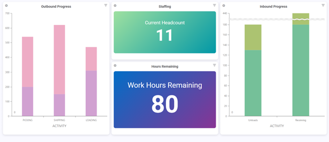
Use high-level KPIs that summarize current conditions at a glance. Here are some example widgets:
Today’s Inbound Progress
Today’s Outbound Progress
Staffing vs Workload
Department Workload Estimator
Risk indicators (late trucks, backlog, etc.)
Bottom Row: What you need to act on
Use detailed widgets and tables to help guide decisions. Here are some example widgets:
Inbound trailer status grid (scheduled vs completed)
Outbound shipment readiness (target departure vs actual)
Order-by-order progress detail (remaining picks, loads, time left)
Department workload by hour (where labor needs to be shifted)
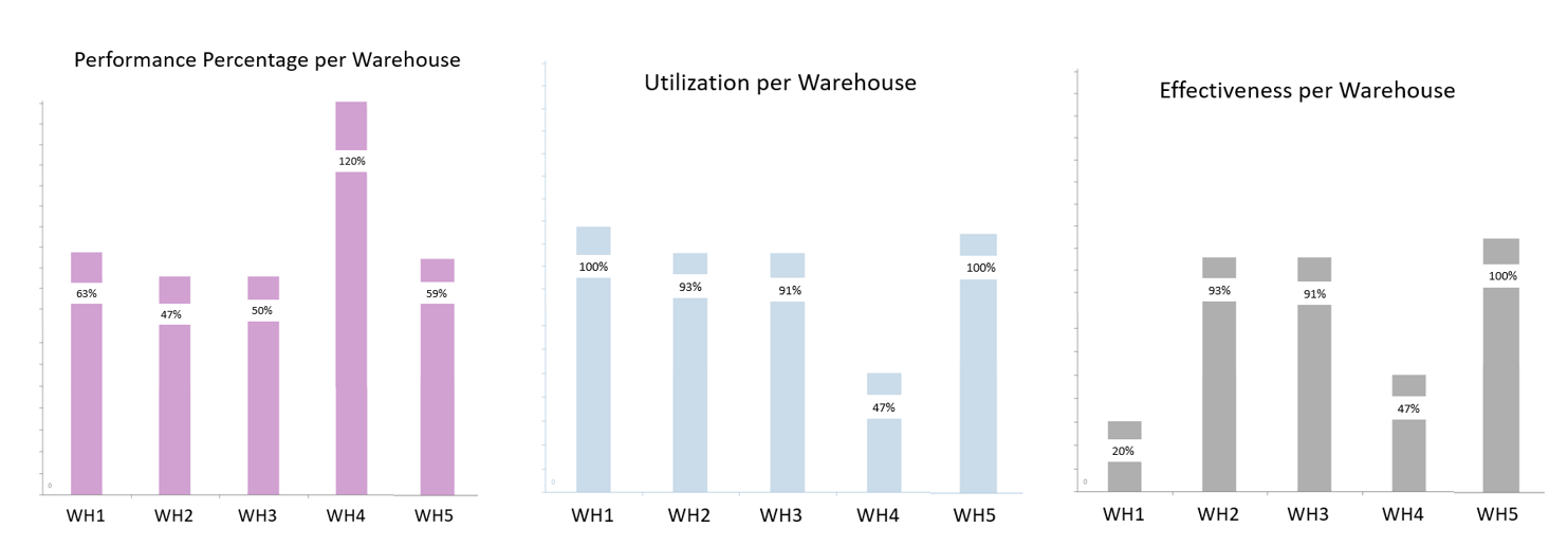
Performance Overview Widgets#
Create three widgets that show high-level performance, utilization, and effectiveness trends at the warehouse level.
Widget Type#
Bar chart
Data Needed#
Below is the data needed to create each of the widgets that show you a performance overview of your warehouses.
Performance |
Utilization |
Effectiveness |
|---|---|---|
Goal Time, Measured Time |
Measured Time, Total Time |
Measured Time, Goal Time, Total Time |
Steps#
For each widget:
Navigate to Widget Builder and click New.
Fill in basic widget details and select a data source that includes the required data from the table above, depending on whether you’re building a widget to display Performance, Utilization or Effectiveness.
Filter the data at the Filter stage. Include a date field.
Assign fields at the Fields stage, then design your chart using Chart Designer.
Performance |
Utilization |
Effectiveness |
|---|---|---|
Create a calculated field for Performance. For example: divide(GOAL_HOURS, MEASURED_HOURS). Configure a Bar Chart in Chart designer with Performance as the series and Warehouse as the X-Axis. |
Create a calculated field for Utilization. For example: divide(MEASURED_HOURS, TOTAL_TIME). Configure a Bar Chart in Chart designer with Utilization as the series and Warehouse as the X-Axis. |
Create a calculated field for Effectiveness. For example: multiply( divide(GOAL_SECONDS, MEASURED_SECONDS), divide(MEASURED_SECONDS,TOTAL_TIME) ). Create a bar chart that uses Effectiveness as the series and Warehouse code as the X axis. |
Add all three widgets to a dashboard to have an easy-to-read performance overview of your warehouses.
Optional: set up an alert to notify you when one of these widgets goes above a pre-determined threshold. You can use alerts to keep supervisors on the floor rather than at a computer constantly monitoring dashboards. See Alerts for more information about how to set them up.
How to Interpret Performance Overview Widget Results#
These three widgets (Performance, Utilization, and Effectiveness) are designed to give you a warehouse-level snapshot of how labor is performing across sites. Together, they help answer and evaluate your data 3 ways:
Performance tells you how closely labor is meeting goal time. Use this metric to have conversations about both team and individual goals and how to better reach them. How to interpret values:
> 100% means teams are performing better than goal (be cautious about inaccurate goal times or under-reporting).
= 100% is exactly on goal (ideal).
< 100% is underperforming vs goal (requires investigation).
Utilization tells you how much of paid time is spent in measured (productive) work vs non-productive time. Use this metric to discuss indirect time management with employees. How to interpret values:
80–95% means strong utilization (varies by operation and how indirect time is expected to be used based on your personal operations)
< 70% suggests too much time is going unmeasured (indirect time, idle time, coding issues, etc.)
Very high (near 100%) can indicate that indirect activities are not being captured accurately.
Effectiveness tells you the big picture story of your operation by combining Performance and Utilization. Use this metric to identify issues and suggest workflow improvements. How to interpret values:
High Effectiveness = people are productive and spending most time on measured activities
Low Effectiveness could mean either: performance is low, utilization is low, or both
Dashboard Labor Widgets#
Inbound Progress Widget#
Show whether inbound activity is keeping pace so receiving doesn’t fall behind and affect downstream workflows.
Recommended Widget Types
Stacked bar chart (Received vs Remaining)
Data Needed
Scheduled inbound appointments (count or units)
Completed unloads
Remaining inbound units
Actual arrival time vs scheduled arrival time (optional)
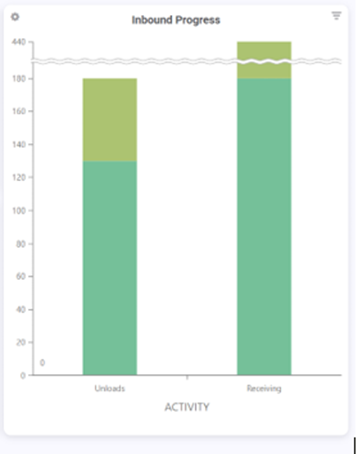
Interpretation
Use this widget to answer:
Are inbound trailers being unloaded on time?
Is receiving falling behind early in the day?
Do we need to pull labor into Receiving immediately?
Outbound Progress Widget#
Track outbound execution so shipping deadlines are not missed.
Recommended Widget Types
Stacked bar chart (Picked / Loaded / Shipped)
Data Needed
Units picked vs remaining
Units loaded vs remaining
Units shipped (completed)
Orders or shipments pending from yesterday
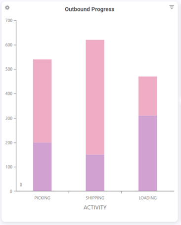
Interpretation
Use this widget to answer:
Are we still carrying work from yesterday?
Are we behind for today’s outbound volume?
Are we loading too late to hit target departures?
Department Workload Estimator#
This widget estimates remaining workload by department using the relationship: Remaining Work Hours = Remaining Units ÷ Units Per Hour (UPH). Rebus knows department UPH (Receiving/Picking/Packing/Loading) and knows remaining units, so it can translate the workload into hours required.
Recommended Widget Format
Grid or Card widget
Department |
Remaining Units |
UPH |
Estimated Hours Remaining |
|---|---|---|---|
Receiving |
X |
Y |
X/Y |
Picking |
X |
Y |
X/Y |
Packing |
X |
Y |
X/Y |
Loading |
X |
Y |
X/Y |
Setup Recommendations
Ensure the unit type is consistent (cases, pallets, lines, etc.)
Use average UPH for the selected shift (or last 7–14 days)
Allow filtering by department and shift
Interpretation
This widget supports labor balancing decisions like:
Receiving only has 2 hours left, but Picking has 10 hours left. Solution: move people to Picking.
Loading is behind and departures are approaching. Solution: reassign packers temporarily.
Staffing vs Workload Widget #1: “People Assigned vs Hours Remaining”#
Recommended Widget Types
Side-by-side bar chart
Data Needed
Assigned headcount (current)
Hours remaing (workload estimator output)
Interpretation
If Receiving shows 10 hrs remaining and only 2 people, risk is high. If Packing shows 2 hrs remaining and 8 people, you’re likely overstaffed.
Staffing vs Workload Widget #2: “Workload Risk Indicator”#
Recommended Widget Types
Status indicator cards (Green / Yellow / Red)
Data Needed
Assigned headcount (current)
Hours remaing (workload estimator output)
Interpretation
Green: work can finish with current staffing
Yellow: borderline, monitor closely
Red: projected delay unless labor shifts
Inbound Trailer Status Board#
Track whether inbound unloads are happening on schedule.
Recommended Widget Type
Grid with conditional formatting
Recommended Fields
Trailer / Load ID
Appointment time
Actual arrival time (if available)
Scheduled unload quantity
Completed unload quantity
Status
Interpretation
If inbound unload slips, it can delay replenishment, starve picking locations, increase indirect time (waiting), or create a backlog that forces overtime later.
Monitoring Outbound Status (Target Departure vs Actual)#
Spot shipments that are in danger of missing departure targets. For example, shipments with only 1–2 hours remaining but still many pallets remaining to pick/load must be prioritized immediately.
Recommended Widget Type
Table/grid sorted by “Time Remaining”
Recommended Fields
Shipment / Order ID
Carrier
Door / Dock
Target departure time
Actual departure time (if shipped)
Remaining pallets to pick
Remaining pallets to load
Time remaining until cutoff